- Posts
- 22,594
- Likes
- 32,146
Aquagraph
·I am really glad to hear that you are feeling more positive towards your new Carreras TH Junkie - I really felt for you laying out that amount of money and feeling like you had made a big mistake.👍
Just trying to understand: Is it really “only” the noise and spinning that is an issue with your latest H02 chronos or is there also something wrong with their accuracy and/or power reserve?


So @Aquagraph 's "fixing" of the 160 gave me an idea, and I decided that while the only thing that watch needs is a slightly better crystal, the "Elegant" Carrera sorely needs to be fixed as it currently is not so much Elegant as it is a jarring mishmash of half-assed design cues.
It's really not very difficult to deal with - just get rid of that fugly vestigial running seconds. Simple as hell and could be done today with just the slightest actual attention to detail by TAG's design department:
Ahhhhhh.... with just that one simple change, the ugliness is gone and replaced by a much more harmonious and attractive piece!
(With the running seconds removed, I added a steel surround to the date window to better balance the dial. I think removing the date altogether would actually not work as well).
However, as many have pointed out, the "HEUER 02 80 HOURS" text really screws up this watch too. I think it works a bit better on the 44mm "Sport" models but has no place on an "Elegant" design. So I removed it, easy! But: I noticed too that putting the "SWISS MADE" trademark on the chapter ring also causes problems with balance, so I moved that to the dial instead (but kept the same size, which is crucial).
Look at that gorgeous watch 🥰, that we so easily could have gotten instead of the listless tat TAG insist on punishing us with.
(Yes I dislike the mushroom pushers too, but they're really not that big a deal and I'm starting out just intending to show how some very minor decisions about just the dial design could really have benefited this watch.)
Now that I've fixed it, I'm working on some other fun ideas and will share later on 😀
Can you move the 'Carrera' text to the bottom, because it looks really empty now.
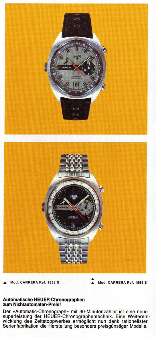
The element has a long tradition in Heuer watches. E.g. was already found in a 1972 Carrera Ref. 1553N
Remo, just because it was in the history doesnt mean it looks good
Wow Adam, much much better looking 👍
Remo, just because it was in the history doesnt mean it looks good 😉