Forums Latest Members

New Post- 2020 TAG Heuer Carrera Elegant Chronograph 42mm

  1. kappa_md

    kappa_md Sep 17, 2020

    Posts
    4,041
    Likes
    5,854
    A certain iconic watch has ALOT of TEXT in the dial and it certainly doesn’t affect sales and prestige.. :rolleyes::rolleyes:

    The “80 hours” text is a NO ISSUE for me. Though it can be a good conversation topic, it plainly is a superior technological improvement :thumbsup::thumbsup:
     
  2. OttoWilliam

    OttoWilliam Sep 17, 2020

    Posts
    2,826
    Likes
    2,505
    Nobody talking about the golden rotor of these Carrera yet ? Yay or Nay ? or prefer the black rotor like before ?
     
    Ara likes this.
  3. Nalin

    Nalin Sep 17, 2020

    Posts
    21
    Likes
    40
    Having tried these on instore, I can offer some insights:
    -The rotor takes up less real estate in the display caseback, while the black rotor drew the eye away from the internal components
    -The blue is very dark, unlike the photos and has a slight reddish hue (under lights)
    -The anthracite dial is highly reflective under the bright lights of the AD, this is where the black is best. On the black, the chrome surfaces draw attention while the matt black dial offers a subdued background
    -42mm case wears like a perfectly sized sport watch on a 6.5" wrist. It is not a dress watch by any means
    -The brown leather band very nice. Might just be the fact that it is different, but the deep chocolate colour works very well for a 'dress watch'
    -The white dial is more of a cream colour. Frankly, it's the fashion watch of the lot but it pays the Tag Heuer bills, so I can't hate it. I would never wear it though
     
  4. Mr_Orange

    Mr_Orange Sep 18, 2020

    Posts
    3,253
    Likes
    2,310
    Thank you for the feedback and welcome to Calibre 11!
     
  5. OttoWilliam

    OttoWilliam Sep 18, 2020

    Posts
    2,826
    Likes
    2,505
    i wonder how the black is the black dial compared to the Vanta Black. Because it's sure looks really black (without stark comparison side by side, of course).

    The black one remain my favorite among the lot. Looking back i think my taste had changed over the years.

    Before i was drooling for the anthracite dial H01 and ended up buying it. Now i feel like the anthracite dial just does nothing for me.
     
  6. Mr_Orange

    Mr_Orange Sep 18, 2020

    Posts
    3,253
    Likes
    2,310
    It might be the design of the H01 which is not working for you any more rather than the dial colour, especially when you see these latest H02 models.
     
    OttoWilliam likes this.
  7. Hubert

    Hubert TAG Heuer Forums Moderator Staff Member Sep 18, 2020

    Posts
    9,927
    Likes
    10,904
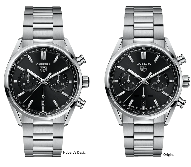
    I was doing a little photo editing and I think with some minor tweaks, this could have been even more elegant. "Less is More" works here.
     
    upload_2020-9-17_23-49-49.png
    Redwes25 and Calibre11 like this.
  8. Mr_Orange

    Mr_Orange Sep 18, 2020

    Posts
    3,253
    Likes
    2,310
    Removal of text - yes.
    Removal of crosshairs - no.
     
    Albert-AMG, Aquagraph and YY77 like this.
  9. imagwai

    imagwai Sep 18, 2020

    Posts
    5,847
    Likes
    6,989
    Hubert's does look cleaner though
     
    Hubert likes this.
  10. Aquagraph

    Aquagraph Sep 18, 2020

    Posts
    19,870
    Likes
    27,544
    It's starting to look dangerously like that overpriced F1 from whatsisname!
     
    Yago likes this.
  11. imagwai

    imagwai Sep 18, 2020

    Posts
    5,847
    Likes
    6,989
    Replace the hour markers with red dots?
     
  12. Aquagraph

    Aquagraph Sep 18, 2020

    Posts
    19,870
    Likes
    27,544
    Over to you Hubert
     
    Hubert and Jim Dollares like this.
  13. Albert-AMG

    Albert-AMG TAG Heuer Forums Moderator Staff Member Sep 18, 2020

    Posts
    5,398
    Likes
    13,813
    Agree about keeping the crosshairs

    I would just remove the “HEUER 02 80 HOURS” text (that could be placed just on the caseback), and I would put the classic “SWISS MADE” instead, like in this other Carrera

    9675A9A1-8962-44FB-A2CB-EBAFFF8B5CFF.jpeg

    Otherwise I find this part of the dial too empty (and not balanced with the rest of the dial) in Hubert’s version
     
    Mr_Orange and Aquagraph like this.
  14. Mr_Orange

    Mr_Orange Sep 18, 2020

    Posts
    3,253
    Likes
    2,310
    The lack of crosshairs for the running seconds makes the running seconds hand look like the vestigial tail that one of or other members keeps referring to it as. It needs the crosshairs IMO.
     
    Albert-AMG likes this.
  15. Aquagraph

    Aquagraph Sep 18, 2020

    Posts
    19,870
    Likes
    27,544
    Easily solved, just make the running second hand black and you'll barely be able to see it at all.... except when it whizzes across the date.

    So how about a phantom elegant Carrera?
     
  16. Mr_Orange

    Mr_Orange Sep 18, 2020

    Posts
    3,253
    Likes
    2,310
    Well, by the time you get there, you might as well remove the running seconds altogether, which would no doubt please some people.
     
  17. Aquagraph

    Aquagraph Sep 18, 2020

    Posts
    19,870
    Likes
    27,544
    Take em all off, make it a three hander.... then it will be too big. Make it 39mm, give it a glassbox put the chrono back and voila... perfect.
     
    Hubert likes this.
  18. imagwai

    imagwai Sep 18, 2020

    Posts
    5,847
    Likes
    6,989
    Oh, and... change the subdials to white. Replace TAG Heuer with Heuer. Change the crown and pushers.
     
    Hubert likes this.
  19. Mr_Orange

    Mr_Orange Sep 18, 2020

    Posts
    3,253
    Likes
    2,310
    Actually, far from perfect, IMO. I'm not a fan of any of the 39mm, glassbox models.
     
    Hubert likes this.
  20. kappa_md

    kappa_md Sep 18, 2020

    Posts
    4,041
    Likes
    5,854
    I’m a big fan of the 39mm Carrera glassbox :thumbsup::thumbsup:

    Am I the only one who likes the text “Heuer02 / 80 Hours” ?? :eek::eek:

    It’s a testament of the Calibre H02 movement and “normal” people will not understand it if they don’t see it :rolleyes::rolleyes: