The TAG Heuer Enthusiast blog.
Mspeedster
·On the plus side, at least you know the WOTY wasn't fixed. 😁


Jim Dollares
·Aquagraph
·Mspeedster
·It's not the date at 9 o clock, it's that it's about 2mm too far to the left.
I get that maybe the Heuer 02 may be the issue, if so then the movement isn't suitable for the watch.
Honestly I don't know how anyone can look at that and think it looks fine.
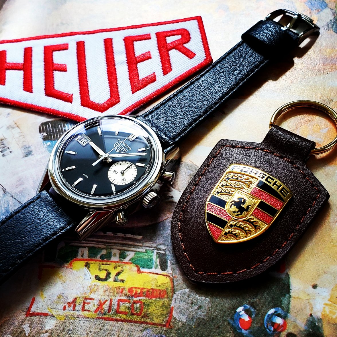
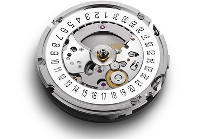
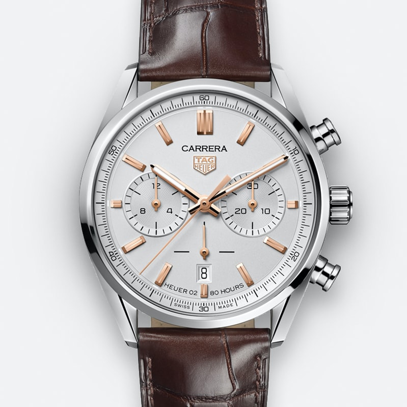
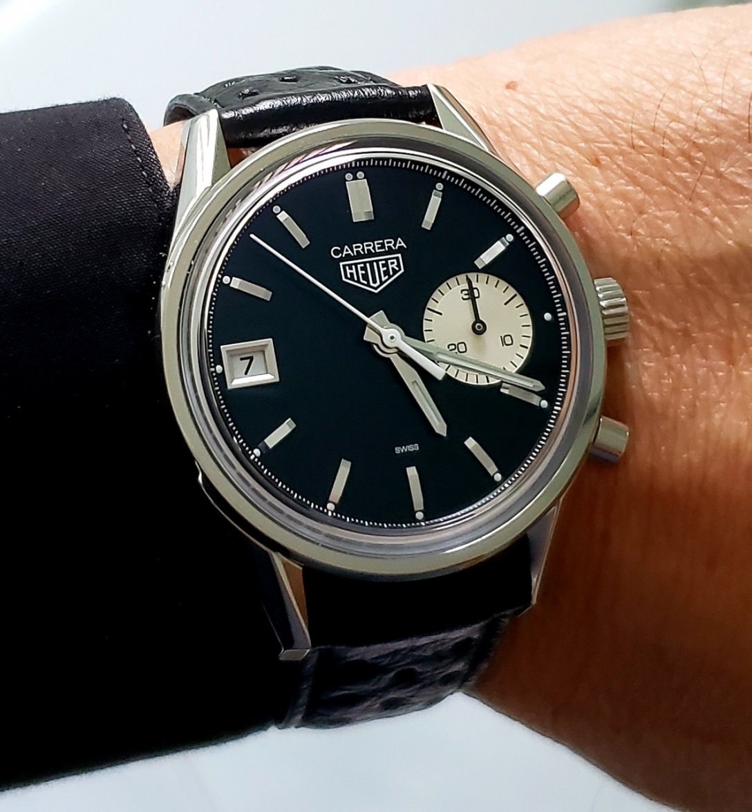
If you look at the H02 date wheel and the date position on the 42mm Carrera Elegant, I believe TAG Heuer could've position it 2mm further away from the lume dot if they had wanted to. A slight change to the width of the font used might have been enough, but it looks like it could have been done even with its current font as there's space on the wheel.
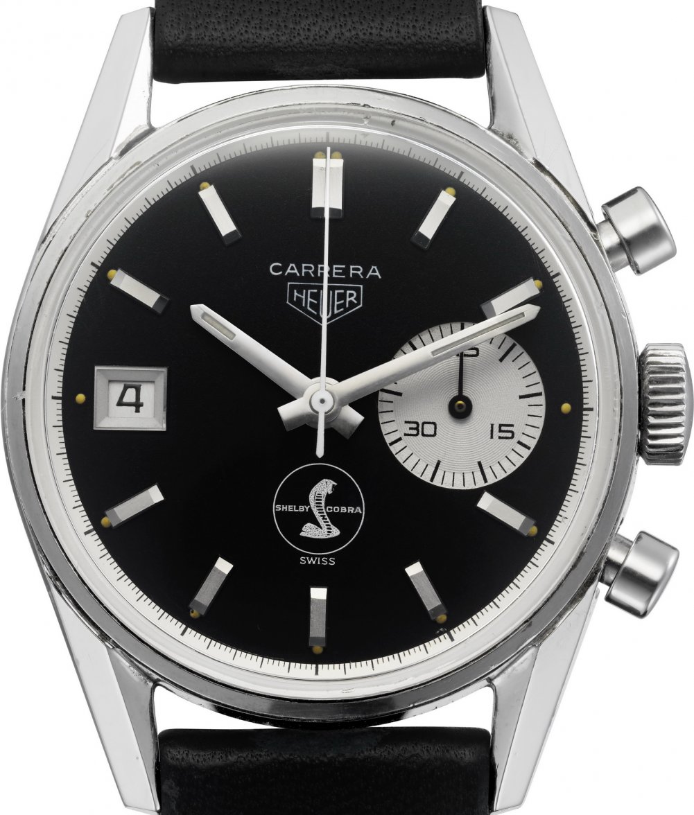
So it's quite possible that the designers chose the date position on purpose, just as they chose to make the chapter ring black instead of the original's white. The reason being perhaps because the original's date is not aligned with the other hour markers. Not only does it sit 2mm further in from the lume dot, it also protrudes 2mm further in compared to the hour markers.
On the Hodinkee re-edition, the length of date box is identical to the hour markers and sits perfectly aligned with them. Hence, why it may have been a creative design decision rather than a forced decision due to the dimensions of the H02 date wheel.
I think this is why it's a non issue to me and something I've never even thought about 'till now. The watch is already asymmetrical with it's single register, so the date box being neatly aligned with the other hour markers works just fine. 👍
Edited:
Pitfitter446
·Aha, logical thinking applied, I like it.
Aquagraph
·I'm honestly not trying to make you feel bad about your watch, if it doesn't bother you / you like it's quirkiness then all's well and good. To me though every time I see it it stands out like a sore thumb. And if it's a design 'choice' then that's bizarre. Considering how people pick on every little thing that TAG do on new models, I don't quite understand how this is acceptable. To me it doesn't matter about the hour markers, it's the symmetry of the gaps between the lume pip and the dial/window on either side, which the original has and the new one doesn't. Well actually the Shelby one above isn't quite the same, but it's better than the new one in that regard.
And also, I don't quite understand how a cross hair running seconds at 6 on a new Monaco is 'hideous' but a cross hair running seconds at '10' on an old Monaco is 'funky'. Couldn't possibly make less sense!
And also, I don't quite understand how a cross hair running seconds at 6 on a new Monaco is 'hideous' but a cross hair running seconds at '10' on an old Monaco is 'funky'. Couldn't possibly make less sense!
abrod520
·And also, I don't quite understand how a cross hair running seconds at 6 on a new Monaco is 'hideous' but a cross hair running seconds at '10' on an old Monaco is 'funky'. Couldn't possibly make less sense!
Asymmetric = funky. Ruining an otherwise pleasantly symmetric 2-register = hideous
Though I will say I think the Cal 15 design did not work that well in the Monaco. Looked best in the Carrera, worked all right in the Autavia, but not quite as nicely in the square case.
Aquagraph
·😒
Mspeedster
·To me though every time I see it it stands out like a sore thumb. And if it's a design 'choice' then that's bizarre.
Aquagraph
·Well the important thing is that you like it, so that's okay.
Mspeedster
·Well the important thing is that you like it, so that's okay.
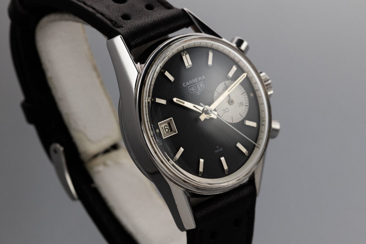
Case in point, from this angle the original looks very similar to the re-edition in terms of the date's position. Makes no difference to me in the overall appearance of the watch.
abrod520
·I mean also, an asymmetric design gives you a lot more leeway to play with exact positioning of other dial elements.
Mspeedster
·I mean also, an asymmetric design gives you a lot more leeway to play with exact positioning of other dial elements.
Similar threads
- Posts
- 56
- Views
- 4K
- Posts
- 24
- Views
- 2K
- Posts
- 4
- Views
- 941
- Posts
- 16
- Views
- 3K
