Forums Latest Members
  1. Ara

    Ara Jan 9, 2021

    Posts
    754
    Likes
    1,148
    That's OK, Speedy Tuesday reminds me of Speedy Autavia 2446.
     
    Albert-AMG likes this.
  2. Yago

    Yago Jan 10, 2021

    Posts
    4,253
    Likes
    7,158
    It’s a bit similar but even in concept stage it looks a lot better than the Speedy. 
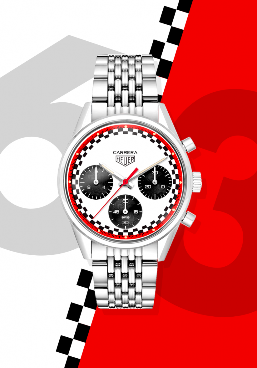
The racing box has chequered squares iso rectangles so it could be tweeked to move it away from the Speedy. Some finetuning by Ara would make this a bomb. Which vintage Heuer Carrera enthusiast wouldn’t want this one? I’m certain it would sell out. I’m keeping a spot warm.

    33C3765E-EB60-43CE-B138-AB8439DB63A4.jpeg
     
  3. abrod520

    abrod520 Jan 10, 2021

    Posts
    11,262
    Likes
    35,476
    Yeah but... it isn't though

    It was actually inspired by the Tintin moon rocket, as seen in the post above ^ . Herge's estate (IP holders of the Tintin trademarks) didn't agree to license it though which is why they called it "racing" or some such.

    EDIT: oh you mean your Carrera. Of course, but even so it does bear a very close resemblance. No matter - see if you can get Bamford to agree to it! (We have not seen the last of the Glassbox so there will still be cases manufactured...)
     
    Yago likes this.
  4. Yago

    Yago Jan 10, 2021

    Posts
    4,253
    Likes
    7,158
    The Red Racing Carrera might also look good in the 41mm elegant case.
     
    Mspeedster and Ara like this.
  5. Ara

    Ara Jan 10, 2021

    Posts
    754
    Likes
    1,148
    Good morning from Los Angeles.
     
    RedRacingBoxDial-63.png
  6. Albert-AMG

    Albert-AMG TAG Heuer Forums Moderator Staff Member Jan 10, 2021

    Posts
    5,398
    Likes
    13,813
    So do you mean like this, using squares (exactly like the box) instead of rectangles?

    FFEF1665-097F-4B91-8BFD-25767D70161B.jpeg
    9B5AC78F-4D67-4E17-8143-23C2FA446803.jpeg
     
    Snowy likes this.
  7. Ara

    Ara Jan 10, 2021

    Posts
    754
    Likes
    1,148
    Albert-AMG likes this.
  8. Yago

    Yago Jan 10, 2021

    Posts
    4,253
    Likes
    7,158
    That’s nice, I like the squares more. Now I really want one ;)
    A tad smaller subdials and it’s a slam dunk.
    The double grain BoR would be a nice plus. The Auatavia bracelet is 21mm at the lugs so won’t fit unfortunately.
     
    Albert-AMG likes this.
  9. Mspeedster

    Mspeedster Jan 10, 2021

    Posts
    7,469
    Likes
    15,362
    Do you own a Tintin? That Carrera around the Tintin rocket looks out of place. Seems like your model diorama is staged for a Tintin or at least some kind of Speedy.
     
  10. Yago

    Yago Jan 10, 2021

    Posts
    4,253
    Likes
    7,158
    I'm a Tintin fan but not that much of a Speedy fan. I think Tintin would opt for a classic 3 hander himself. Had a Speedy mark II and debated over a few others but there's always a watch that comes in between.
     
    Mspeedster likes this.
  11. Ara

    Ara Jan 10, 2021

    Posts
    754
    Likes
    1,148
    Squared up the renders for you, @Albert-AMG. Also added a "Night" version in PVD just because.
     
    RedRacingBoxDial-squared.png
  12. Albert-AMG

    Albert-AMG TAG Heuer Forums Moderator Staff Member Jan 10, 2021

    Posts
    5,398
    Likes
    13,813
    Really nice!! ::love::

    My favourite strap for this Carrera Racing (for all three versions) is the perforated rally style with red stitching :thumbsup:
     
    kappa_md and Mspeedster like this.
  13. Ara

    Ara Jan 10, 2021

    Posts
    754
    Likes
    1,148
    Me too.
     
    Yago, kappa_md and Albert-AMG like this.
  14. abrod520

    abrod520 Jan 10, 2021

    Posts
    11,262
    Likes
    35,476
    I had the same idea at the beginning of the weekend, put a rough one together.

    upload_2021-1-10_15-43-6.png
     
    thingziliketoo and Remo like this.
  15. abrod520

    abrod520 Jan 10, 2021

    Posts
    11,262
    Likes
    35,476
    A word about squares versus rectangles: The racing dial uses rectangles that match the intervals of the seconds, so that the chrono needle can be immediately followed as it sweeps past each tick. Thus, my render matches the scale, and my vote is that the rectangles stay
     
    Mspeedster likes this.
  16. Albert-AMG

    Albert-AMG TAG Heuer Forums Moderator Staff Member Jan 10, 2021

    Posts
    5,398
    Likes
    13,813
    I agree with @Yago about using squares and not rectangles, as this design is inspired by the Heuer boxes, so the squares have a more direct Heuer link, and also with the racing checkered flag... and also moving it away from the Tintin Omega

    030ED2A3-A579-4218-9250-60316EA14A78.jpeg 88426D8E-0BA1-49AB-9A20-DF06566CC473.jpeg

    I already have the three new versions for the TH Connected ;)
    77554D2C-D75D-472A-8820-00BC9145E508.jpeg
    7A1301B5-5E93-4CD8-AD25-7E656D397D82.jpeg CF9BE638-6DAF-4B11-81C3-698B2BEDD125.jpeg
     
  17. abrod520

    abrod520 Jan 10, 2021

    Posts
    11,262
    Likes
    35,476
    ... and also making it very difficult to read the chronograph. Thus moving us even further away from the central design ethos of the Carrera
     
  18. Albert-AMG

    Albert-AMG TAG Heuer Forums Moderator Staff Member Jan 10, 2021

    Posts
    5,398
    Likes
    13,813
    We have the scale on the red outer ring. I see no problem at all to read the chronograph. Your idea about the rectangles matching the seconds would be nice for a quartz chronograph, but I don’t see it useful for an automatic watch, when we have a much more clear and precise scale on the outer ring

    This is a version with rectangles matching the seconds. To read the chronograph, are you looking at the outer ring scale, or are you counting rectangles?
    FB7C049D-6BE0-479A-9AE5-7568BAF0A653.jpeg
     
    Edited Jan 10, 2021
  19. abrod520

    abrod520 Jan 10, 2021

    Posts
    11,262
    Likes
    35,476
    I'm sorry, I don't follow why it would work for quartz but not automatic.

    You see, the idea of the racing dial is not whether or not it matches the track - it's intended for higher contrast so that it makes reading the chronograph very easy even at speed:

    [​IMG]

    The Tintin iterated on this but had the hash marks in each bloc:

    [​IMG]

    Racing tracks on chronographs were not intended simply to look nice - this was an innovation with a purpose. And since the heritage of Heuer is most strongly associated with racing, I think we should use the checkered-flag motif in service of that.
     
    Yago likes this.
  20. Yago

    Yago Jan 10, 2021

    Posts
    4,253
    Likes
    7,158
    These are good points. I like the idea of using the chequers for easy reading of the chronograph seconds iso just aesthetics. Having both won’t be possible as we’s end up with huge squares. A nod to the boxes but with rectangles works. So back to the original design. But I’m glad we’re having the discussion. :)