My thoughts on Fujiwara Fragment design's latest triumph

Posts
822
Likes
2,297
I speak Japanese and have had a 30 year love affair with Japan, Japanese people and their culture.
So it is with considerable interest every time Mr Hiroshi Fujiwara, (Fujiwara san) the master of streetwear, releases a piece in conjunction with my beloved Tag Heuer.
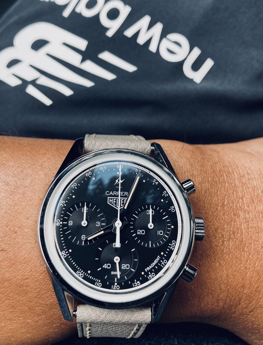
Hi first foray into the world of TH was received well by taking a classic Carrera and adding a few simple additions.
Not a lot of risk I thought and well ...too small for my wrists at 39mm so I didn't pursue it for my collection.
Interestingly, this watch seems to have appreciated considerably on the second hand market.

Well if his first attempt was "low in risk", his latest piece seems to have been delivered with boundless freedom and pure design skill.
What made me sit up and take extra notice was the statement from the father of vintage Heuers , Jeff Stein, from ON THE DASH fame.
" it’s the best looking Autavia released by TAG Heuer since the model was discontinued in the mid-1980s."
Big props from Mr Stein, massive in fact. I know exactly where that statement came from. It's a pretty special looking watch in the metal.
I can remember back when we read Jeff's comment. a lot of us on the forums thought, Wow, that's big praise for a watch that seemed to be a little confused about where it came from in terms of it's heritage. But Jeff is quite right in my opinion, linking it to the Autavia's of old due to its case shape and other design facets.
I don't know if I would be as bold as Jeff by stating it the best vintage inspired Tag Heuer, but maaaaaaan, I like it a lot.
masterpiece
Sometimes, I think we can get a little held up on the "closest to the original" approach to judging vintage inspired releases so it's nice to see a watch that has a link to the past but has had an enormous amount of thought and flair added. This watch wins because it's different, it's simple and it's just cool.

What I like:
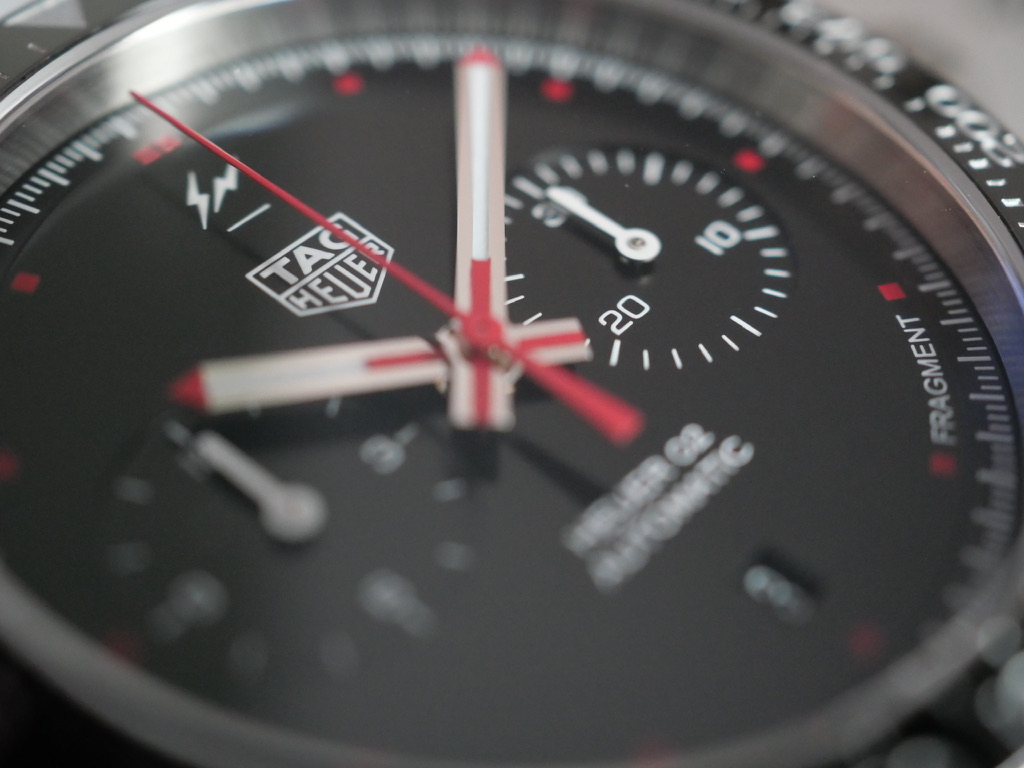
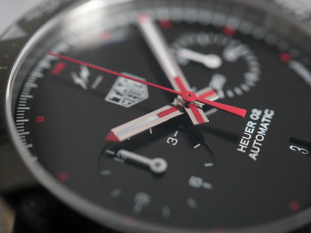
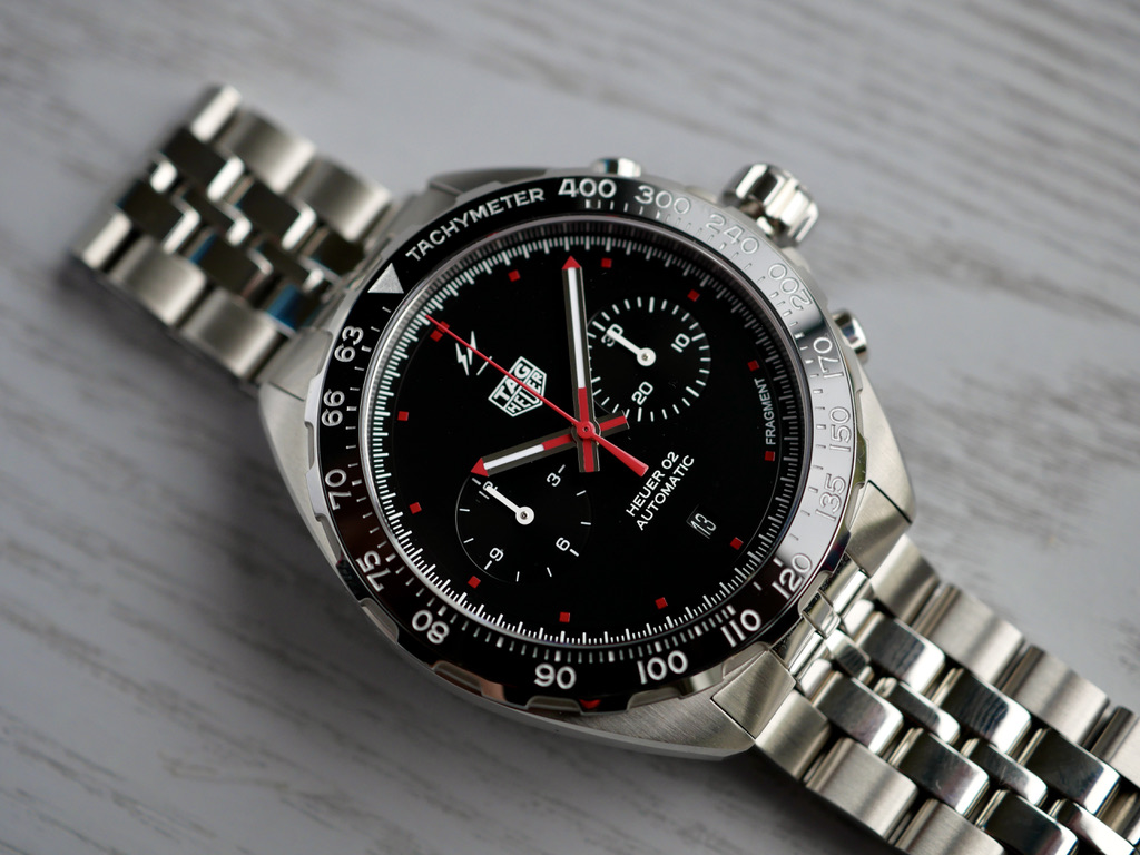
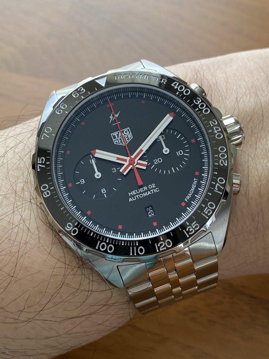
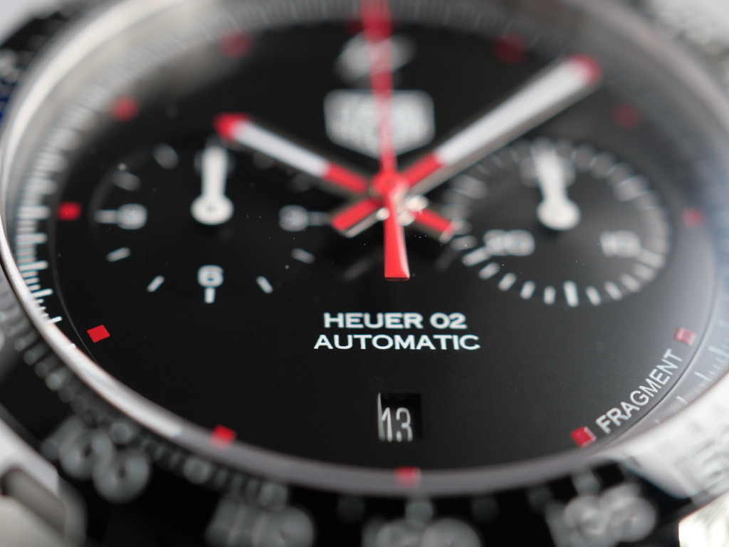
The first thing that jumps out about this watch is its Jet black face and simple white subdials.
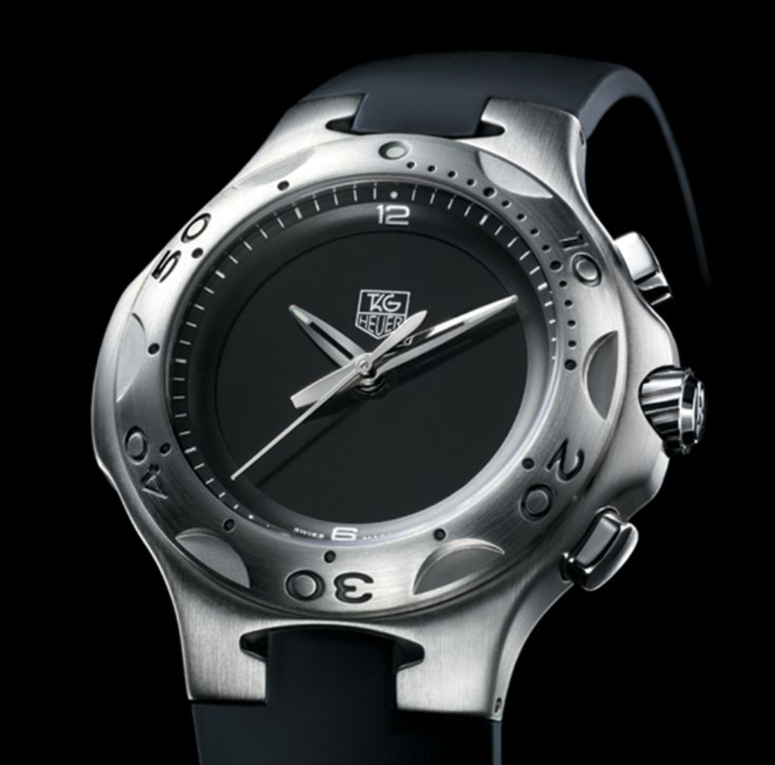
It's not that there isn't anything on the face, it has plenty of text and logos going on, but still manages to fulfil my love of the minimalistic look. I think this is due to the black they have chosen..., it's black, real black and nothing but black. If I wasn't mistaken, I would say that Fujiwara has not only taken cues from the 70's Heuers but also from the Kirium F1 from the early 2000's which was also hero's a very black minimal face.

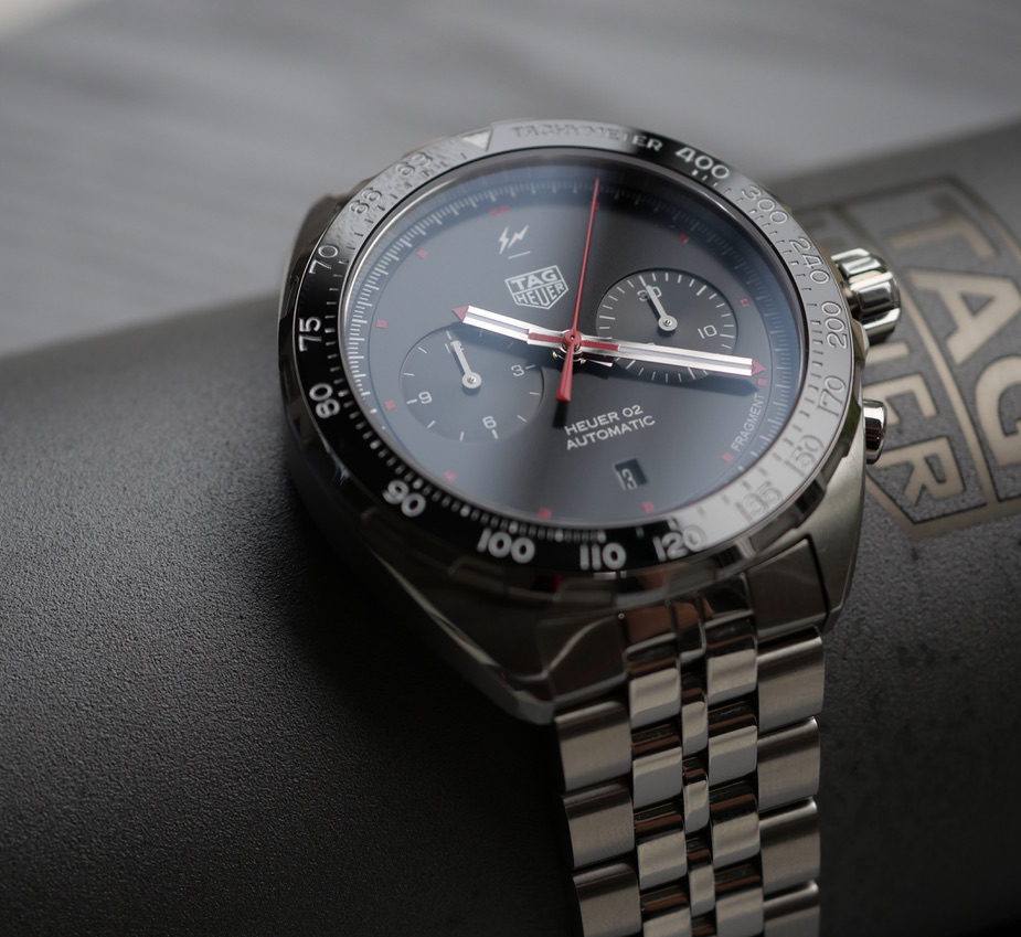
The black face manages to "POP" ever so much more with the brilliant white of the minute and hour hands standing out it stark contrast.


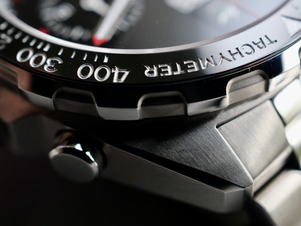
Then there is the Bezel insert, black ceramic but looks grey / silver a lot of the time.
It shines, some may say it's"Blingy" as my first thought was when I first saw it in the metal. That soon changed as I realised It reflects... picks up the light, changes dependant on it's surroundings. Its quite magical the way it can look black, no grey, no wait....silver....


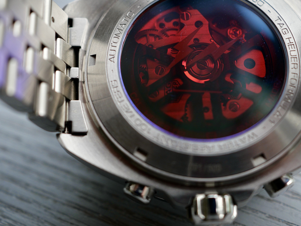
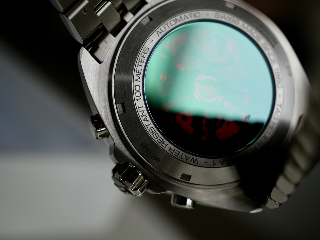
The back crystal is a star addition to this watch. Sure there have been watch backs with colour before but this is different. As with its mate the Bezel on the front, it changes colour and has an array of hues from the obvious Red, to purple and then on to a mystical green.


As you can tell, I'm quite keen on this watch and I love the 44mm size on my substantial wrists.
Looking at prices and availability, it doesn't seem to have provoked the interest that Fujiwara san's earlier piece did but feel if you ever get to see it in the metal, you may well be as excited as Jeff Stein and I am.


JOMO
Just one mans opinion.
 
Posts
5,234
Likes
24,073
Although not a fan of this watch this is a great write up, enjoyed it.👍
 
Posts
2,769
Likes
8,575
I speak Japanese and have had a 30 year love affair with Japan, Japanese people and their culture.
So it is with considerable interest every time Mr Hiroshi Fujiwara, (Fujiwara san) the master of streetwear, releases a piece in conjunction with my beloved Tag Heuer.
Hi first foray into the world of TH was received well by taking a classic Carrera and adding a few simple additions.
Not a lot of risk I thought and well ...too small for my wrists at 39mm so I didn't pursue it for my collection.
Interestingly, this watch seems to have appreciated considerably on the second hand market.

Well if his first attempt was "low in risk", his latest piece seems to have been delivered with boundless freedom and pure design skill.
What made me sit up and take extra notice was the statement from the father of vintage Heuers , Jeff Stein, from ON THE DASH fame.
" it’s the best looking Autavia released by TAG Heuer since the model was discontinued in the mid-1980s."
Big props from Mr Stein, massive in fact. I know exactly where that statement came from. It's a pretty special looking watch in the metal.
I can remember back when we read Jeff's comment. a lot of us on the forums thought, Wow, that's big praise for a watch that seemed to be a little confused about where it came from in terms of it's heritage. But Jeff is quite right in my opinion, linking it to the Autavia's of old due to its case shape and other design facets.
I don't know if I would be as bold as Jeff by stating it the best vintage inspired Tag Heuer, but maaaaaaan, I like it a lot.
masterpiece
Sometimes, I think we can get a little held up on the "closest to the original" approach to judging vintage inspired releases so it's nice to see a watch that has a link to the past but has had an enormous amount of thought and flair added. This watch wins because it's different, it's simple and it's just cool.

What I like:
The first thing that jumps out about this watch is its Jet black face and simple white subdials.
It's not that there isn't anything on the face, it has plenty of text and logos going on, but still manages to fulfil my love of the minimalistic look. I think this is due to the black they have chosen..., it's black, real black and nothing but black. If I wasn't mistaken, I would say that Fujiwara has not only taken cues from the 70's Heuers but also from the Kirium F1 from the early 2000's which was also hero's a very black minimal face.

The black face manages to "POP" ever so much more with the brilliant white of the minute and hour hands standing out it stark contrast.


Then there is the Bezel insert, black ceramic but looks grey / silver a lot of the time.
It shines, some may say it's"Blingy" as my first thought was when I first saw it in the metal. That soon changed as I realised It reflects... picks up the light, changes dependant on it's surroundings. Its quite magical the way it can look black, no grey, no wait....silver....


The back crystal is a star addition to this watch. Sure there have been watch backs with colour before but this is different. As with its mate the Bezel on the front, it changes colour and has an array of hues from the obvious Red, to purple and then on to a mystical green.


As you can tell, I'm quite keen on this watch and I love the 44mm size on my substantial wrists.
Looking at prices and availability, it doesn't seem to have provoked the interest that Fujiwara san's earlier piece did but feel if you ever get to see it in the metal, you may well be as excited as Jeff Stein and I am.


JOMO
Just one mans opinion.
Excellent first hand Comments.
Thanks for this detailed review.
So happy for you to finally have this watch and even happier that after an extended wait to receive it that it has lived up to your expectations and probably even exceded them.
Congratulations again.
 
Posts
10,302
Likes
13,460
Wow, congrats again and thanks for this little review! And the awesome photos. The black really look very black as you say.


Sometimes, I think we can get a little held up on the "closest to the original" approach to judging vintage inspired releases so it's nice to see a watch that has a link to the past but has had an enormous amount of thought and flair added.
Yes agree, this is an interesting perspective and a good summary of this watch.

While this piece is not fully to my taste, I am really glad you love it, especially after waiting so long.
 
Posts
4,063
Likes
5,937
Awesome review sir @heuerholic ! 😀 I’m also a Japanese fan and this watch speaks to me as well 😉 Black with hints of red and white truly reminds me of motorsports. I settled with the Autavia Viceroy Heuer 02 when I was also looking into this. Thanks for sharing your thoughts on the F1 Fragment! Truly unique in my book 👍
 
Posts
1,390
Likes
5,173
Nice, well written review with some great macro photos. Thank you for sharing your thoughts on the watch and congratulations on your new addition.
 
Posts
8,683
Likes
17,551
Love the write up! I'm very glad you're smitten with this watch and rightfully so! 👍
 
Posts
822
Likes
2,297
Thank you folks for your kind comments.

Possibly the best judge of how a watch looks comes from people who don’t really give a toss about Watches.
My family tend to do a big “yawn” whenever I say “look at my new watch “
The Fujiwara bought reactions of “ ooooo yes I like it” and “that’s quite stunning “ without the Yawns.

I’m interested, from those of you who say “it’s not for me “why is that?
The reason I ask this is I just wonder why it hasn’t been as successful as I think it could’ve been.
Is it because it’s a collaboration piece?
Or is it that it doesn’t have a hard and fast identity?
Or is it that it was just bloody expensive !!!

Anyway, I am enjoying the experience of having this on my wrist, I feel it might be there for a while before I go back to something more traditional.

Cheers
 
Posts
22,522
Likes
31,984
Interesting idea to draw comparison with the Kirium... congrats on your watch, glad it's lived up to your expectations!
 
Posts
10,302
Likes
13,460
those of you who say “it’s not for me “why is that?
Its a very nice watch but for me there are two things that means I would never spend the asking price for this one. First of all the lack of indexes, the look gets too minimalistic for my taste. Second thing is the ss (sn?) logo on top, I have no connection or knowledge about this designer or Japan so it doesnt mean anything to me personally.
 
Posts
1,433
Likes
7,805
Amen..
I like what TH is doing with Fujiwara, Bamford, Hodinkee…
Low production ensures prices to stable/rise.
Fragment carrera is my fav carrera ever.
 
Posts
456
Likes
2,216
I'm Japanese. I am very happy that a small country at the end of Asia attracts attention.

I enjoyed this article.
And I am also a fan of this watch.
It's a little big for my wrist, but it's really cool.
 
Posts
8,683
Likes
17,551
I made my thoughts known about this watch when it was first released. Overall, I like it quite a bit. It's the best looking Autavia that's not an Autavia. 😉

I suspect I'd really love it if I saw one in the metal, but in pictures my reaction varies depending on the pic. It looks absolutely gorgeous in the pics posted here. The cons for me is that it's a lot of money to pay for a "Formula 1" and its size is too large for my wrist. I could probably get over the former con, but the latter con is the primary reason I've not seriously considered getting one. However, one man's con is a positive for another.
 
Posts
7,123
Likes
15,100
I speak Japanese and have had a 30 year love affair with Japan, Japanese people and their culture.
So it is with considerable interest every time Mr Hiroshi Fujiwara, (Fujiwara san) the master of streetwear, releases a piece in conjunction with my beloved Tag Heuer.
Hi first foray into the world of TH was received well by taking a classic Carrera and adding a few simple additions.
Not a lot of risk I thought and well ...too small for my wrists at 39mm so I didn't pursue it for my collection.
Interestingly, this watch seems to have appreciated considerably on the second hand market.

Well if his first attempt was "low in risk", his latest piece seems to have been delivered with boundless freedom and pure design skill.
What made me sit up and take extra notice was the statement from the father of vintage Heuers , Jeff Stein, from ON THE DASH fame.
" it’s the best looking Autavia released by TAG Heuer since the model was discontinued in the mid-1980s."
Big props from Mr Stein, massive in fact. I know exactly where that statement came from. It's a pretty special looking watch in the metal.
I can remember back when we read Jeff's comment. a lot of us on the forums thought, Wow, that's big praise for a watch that seemed to be a little confused about where it came from in terms of it's heritage. But Jeff is quite right in my opinion, linking it to the Autavia's of old due to its case shape and other design facets.
I don't know if I would be as bold as Jeff by stating it the best vintage inspired Tag Heuer, but maaaaaaan, I like it a lot.
masterpiece
Sometimes, I think we can get a little held up on the "closest to the original" approach to judging vintage inspired releases so it's nice to see a watch that has a link to the past but has had an enormous amount of thought and flair added. This watch wins because it's different, it's simple and it's just cool.

What I like:
The first thing that jumps out about this watch is its Jet black face and simple white subdials.
It's not that there isn't anything on the face, it has plenty of text and logos going on, but still manages to fulfil my love of the minimalistic look. I think this is due to the black they have chosen..., it's black, real black and nothing but black. If I wasn't mistaken, I would say that Fujiwara has not only taken cues from the 70's Heuers but also from the Kirium F1 from the early 2000's which was also hero's a very black minimal face.

The black face manages to "POP" ever so much more with the brilliant white of the minute and hour hands standing out it stark contrast.


Then there is the Bezel insert, black ceramic but looks grey / silver a lot of the time.
It shines, some may say it's"Blingy" as my first thought was when I first saw it in the metal. That soon changed as I realised It reflects... picks up the light, changes dependant on it's surroundings. Its quite magical the way it can look black, no grey, no wait....silver....


The back crystal is a star addition to this watch. Sure there have been watch backs with colour before but this is different. As with its mate the Bezel on the front, it changes colour and has an array of hues from the obvious Red, to purple and then on to a mystical green.


As you can tell, I'm quite keen on this watch and I love the 44mm size on my substantial wrists.
Looking at prices and availability, it doesn't seem to have provoked the interest that Fujiwara san's earlier piece did but feel if you ever get to see it in the metal, you may well be as excited as Jeff Stein and I am.


JOMO
Just one mans opinion.
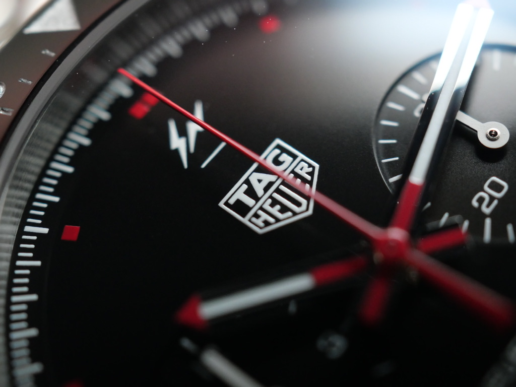
Lovely photos and great review. I agree with you on the dial- I think in my review I likened it to almost looking like a Connected dial. It's one of those designs that is more polarising than most. Also agree with you on the red sapphire caseback...that should be the new Fujiwara design signature.
 
Posts
206
Likes
124
I would not say an automatic F1 is a lesser watch than a quartz AR ,Link or Carrera, just my opinion.
I have a Quartz and an automatic TAG and they both are good.