Design Concepts
kappa_md
·IMHO, the Carrera Racing is better designed than the Speedy Tintin. 👍 (Please take note, I’m a Tintin fan 😉)
Mspeedster
·Looks really good
Edited:
Ara
·Just saw a Heuer Roulettintin on Chrono24. Best of both worlds.
https://www.chrono24.com/all/heuer-...-am--id18039596.htm?SETLANG=en_US&SETCURR=USD
https://www.chrono24.com/all/heuer-...-am--id18039596.htm?SETLANG=en_US&SETCURR=USD
Albert-AMG
··TAG Heuer Forums ModeratorI'm sorry, I don't follow why it would work for quartz but not automatic.
But the movement is continuous in automatic watches, so the outer red ring with 240 markers is what you really use to read the chronograph and not the rectangles
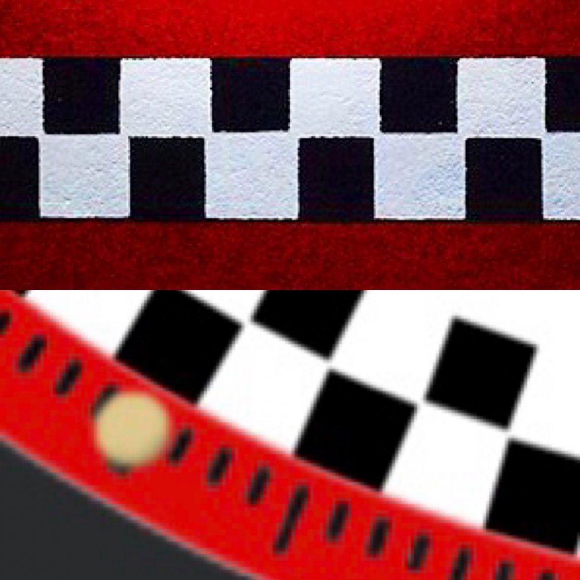
You see, the idea of the racing dial is not whether or not it matches the track - it's intended for higher contrast so that it makes reading the chronograph very easy even at speed:

The Tintin iterated on this but had the hash marks in each bloc:

Racing tracks on chronographs were not intended simply to look nice - this was an innovation with a purpose. And since the heritage of Heuer is most strongly associated with racing, I think we should use the checkered-flag motif in service of that.
In these two watches Omega is using the checkered rings as a markers to read the chronograph -even putting extra markets inside the rectangles- because they don’t have a outer ring with 240 markers, but the Carrera Racing by Ara has this outer ring with 240 markers, so I don’t see why we need three rings of markers in the Carrera... I though we were not copying Omega with this design, and even trying to get away from the Tintin Omega 😉
I think @Ara wanted to use these checkered rings just as a decorative link to remind the vintage Heuer box (in his first design with rectangles, they were not matching the seconds either), like the stripes of the Monaco Gulf, or the blue ring of the Carrera 160 Montreal... and this link with the Heuer boxes is even stronger with squares instead of rectangles
But it’s @Ara ‘s design, so it’s up to him to decide 😉
I imagine that all these discussions must take place also in TH before approving a new design to launch it on the market... it's fun! 👍
Edited:
abrod520
·But the movement is continuous in automatic watches, so the outer red ring with 240 markers is what you really use to read the chronograph and not the rectangles
The automatic movement actually isn't continuous - it has a number of beats per hour. If you stop a chronograph, you'll actually see it will stop on the exact hash mark on the track! (Don't try this with an 861 Speedmaster though; they used the same dial track from the 321 all these years and only just fixed it with the new update.)
The different colored boxes - or in the case of the original racing dials, the opposing hashmarks - were to make it easier to distinguish whole seconds first and foremost, and then fractions of a second. Helps with making calculations a bit quicker on the run, when you don't need the exact fraction of a second.
We can go in the opposite direction though and make that extra difficult in service of a pretty look if you guys prefer ☕ I can't support it though, sorry.
Yago
·I have to agree with @abrod520 on this one. Simply having the chequers is nice but this way they would serve a purpose, improve readability, which is a big part of what the 2447 was about. So that's a big plus. Ara's Carrera is not just a re-edition of 2447sn. It brings something new to the table while at the same time respecting Heuer's heritage. It's a knock-out. If anyone finds a dial maker than can make one at a reasonable cost I'm signing up. If Ara agrees of course.
abrod520
·Just saw a Heuer Roulettintin on Chrono24. Best of both worlds.
https://www.chrono24.com/all/heuer-...-am--id18039596.htm?SETLANG=en_US&SETCURR=USD
Hmmm.... might have a go at integrating this into the 42mm version I put together. I think there's a 50/50 shot it'll look either cool or too busy, but it's all in fun so why not
abrod520
·Working on something like it, but just using the red outer ring as a design motif rather than changing the scale. Should be able to finish it pretty soon since I'm just building on my previous one
connected1976
·👍
Ara
·I think @Ara wanted to use these checkered rings just as a decorative link to remind the vintage Heuer box (in his first design with rectangles, they were not matching the seconds either), like the stripes of the Monaco Gulf, or the blue ring of the Carrera 160 Montreal... and this link with the Heuer boxes is even stronger with squares instead of rectangles
But it’s @Ara ‘s design, so it’s up to him to decide
You're on point, @Albert-AMG
Renders only go so far in visually expressing a concept, but in my imagination I can see the lights of store shimmering off a glossy dial with B&W checkered boxes around the rim, along with a red outer ring pulling it all together. To me it screams vintage Heuer with a modern flair.
My main goal in creating a render is to create a “design wish list” mostly because it makes me happy, and when enthusiasts here at C11 and IG like it as much as I do — well, that’s pretty cool feeling.
Can’t create a design that pleases everyone, but that really wasn’t my goal. I just wanted to create an idea that was fun to look it. The fact that some of you guys want it to actually exist is really amazing.
Ara
·I have to agree with @abrod520 on this one. Simply having the chequers is nice but this way they would serve a purpose, improve readability, which is a big part of what the 2447 was about. So that's a big plus. Ara's Carrera is not just a re-edition of 2447sn. It brings something new to the table while at the same time respecting Heuer's heritage. It's a knock-out. If anyone finds a dial maker than can make one at a reasonable cost I'm signing up. If Ara agrees of course.
Ara
·Mr_Orange
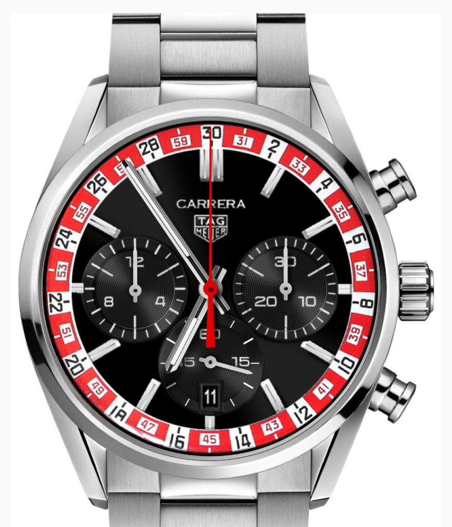
·It's getting closer to a Roulette Wheel everyday. Just add a green square 😉.
Albert-AMG
··TAG Heuer Forums ModeratorIt's getting closer to a Roulette Wheel everyday. Just add a green square 😉.
Mr_Orange
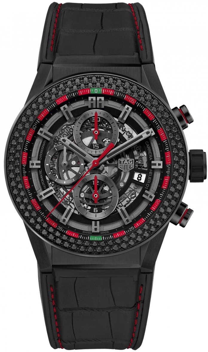
·Not like 😉.
I assume that is some sort of limited edition?
@Aquagraph have you got this one on your list of limited runs?
I assume that is some sort of limited edition?
@Aquagraph have you got this one on your list of limited runs?
Albert-AMG
··TAG Heuer Forums ModeratorNot like 😉.
I assume that is some sort of limited edition?
@Aquagraph have you got this one on your list of limited runs?
Rob was aware of this Limited Edition 😉
http://tagheuerenthusiast.blogspot.com/2018/01/first-impressions-tag-heuer-launch-two.html?m=1
Edited:
Albert-AMG
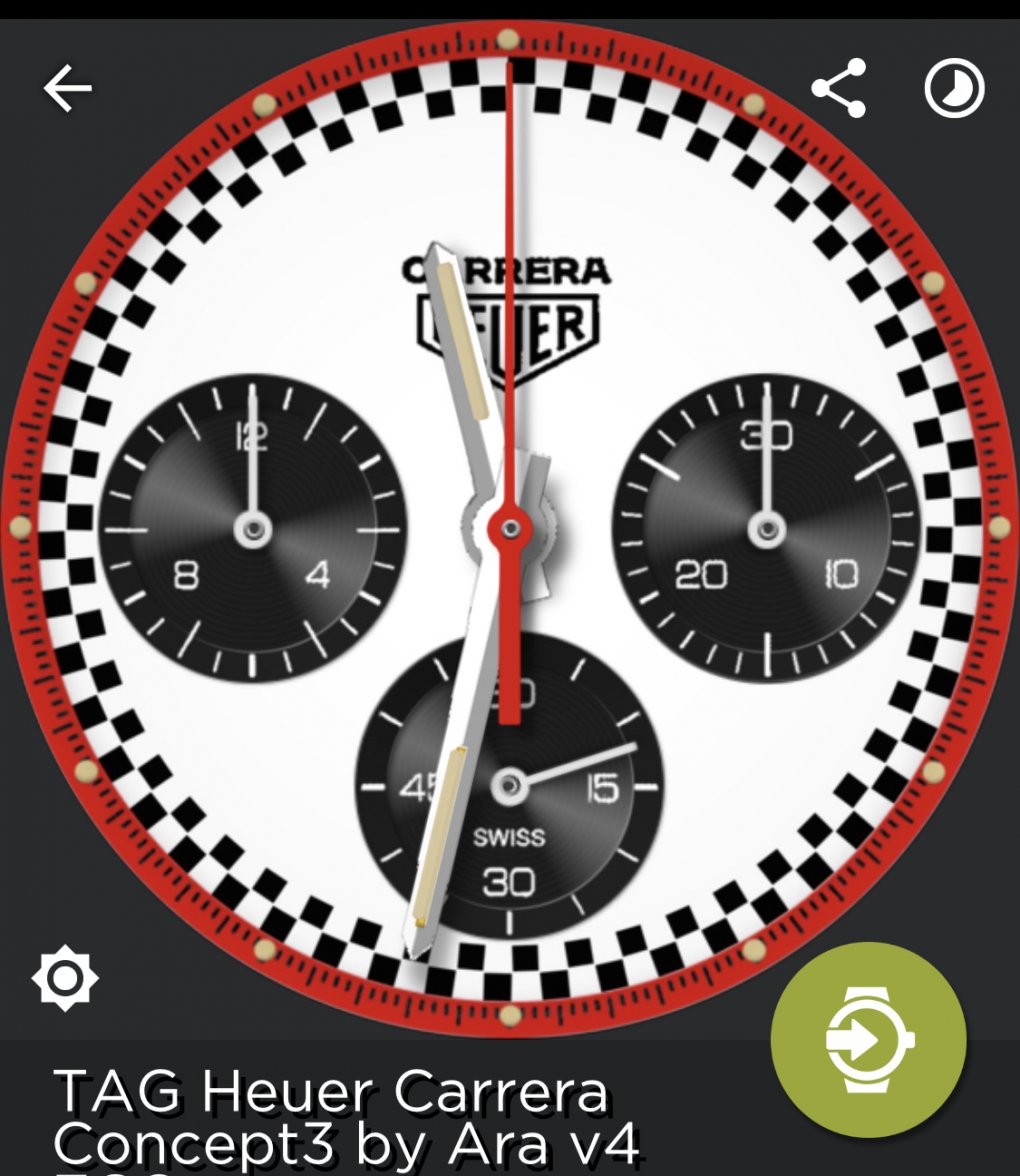
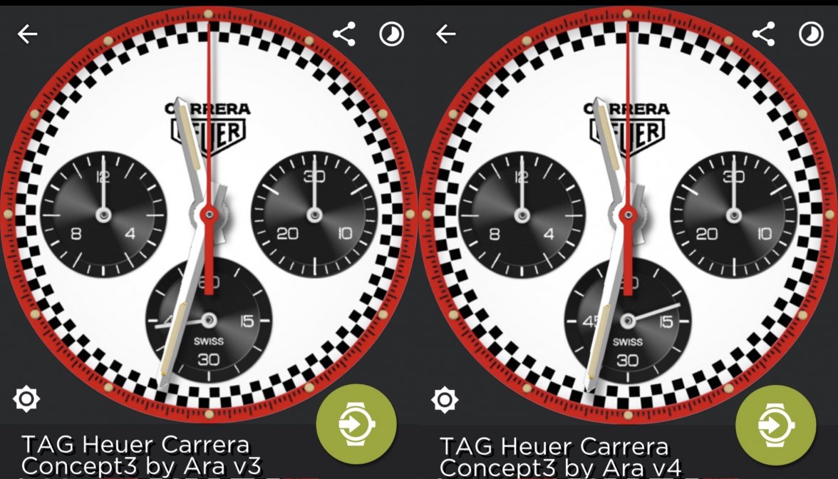
··TAG Heuer Forums ModeratorJust for fun I made a slight change to @Ara ’s Carrera Racing, trying to make it closer to the vintage Heuer box look. I removed some squares from each ring (108 in last Ara’s render, and 100 in this version4) making the squares slightly bigger, and also putting more distance between them, without touching each other, like in the box
I was testing it in the Connected and I like how it looks 😀
V3 with 108 squares per ring, and v4 with 100 squares per ring
I was testing it in the Connected and I like how it looks 😀
V3 with 108 squares per ring, and v4 with 100 squares per ring
Edited:
Pitfitter446
·How would black hands on the white* dial look?
* Or red, just a definite contrast to the main dial.
* Or red, just a definite contrast to the main dial.
Similar threads
- Posts
- 14
- Views
- 952


