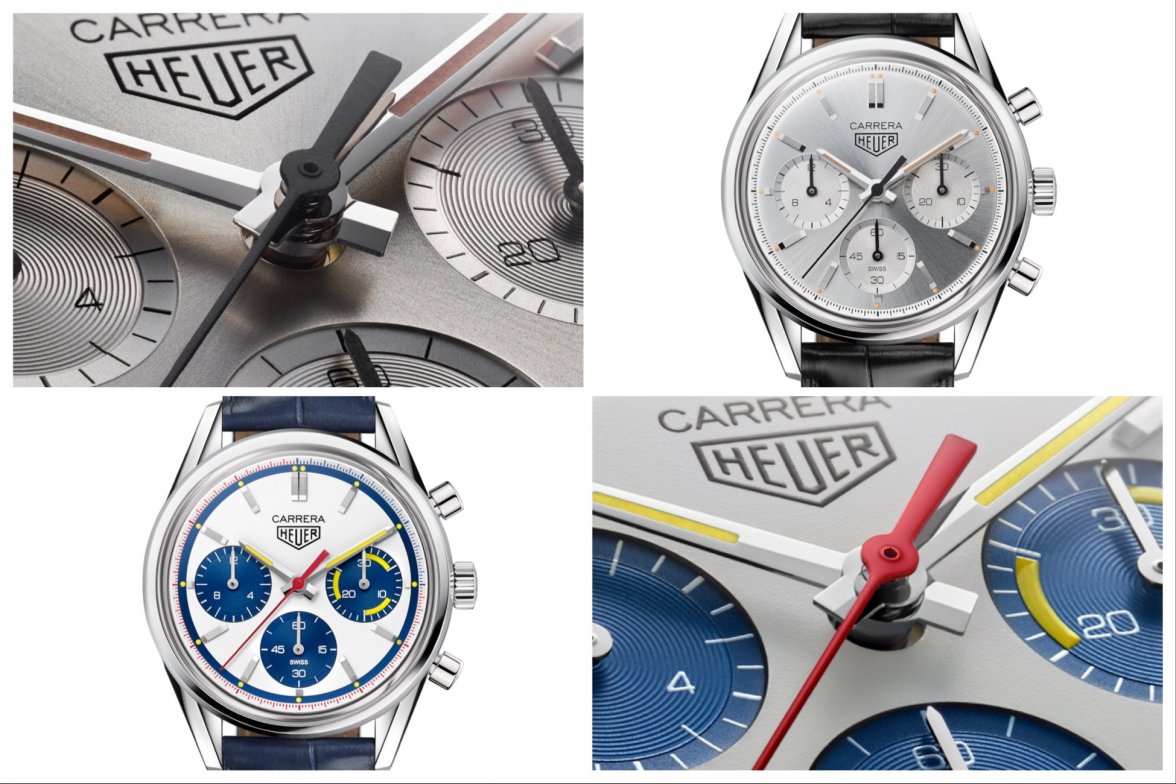
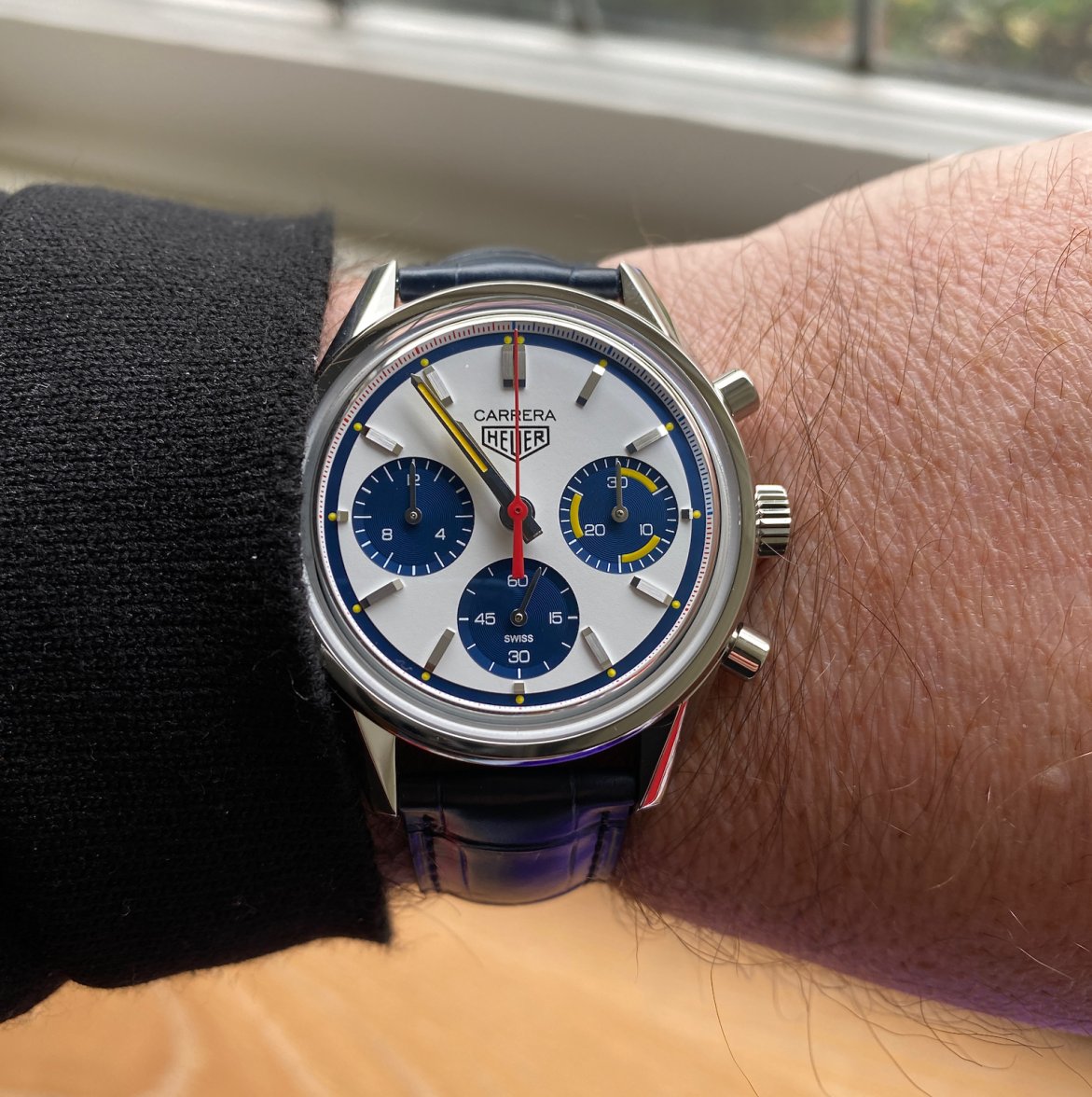
TAG Heuer Carrera Heuer 02 Montreal Limited Edition CBK221C
kappa_md
·I would get it in a hearbeat ONLY if it was named Montreal.. 🙁 I wish TH just named this one “Montreal” on the dial. They can call is Carrera Montreal..
Edited:
Mr_Orange
·Indeed. I don't think TAG Heuer have really hit the mark since these JH81 editions. I still plan to pick up one of these (CV5111) at some point.
kappa_md
·kappa_md
·Thanks for article DC! All the while I thought the Heuer Montreal was about the “Canadian GP” racetrack.. 😕
So we have 6x 39mm Glassbox Heuer Carreras 📖📖
Calibre 18
Carrera Telemeter, Skipper, Carrera Blue Dreamer
Calibre Heuer 02
Carrera Fragment, Carrera Silver 160, Carrera Montreal
So we have 6x 39mm Glassbox Heuer Carreras 📖📖
Calibre 18
Carrera Telemeter, Skipper, Carrera Blue Dreamer
Calibre Heuer 02
Carrera Fragment, Carrera Silver 160, Carrera Montreal
Aquagraph
·I still don't understand. Why put the Montreal colours on a Carrera?? It's not even as well done as that Montreal. It looks like something is missing.
As soon as I saw this I thought 'someone on the Calibre 11 forum will say: why put the Montreal colours on a Carrera', and sure enough...😁
Mspeedster
·Seems like the TH designers couldn't get enough of creating 5 Monacos for each decade, and carried things over for the 160th. But in the Carrera's case, just did a 60s version & a 70s version. Guess they'll save the 80's, 90's, 00's and 10's for the 60th anniversary of the Carrera. LOL 🙄
- Posts
- 61
- Likes
- 26
cwsbbb
·Blue, yellow and red really go well together
abrod520
·I'm overall not a fan either, I think it's too much of a mish-mash of colors. What I will say though is I think the chapter ring with the 12-15 in blue and the rest in red is a pretty cool touch.
Honestly? I think this should have been what they used for the Formula 1 Fragment - these loud colors would work so much better in a "loud" case like that!
Calling @Ara for a photoshop here. He hasn't been responding to 'shop requests but we need him now more than ever!
Honestly? I think this should have been what they used for the Formula 1 Fragment - these loud colors would work so much better in a "loud" case like that!
Calling @Ara for a photoshop here. He hasn't been responding to 'shop requests but we need him now more than ever!
Aquagraph
·I'm overall not a fan either, I think it's too much of a mish-mash of colors. What I will say though is I think the chapter ring with the 12-15 in blue and the rest in red is a pretty cool touch.
Honestly? I think this should have been what they used for the Formula 1 Fragment - these loud colors would work so much better in a "loud" case like that!
Calling @Ara for a photoshop here. He hasn't been responding to 'shop requests but we need him now more than ever!
Are you talking about the original or the new one, cos I don't see 12-15 in blue on the new one...?
imagwai
·I'm overall not a fan either, I think it's too much of a mish-mash of colors.
I just hope TAG listen to the comments on Instagram though and bring out panda and reverse panda versions (for the Carrera 60th anniversary?). That would be a **really** difficult choice, trying to decide between those two!!


