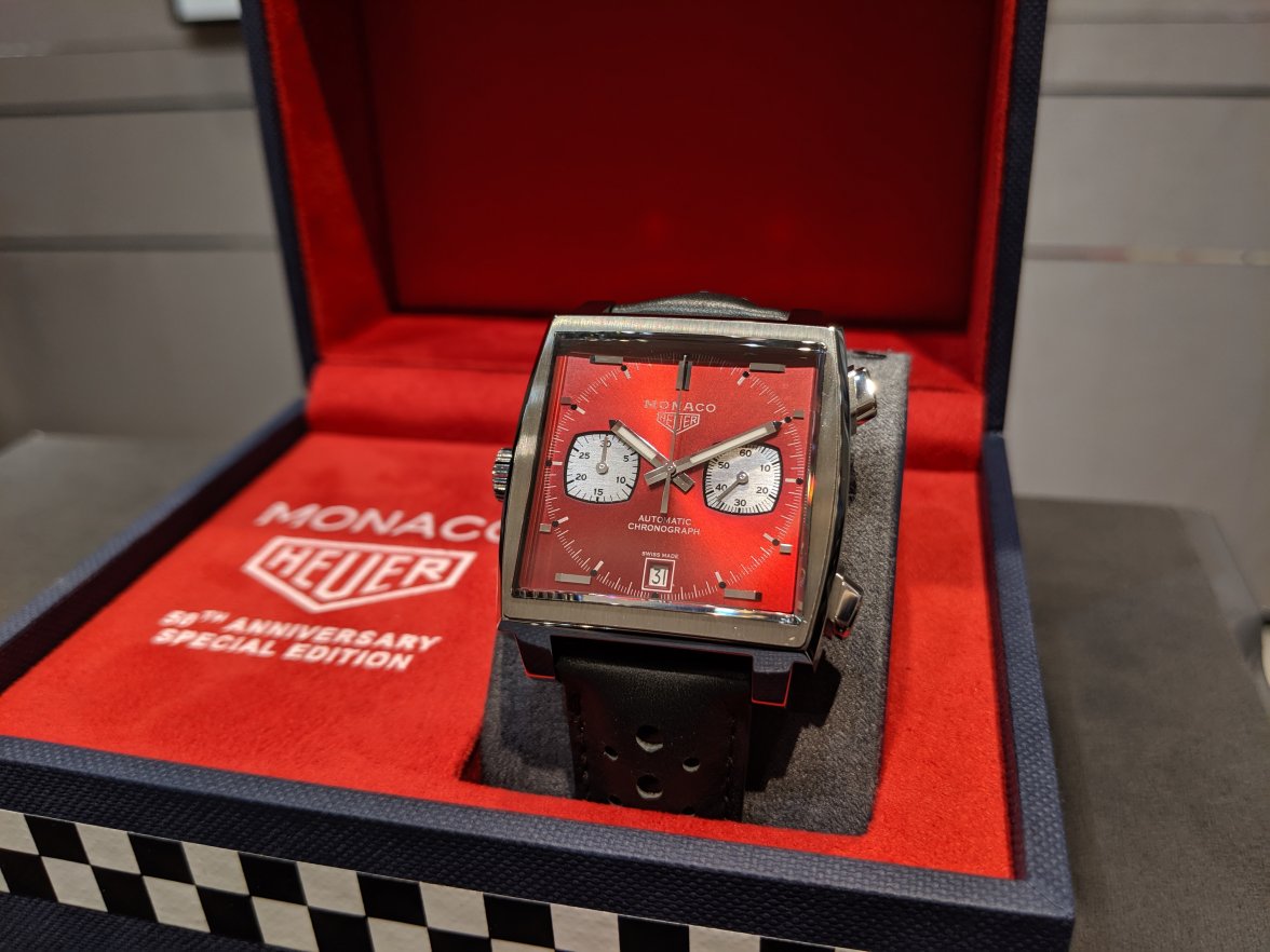
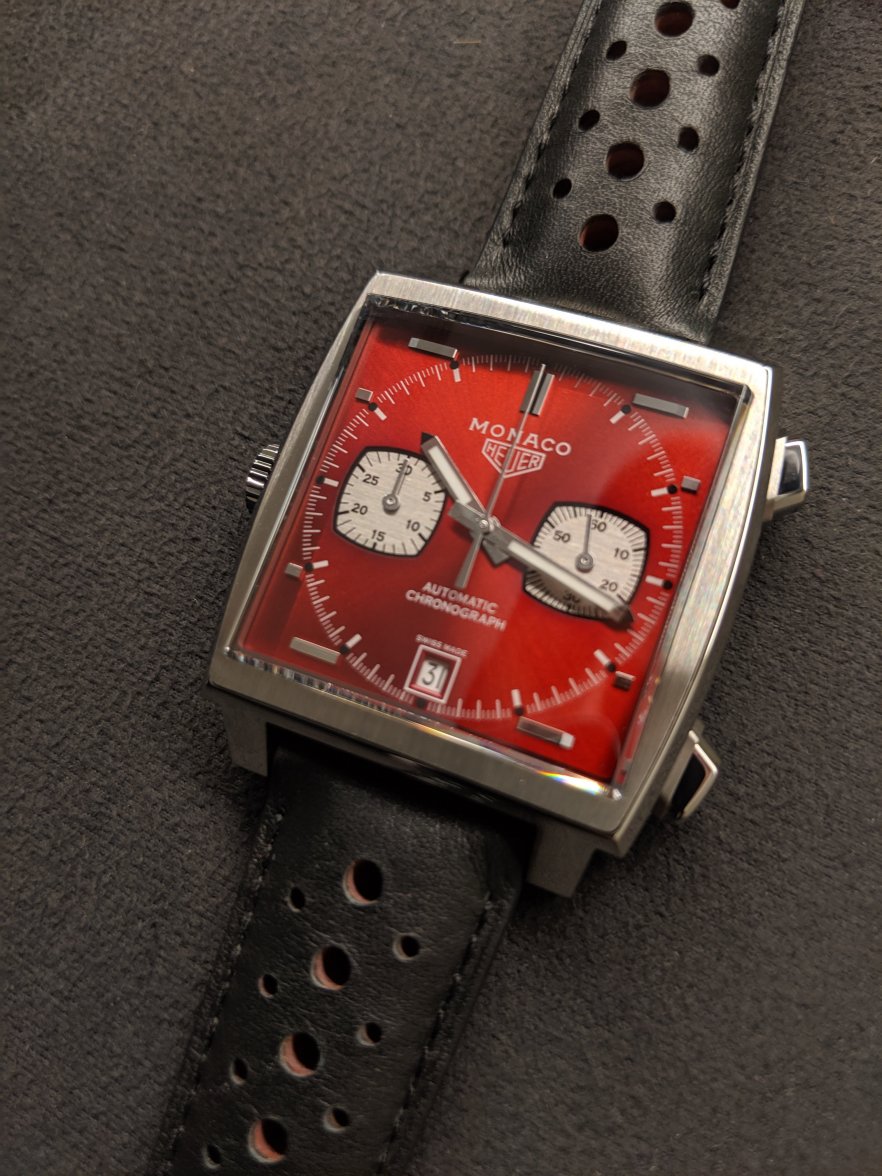
New post: TAG Heuer Monaco 50th Anniversary Watch 2: 1979-89 Limited Edition
TonyStark
·Actually, it was an easy call- I had this beautiful watch sitting in the safe that I couldn't wear for fear of damaging that sticker. I had three NOS Heuers and sold them all and vowed to never buy another one...don't get me wrong, they are incredible to look at and really special...but if you don't wear them, then what's the point?
I sold them to TAG Heuer, so it will be somewhere in the archives/ Museum
I suspect once I had them in my possession I might struggle....
Aquagraph
·It's a dilemma for sure... but then what is the point of an unworn watch. I never get this Rolex collector thing where nobody ever takes the stickers off... I get that as soon as you do the value drops significantly, but why? What's the point of paying through the nose for something you can never wear? It's not even like wine where as soon as you open it you've got to drink it and then it's gone, so I actually think it's a good thing that Rolex boutiques take the stickers off before you get it, stamp this nonsense out for good!
OttoWilliam
·Monaco red is lit ! 


Pitfitter446
·No wrist shots yet?
THJunkie
·Agree!
You did say it was very different. And whilst the design and detailing I though were nit that different at all, the different in the overall asthetic between the ore and post release images was night and day.
I confess, from the low res shots that Red was the ‘worst’. The shade looked flat and full, no ‘life’ in the dial. But bit did that changed with better lighting and a half decent picture. And it grows with each sighting.
They did good with this one fair play.
Calibre11
·You did say it was very different. And whilst the design and detailing I though were nit that different at all, the different in the overall asthetic between the ore and post release images was night and day.
I confess, from the low res shots that Red was the ‘worst’. The shade looked flat and full, no ‘life’ in the dial. But bit did that changed with better lighting and a half decent picture. And it grows with each sighting.
They did good with this one fair play.
rafabond
·with the 69-70 TH it has been overcome, it will be difficult for the other editions to surpass in beauty the first, but everything is tastes
Tavknack
·I love both the 70s and 80s editions - I’m glad to see that they took some risks in colours etc. Sure some people will take issue with them or not like them but it allows others to really love and appreciate them. The low numbers is a double edge sword - makes then even more special and exclusive but restricts how many of us will ever get to enjoy them. I’m lucky and have a Red Devil in the way - I’d have killed to get a 70s Edition too though! Looks as though there aren’t too many people trying to flip them straight away which is nice to see.
- Posts
- 42
- Likes
- 29
snk11388
·That's my feeling too. Based from the initial image, I thought this one could be a disaster..but the final watch is a huge improvement. Still a "love it or hate it" colour, but a real stand out watch.
Dear DC. Well said. Just didn’t imagine that how beautiful and a screaming piece this one turned out to. Pretty much the same feeling after looking at the initial image and now I’m kicking at myself for not taking that chance. I put in my bet on the third one - 90s . Trying my mighty best to see if my Boutique can do some magic. Also, under a dilemma given these wonderful finishes. Am I and fellow collectors betting on a dark horse ? Will the 90s present a punch ? Let’s see.
Cheers !
Tavknack
·Looks like the first advert for a real stock watch, not just a placeholder with press images...
https://www.chrono24.com/au/tagheue...ion--id11479418.htm?SETLANG=en_AU&SETCURR=AUD
https://www.chrono24.com/au/tagheue...ion--id11479418.htm?SETLANG=en_AU&SETCURR=AUD
Mr_Orange
·Looks like the first advert for a real stock watch, not just a placeholder with press images...
https://www.chrono24.com/au/tagheue...ion--id11479418.htm?SETLANG=en_AU&SETCURR=AUD
That is a 50% mark-up over retail price!!!!!!!!!!!
Pitfitter446
·Pity some of pictures are not too great.
rafabond
·the last two that were in chrono24 of model 70 'are already sold, one of the UK and the one of Spain is reserved. if the one in Spain has been sold outside the country, there is only my monaco in all of Spain, well, I would be the only one of my country that has a monaco 70 '


