Limited Editions TAG Heuers
Jim Dollares
·
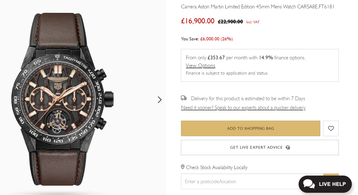
Ah yes, the Lance Stroll tourbillion
THFan346
·Only £353.67 per month. Bargain.
Aquagraph
·Yeah, and if you pay £353 per month for 60 months at 14.9% you end up paying round about what it was originally!
Hubert
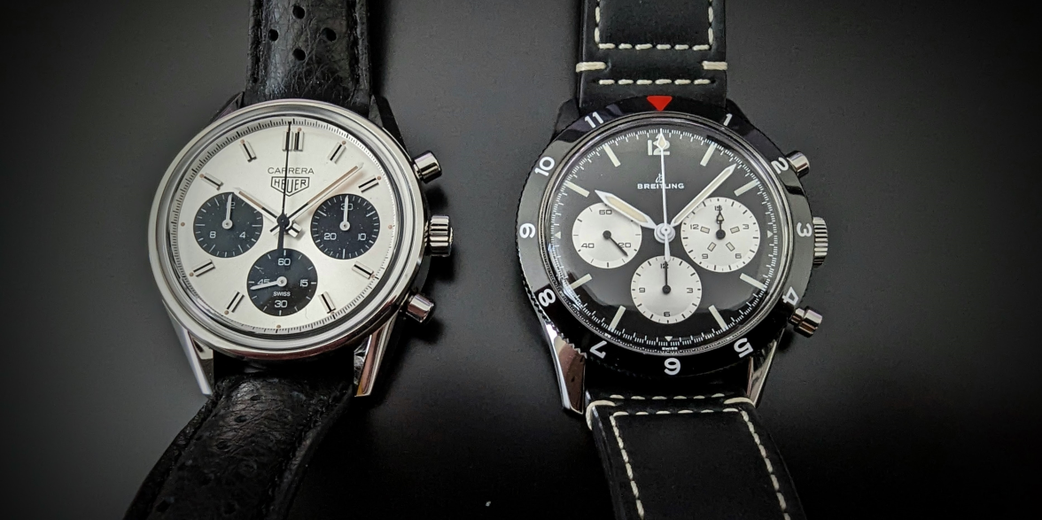
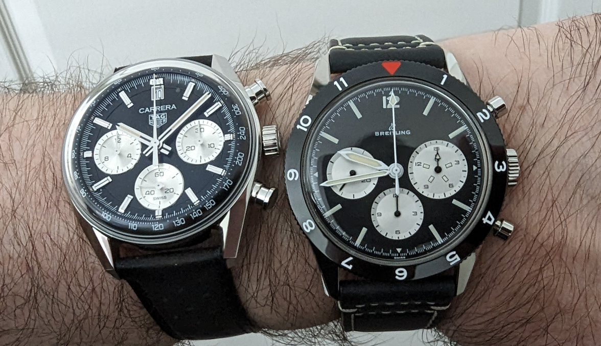
··TAG Heuer Forums ModeratorThey are pretty good. The France LE is special (pictured below), next to the co-pilot re-issue.
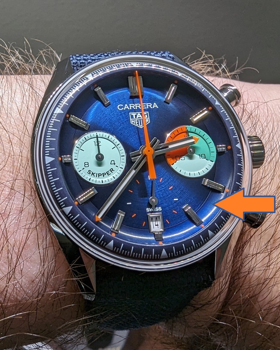
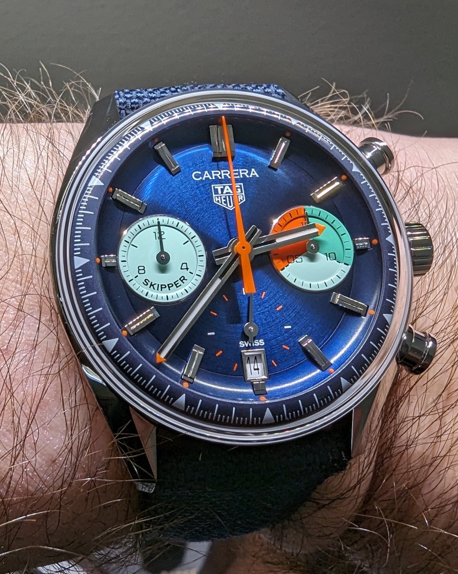
The colors of the Skipper are very striking, but I think looks best at a distance. The closer you get (like in this macro shot), you can see the patchy concave connector over the dial. This could have been an astonishing re-edition, had they chosen to do it more faithfully.
Yes, also got the WoS when it was released last year.
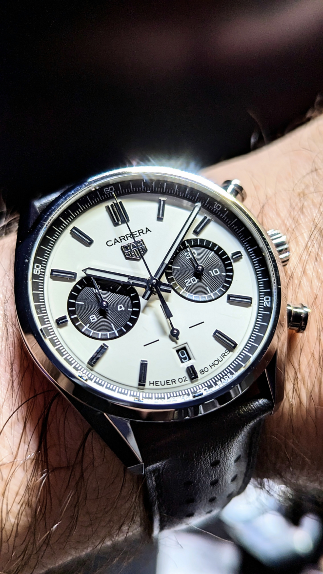
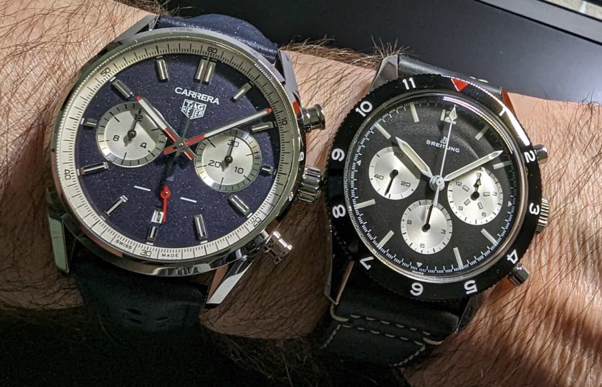
Here's how it compares with the Porsche Carrera RS LE. The color of the WoS dial is antique white.


I prefer the vintage-themed glassbox models over the new ones. To get rid of the milky ring effect of the sapphire, TH could have used plexiglass, like Breitling and Omega have done.
Mspeedster
·They are pretty good. The France LE is special (pictured below), next to the co-pilot re-issue.

The colors of the Skipper are very striking, but I think looks best at a distance. The closer you get (like in this macro shot), you can see the patchy concave connector over the dial. This could have been an astonishing re-edition, had they chosen to do it more faithfully.

Yes, also got the WoS when it was released last year.

Here's how it compares with the Porsche Carrera RS LE. The color of the WoS dial is antique white.


I prefer the vintage-themed glassbox models over the new ones. To get rid of the milky ring effect of the sapphire, TH could have used plexiglass, like Breitling and Omega have done.


Jim Dollares
·Hard to think that the Breitling is 41mm, the French Elegant looks huge next to the Breitling
abrod520
·you can see the patchy concave connector over the dial.
Can you elaborate on this more? I mentioned this in the Skipper thread but nobody who had complained about this responded.
I have to say, I still don’t get this ‘patchy’ complaint… the curved outer dial on mine is a consistent deep blue with a slight reflective behavior, which IMO is well matched to the subtle circular grain of the inner dial.
Mspeedster
·Can you elaborate on this more? I mentioned this in the Skipper thread but nobody who had complained about this responded.
The way it connects to the dial and outer bezel looks "patchy". It also isn't finished exactly the same way as the dial, it lacks the brushed concentric circles of the dial. It's like when the paint on the plastic nose of a car doesn't exactly match the paint on the hood & fenders.
abrod520
·It's this concave sloping piece that offends some. I call it the skate board rink.
The way it connects to the dial and outer bezel looks "patchy". It also isn't finished exactly the same way as the dial, it lacks the brushed concentric circles of the dial. It's like when the paint on the plastic nose of a car doesn't exactly match the paint on the hood & fenders.
Right, I'm just saying I have none of the same issues. It's obviously a separate piece than the center dial, but I think it's integrated pretty well - at least on mine, I never notice a different color, and the entire thing is the same color throughout so I don't get any such 'patchy' impression.
McBeardy
·They are pretty good. The France LE is special (pictured below), next to the co-pilot re-issue.

The colors of the Skipper are very striking, but I think looks best at a distance. The closer you get (like in this macro shot), you can see the patchy concave connector over the dial. This could have been an astonishing re-edition, had they chosen to do it more faithfully.

Yes, also got the WoS when it was released last year.

Here's how it compares with the Porsche Carrera RS LE. The color of the WoS dial is antique white.


I prefer the vintage-themed glassbox models over the new ones. To get rid of the milky ring effect of the sapphire, TH could have used plexiglass, like Breitling and Omega have done.


Thanks @Hubert think I’d be hard pressed to choose between the WoS & France Ed. However did I imagine you also ordered the chronotempus one also or am I getting confused?
Ara
·Can you elaborate on this more? I mentioned this in the Skipper thread but nobody who had complained about this responded.
Jim Dollares
·I suppose. But when I check my wrist to tell the time, I'm not using a macro lens to look at it 😀
abrod520
·This is a healthy point I think watch addicts could think of more often. All these high resolution close ups messin with our judgement
For sure. Meanwhile every time I check the time when I'm wearing the Skipper (so far), I admire it a little bit. I much prefer a watch that's fun on the wrist to one that's fun in macro images.
Hubert
··TAG Heuer Forums ModeratorHubert
··TAG Heuer Forums ModeratorCan you elaborate on this more? I mentioned this in the Skipper thread but nobody who had complained about this responded.
Right, I'm just saying I have none of the same issues. It's obviously a separate piece than the center dial, but I think it's integrated pretty well - at least on mine, I never notice a different color, and the entire thing is the same color throughout so I don't get any such 'patchy' impression.
I suppose. But when I check my wrist to tell the time, I'm not using a macro lens to look at it 😀
For sure. Meanwhile every time I check the time when I'm wearing the Skipper (so far), I admire it a little bit. I much prefer a watch that's fun on the wrist to one that's fun in macro images.
Mspeedster
·Right, I'm just saying I have none of the same issues. It's obviously a separate piece than the center dial, but I think it's integrated pretty well - at least on mine, I never notice a different color, and the entire thing is the same color throughout so I don't get any such 'patchy' impression.
For me, it's not the concave tension ring that's holding me back. I would've bought one at launch if had "Skipper" above a "Heuer" logo and a white minute track like the original. Still haven't ruled it out, we'll see if it grows on me.
