Design Concepts

Posts
8,811
Likes
17,932
Ara Ara
Yes. Had to fiddle a bit but I can’t remember how much I reduced the dial and usually want to go from inspiration to idea as fast as possible The picture vintage_heuer that DC posted was so good that I couldn't stop thinking about it. Looked like a magazine cover.

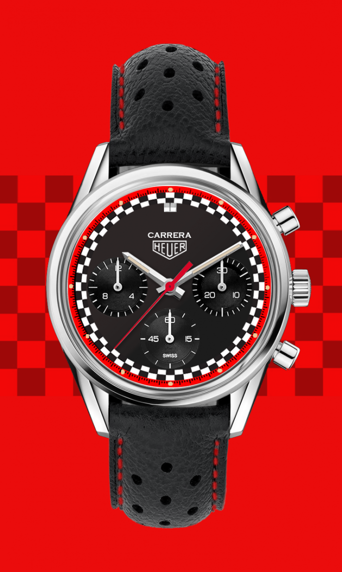
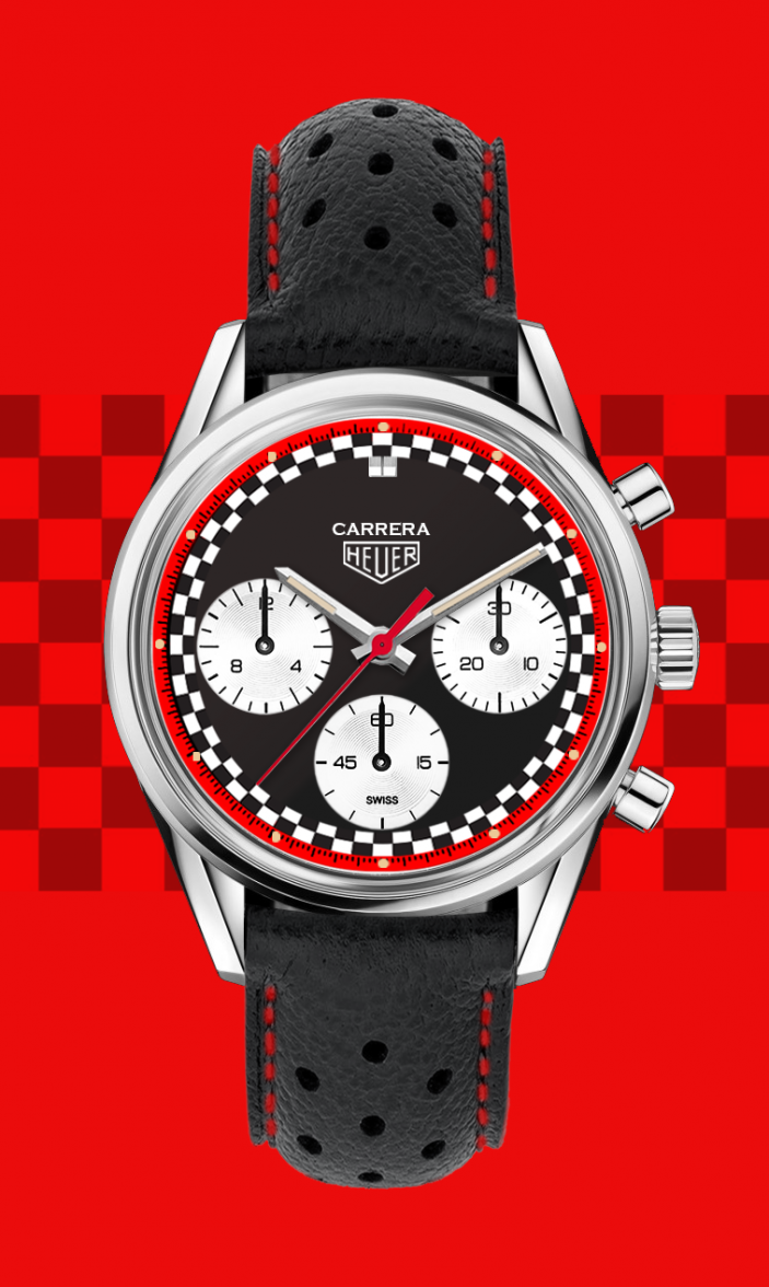
Woke up early today and got the subdials and ring preparations to match the Montreal. Also moved the lime plots to the red ring like @Pitfitter446 suggested -- also gone is the date.
I like the lume dots in red ring much better.👍

Ara Ara
Want to see the all black version? I have that right now.

The first one I did was full red but it was way too intense.
Yes please. 😀
 
Posts
6,096
Likes
7,368
I think the black looks better actually. What would it look like with white subdials I wonder? Too much going on?

I think it looks great, though. Nice inspiration too. But I'd still choose a straight panda were it available. 😀
 
Posts
11,968
Likes
39,433
Ara Ara
Yes. Had to fiddle a bit but I can’t remember how much I reduced the dial and usually want to go from inspiration to idea as fast as possible. The picture by @vintage_heuer that DC reposted was so good that I couldn't stop thinking about it. Looked like a magazine cover.

Woke up early today and got the subdials and ring proportions to match the 160th Carrera Montreal. Also moved the lime plots to the red ring like @Pitfitter446 suggested -- also gone is the date.

Like this one better!

Ara Ara
Voila.

Needs.... dial.... markers.... ::dies::
 
Posts
10,365
Likes
11,757
Ara Ara
Yes. Had to fiddle a bit but I can’t remember how much I reduced the dial and usually want to go from inspiration to idea as fast as possible. The picture by @vintage_heuer that DC reposted was so good that I couldn't stop thinking about it. Looked like a magazine cover.

Woke up early today and got the subdials and ring proportions to match the 160th Carrera Montreal. Also moved the lime plots to the red ring like @Pitfitter446 suggested -- also gone is the date.
Looks much better.
 
Posts
894
Likes
1,378
Like this one better!


Needs.... dial.... markers.... ::dies::
You should see all the thoughts I had before creating. Glassbox and markers were at the top of the list of "oh man, this is gonna be a bumpy ride."
 
Posts
10,365
Likes
11,757
Ara Ara
Voila.
As @imagwai said, probably a white subregisters on the black dial would look better.
 
Posts
8,811
Likes
17,932
As @imagwai said, probably a white subregisters on the black dial would look better.
This was my original request, but he had the all black one ready to go. I do like it better in black, will like it even more as a black reverse panda I think.
 
Posts
894
Likes
1,378
This was my original request, but he had the all black one ready to go. I do like it better in black, will like it even more as a black reverse panda I think.
 
Posts
894
Likes
1,378
I'll add markers to both white, black and panda versions for @abrod520 later in the day, but it's a pretty busy dial already. But I'm always game to excite the crowd.

maximus.jpg
 
Posts
10,365
Likes
11,757
Both of them look great; if I had to choose, I'd probably go with the Panda on the left.
 
Posts
894
Likes
1,378
Both of them look great; if I had to choose, I'd probably go with the Panda on the left.
Thanks, Hubert! The left was also my main choice, and to paraphrase my favorite movie "if you're gonna build a watch dial, why not do it with some style!"

It's all just photoshop, but my gut is that a high-contrast, very bright white dial would look better in real life. Or, maybe it's because I love the bright white + red accents of the Omega Alaska project.

Ara

maxresdefault.jpg
 
Posts
6,034
Likes
16,460
White faces on the connected never seem WHITE, that one looks vaguely pink, maybe just the pictures.
Yes, these pictures don’t show the real color. It looks better IRL. It’s not easy to take pictures to the Connected, mainly when wearing white (and light colors) watchfaces. It’s easier with dark watchfaces
 
Posts
6,096
Likes
7,368
Both of them look great; if I had to choose, I'd probably go with the Panda on the left.
Tough choice, but out of these two I'd go right I think.
 
Posts
11,968
Likes
39,433
Ara Ara
I'll add markers to both white, black and panda versions for @abrod520 later in the day

Shorten 'em! The old 2447s with dial tracks featured not only shorter markers, but shorter hands as well to preserve the proportions.
 
Posts
4,066
Likes
5,939
How about making “Heuer” red ? Either of the panda or reverse panda dial looks great! Even better than Fragment Carrera IMHO 😉
 
Posts
6,034
Likes
16,460
Both of them look great; if I had to choose, I'd probably go with the Panda on the left.
Yes! Both look great, IMO much better than the Carrera Montreal! 👍
 
Posts
894
Likes
1,378
How about making “Heuer” red ? Either of the panda or reverse panda dial looks great! Even better than Fragment Carrera IMHO 😉
Always love a red Heuer logo! You know what they say, can't spell "Fujiwara" without a-r-a.

Yes! Both look great, IMO much better than the Carrera Montreal! 👍

You're all far too kind and make me love C11 even more.
 
Posts
4,066
Likes
5,939
Ara Ara
You're all far too kind and make me love C11 even more.

These 2 design concepts carry the Calibre11 colors also 👍👍
 
Posts
8,811
Likes
17,932
I normally prefer pandas, but in this case I kinda like the all black too. Looks less busy to me.


All 3 are nice. It would not be a quick and easy choice for me.