2024 TAG Heuer Watches and Wonders
Ara
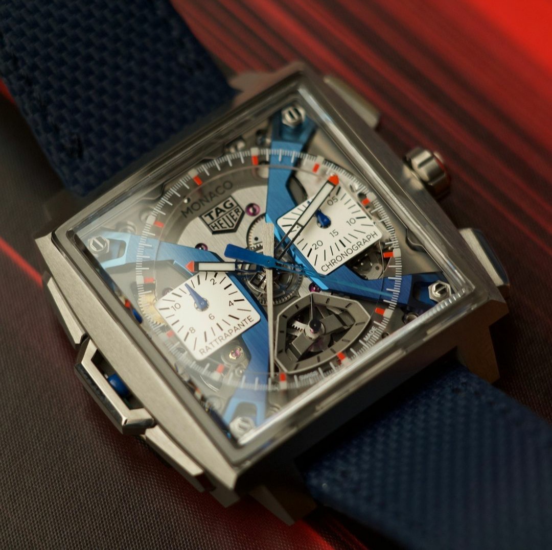
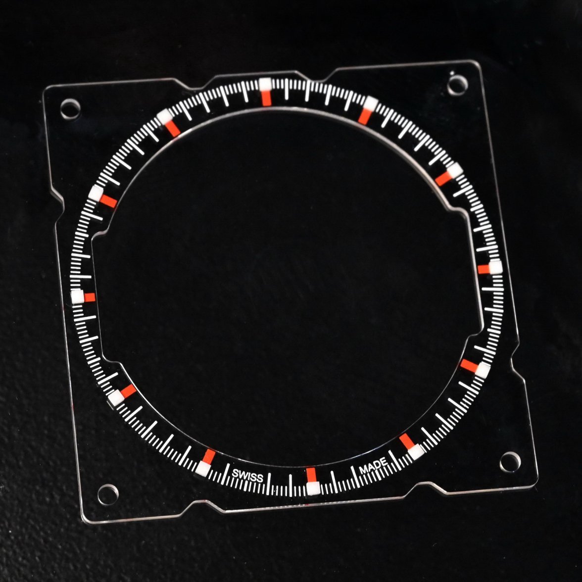
·I'm starting to look through some photos from Watches and Wonders, and I thought that you guys might like to see the "dial" of the new Monaco Split-Seconds Chronograph. Yes, a piece of sapphire, with the center section removed, etc.
An interesting approach to the dial, isn't it?
Jeff
dtf
·Looks great in those photos. They should have posted those not the renders!
Aquagraph
·Really? It still looks bloody terrible to me. The red one looks a bit better in some videos....
They were doing HIT MISS MAYBE on the ABTW podcast and one guy called it hideous.
They were doing HIT MISS MAYBE on the ABTW podcast and one guy called it hideous.
bpsmith
·MISS just doesn’t do justice to how bad this is.
bpsmith
·Let’s face it, if this wasn’t saddled with such a price tag to build the hype, then nobody would look twice at it.
bpsmith
·dtf
·Really? It still looks bloody terrible to me. The red one looks a bit better in some videos....
They were doing HIT MISS MAYBE on the ABTW podcast and one guy called it hideous.
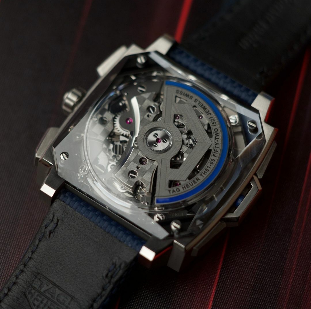
The glass back is cool, not seen one like that before. I’m not a fan of the gargoyle mouth and the registers don’t seem consistent with the style of the mouth, but it looks a lot better there than in the renders, and overall I like skeleton watches.
Agree about the price. It’s a joke.
bpsmith
·I agree on the caseback, as posted the same previously. That’s where it ends for me.
Aquagraph
·Excellent now we have the Deadpool and the Scream. Perfect.
Mspeedster
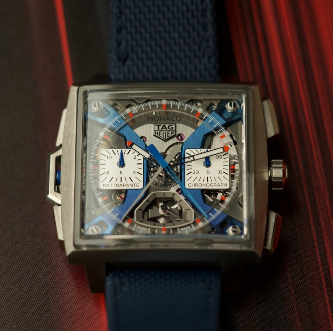
·I guess it's like a Rorschach Test, once you see that face, that's all you'll ever see.
In these latest pics by Nick, looking past that face, I can actually appreciate what they've put into this watch. It's really the first time the blue has looked pretty good to me.
In these latest pics by Nick, looking past that face, I can actually appreciate what they've put into this watch. It's really the first time the blue has looked pretty good to me.
Aquagraph
·The mouth is.... a little odd, but the subdials. I think this picture flatters it because it makes the subdials look square like they ought to be instead of oblong like they are - and like the renders portrayed them. Looks weird having the stems off centre like that and the text on the bottom looks really amateurish.
Aquagraph
·Or maybe they are square and it's an optical illusion. Either way, it looks bad.
Aquagraph
·Blows my mind that the highest scoring watch of the year so far is a 34mm Solargraph Aquaracer.... with a 6.6.
I hope TAG Heuer have some mage surprises up their sleeve for the rest of the year because it is not going well so far.
I hope TAG Heuer have some mage surprises up their sleeve for the rest of the year because it is not going well so far.
Jeff Stein
·Nice! So the subdials must be separate plates, right?
Yes, the subdials are separate pieces; not connected to the "dial"; I believe that they are supported by the "arches".
bpsmith
·Subdials appear to foul the dial too.
bpsmith
·Mspeedster
·Blows my mind that the highest scoring watch of the year so far is a 34mm Solargraph Aquaracer.... with a 6.6.
Oh, but then you woke up. LOL 😜
