2024 TAG Heuer Carrera Porsche 963 (CBU2010.FT6267)
Albert-AMG
··TAG Heuer Forums ModeratorMspeedster
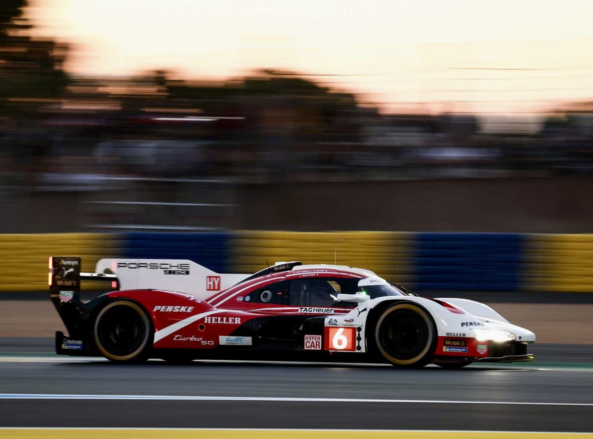
·And a very well-timed launch, with the Porsche 963 (sponsored by TAG Heuer) achieving today Pole Position for the 24H of Le Mans 2024! 👍
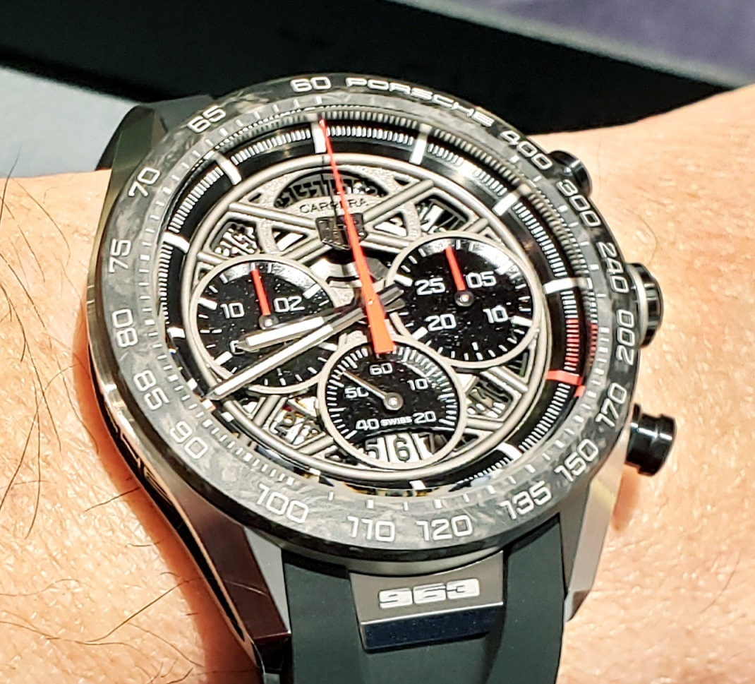
However, the watch is a bit of a letdown for me. There's really nothing about it that gives me a Porsche 963 vibe. If they had incorporated more of the race car's livery into the watch, I'd like it more. Such as making the sub-dials white and using the red stripe with white inner pin stripes motif on part of the strap etc.
It's a nice skeleton Carrera on its own, an improvement perhaps over the previous skeleton. But it's far from being my favorite "Porsche" watch.
Aquagraph
·I'm glad the watch isn't as ugly looking as the car...
Aquagraph
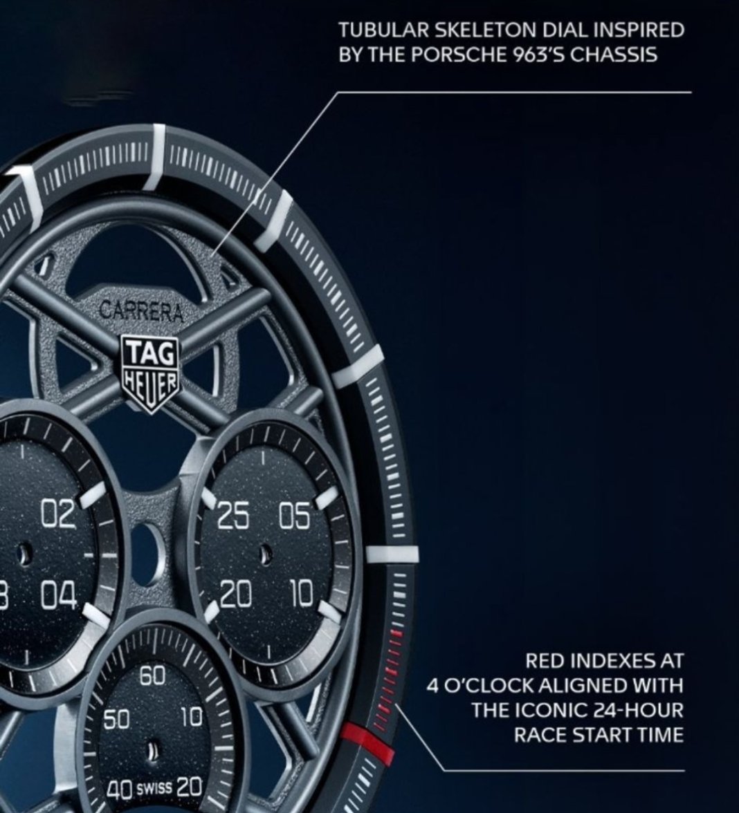
·Anyone notice the red marks on the right side of the minute track? Apparently they signify the start time of the 24hr Le Mans...
THFan346
·I clocked those, yes. 😀
Mspeedster
·I'm glad the watch isn't as ugly looking as the car...
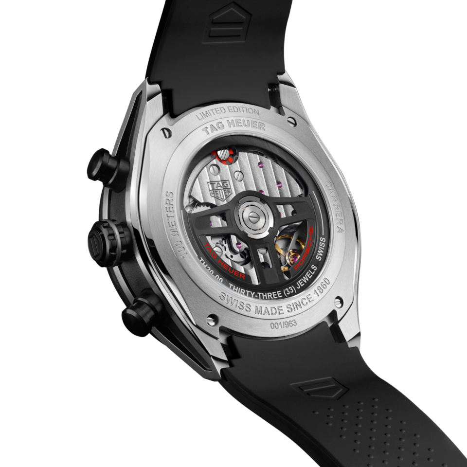
Furthermore, some of the so-called Porsche 963 details aren't really correct. The steering wheel of the 963 looks nothing like the rotor design on the movement. The lume on the 9 & 3 o'clock subdials might mimic the Porsche road car's lights, however it again is not correct for the 963's lights. They say the tubular skeleton design is supposed to evoke the chassis structure of the 963, but I don't really see it when looking at the real car.
So for me, being a Porsche enthusiast, the watch has failed to meet my expectations.
Mspeedster
·^Having said that, I had the chance to try the watch on in person and think it's better IRL than in pictures. The details are very nicely done. I was also pleasantly surprised that the watch didn't wear as huge as I thought it would. As a standalone skeleton Carrera, I'd give it a thumbs up.👍 But as a Porsche 963 watch, it gets a thumbs down. 👎
Aquagraph
·What one thinks of the race car's looks is irrelevant to the point I was making.
I can't argue with that. It's still an ugly car, though that may be the way Endurance Cars look these days...
Mspeedster
·I can't argue with that. It's still an ugly car, though that may be the way Endurance Cars look these days...
Edited:
THFan346
·What one thinks of the race car's looks is irrelevant to the point I was making. If the watch is supposed to be inspired by the Porsche 963, it should give me a 963 vibe, which it doesn't. Slapping on "Porsche" and "963" isn't enough.
Furthermore, some of the so-called Porsche 963 details aren't really correct. The steering wheel of the 963 looks nothing like the rotor design on the movement. The lume on the 9 & 3 o'clock subdials might mimic the Porsche road car's lights, however it again is not correct for the 963's lights. They say the tubular skeleton design is supposed to evoke the chassis structure of the 963, but I don't really see it when looking at the real car.
So for me, being a Porsche enthusiast, the watch has failed to meet my expectations.
Were you expecting something more like this then?
All jokes aside, surely when something is “inspired” by something else it’s all about what the designer creates when thinking about the original object.
They’ve clearly decided that they wanted a skeleton dial with the logic being that the normal flat dial has been removed and you are seeing what’s underneath. It’s pretty darn obvious that, when applying this exact same logic, that you would be seeing the space frame beneath the Porsche with the body removed.
I fail to see what the issue is with the design, other than the fact that you simply just don’t like it!?!
What sort of enthusiast thinks what’s on the surface is the only thing that counts. That applies to cars and watches alike, just like many other well designed objects.
Mspeedster
·They’ve clearly decided that they wanted a skeleton dial with the logic being that the normal flat dial has been removed and you are seeing what’s underneath. It’s pretty darn obvious that, when applying this exact same logic, that you would be seeing the space frame beneath the Porsche with the body removed.
I fail to see what the issue is with the design, other than the fact that you simply just don’t like it!?!
Aquagraph
·According to the TAG marketing the dial is inspired by the tube chassis of the car. So I guess this won't exactly be the normal skeleton going forward?
Aquagraph
·I wouldn't go as far as to say the race car is ugly, but it certainly isn't as pretty as the Porsche Endurance cars of the '70s, '80s or '90s. Modern Formula 1 cars can't hold a candle compared to the F1 cars of the same period either. I could say the same thing about these modern skeleton Carreras, but as always, beauty is in the eye of the beholder.
I find almost all F1 cars look weird when you look back at them. The 2012 cars look super weird with their tall narrow back wing and the 1997 cars look bizarre with their super long spindly suspension arms. Then the 98/99 cars look too narrow and tucked up and with those stupid grooved tyres. Mind you the new ones looked weird when they arrived... but now they look normal I've even got used to the halo. Some older ones look nice. Though some... for example the 1981 Ferrari look utterly bizarre with the nose sticking out from the table top.. and Hunts McLaren didn't look that great either.
Aquagraph
·Of course the JPS Lotus looked great in all its forms... and most of the Marlboro McLarens.
Aquagraph
·But the Toleman looked like a breeze block on wheels...
dtf
·What one thinks of the race car's looks is irrelevant to the point I was making. If the watch is supposed to be inspired by the Porsche 963, it should give me a 963 vibe, which it doesn't. Slapping on "Porsche" and "963" isn't enough.
Furthermore, some of the so-called Porsche 963 details aren't really correct. The steering wheel of the 963 looks nothing like the rotor design on the movement. The lume on the 9 & 3 o'clock subdials might mimic the Porsche road car's lights, however it again is not correct for the 963's lights. They say the tubular skeleton design is supposed to evoke the chassis structure of the 963, but I don't really see it when looking at the real car.
So for me, being a Porsche enthusiast, the watch has failed to meet my expectations.
The dial did make me think ‘space frame’ when I first saw it (although it probably wouldn’t have if it didn’t have Porsche slapped on the side). Maybe not 963 specifically, I was thinking more trophy truck or stock car.
THFan346
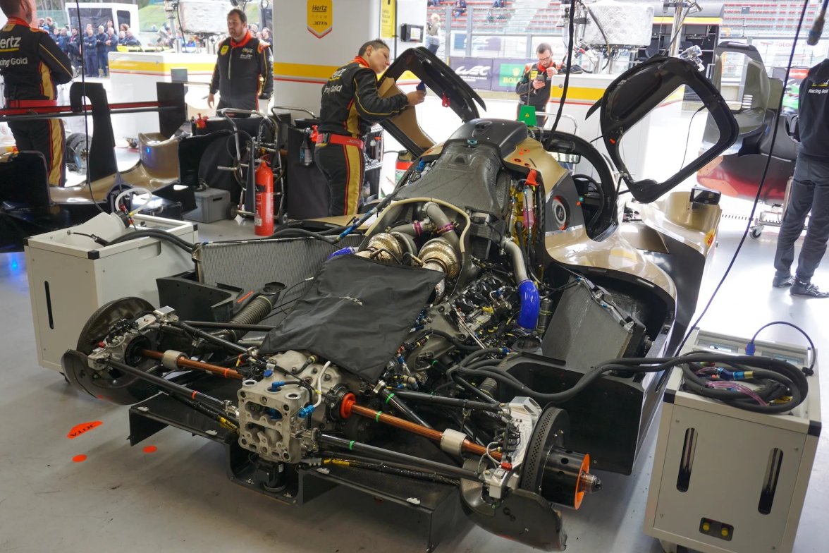
·This is what the body looks like removed. Oh yes, it looks just like the skeleton watch, right? No, it doesn't.
It seems to me that you're just trying to pick a fight. I never said I didn't like the design or had any issue with the design of the watch.
Just saying it how it is, just like you do. If we’re ok with that, then you need to be ok with others doing the same. It’s only fair that we can ALL have an opinion and share that, just like you. 😉
It’s watch design by a company that refers to itself as Avant Garde at the end of the day. It means they can take inspiration from what they like and transform that how they like too.
As for the skeleton dial representing the chassis, how can you not see the gearbox in your photo being the TAG Heuer logo on the dial, with the suspension arms being the cross pieces coming out of the TAG Heuer logo on either side. Please feel free to correct me on the chassis/suspension terminology btw, as you clearly know more about that than me.
(EDIT: In fact, it’s almost their way of displaying the TAG logo on the drivetrain once again. Even the colours match on chassis vs dial too.)
Appreciate the photo demonstrating this, so thank you for that, as saved me searching.
As for you not liking the design it was your words that said, I quote, “…the watch has failed to meet my expectations.” How can that possibly mean that you don’t dislike the design?
Edited:
Mspeedster
·The dial did make me think ‘space frame’ when I first saw it (although it probably wouldn’t have if it didn’t have Porsche slapped on the side). Maybe not 963 specifically, I was thinking more trophy truck or stock car.
