- Posts
- 4,066
- Likes
- 5,939

The dial is a little too flat & washed out in that shot for my taste.
I guess he means you can't see the sunburst effect - it appears white rather than silver.
In an earlier comment, I said the lume almost appeared salmon rather than beige in some lights. I wonder if anyone would be brave enough to have the watch relumed with a standard green lume (I refuse to use the term "fauxtina" - it's just a colour they've chosen to go with the watch 😀)
I guess he means you can't see the sunburst effect - it appears white rather than silver.
Exactly what I meant. No offense, but it's dial pics like those that make the watch look a little plain for my taste. OTOH, shots that show the depth of Silver and the starburst affect are the ones that make me lust for this watch. But this differing look and not being a panda is why I haven't pulled the trigger.
Must be why I liked it....
Which is clearly meant to mimick aged lume thus 'fauxtina' it is.

To be honest I don't get why people like 'aged' lume be it faux or genuine. I'd much prefer my lume to stay exactly the way it was when it left the factory... and while the CBK221B isn't my cup of tea, one of the things that puts me off even more is that odd pinky orange lume. It doesn't really look convincingly like 'aged' lume to me, which means it's just a random odd colour. I'd prefer if it was 'genuine' orange, or better yet white with an orange second hand.
That WMT looks more convincing to me, but I'd just rather it was properly black with white/green superluminova. I don't get the 'beauty' of faded bezels either, what's so great about a bezel that looks knackered or a dial that should be black and now is browny red? Seems like a case of the Emperor's new clothes to me... fuelled by rarity and silly prices.
Apologies to you and Jim.

It doesn't always look pink-ish on the CBK221B, just in some lights/photos. Although I'd also prefer normal lume, I do concede that it brings some much needed warmth to the watch, otherwise it would be quite stark and sterile. And I think that's why peole like aging on a watch. Warmth. Softness. Character. And sometimes the colours things turn can actually look really nice. I loved the cream lume and muted blue bezel on my, now departed, Tudor Sub...they were the best bits about it
Too bad you sold that bad boy, do you miss it?
It doesn't always look pink-ish on the CBK221B, just in some lights/photos. Although I'd also prefer normal lume, I do concede that it brings some much needed warmth to the watch, otherwise it would be quite stark and sterile. And I think that's why peole like aging on a watch. Warmth. Softness. Character. And sometimes the colours things turn can actually look really nice. I loved the cream lume and muted blue bezel on my, now departed, Tudor Sub...they were the best bits about it
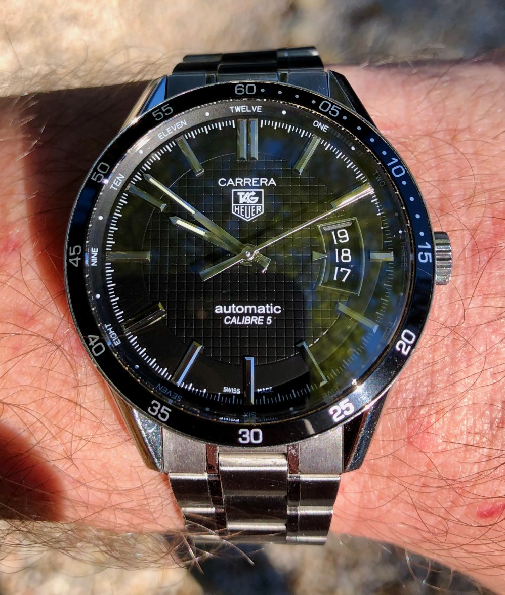
A simple classic today. The first TH my wife bought for me...