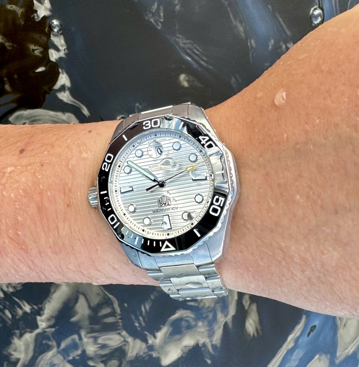
TAG Heuer Aquaracer thread
Jim Dollares
·WAY looks more clean in its design imo
Aquagraph
·Yes, and look at that perfectly proportioned hour hand.
THFan346
·McBeardy
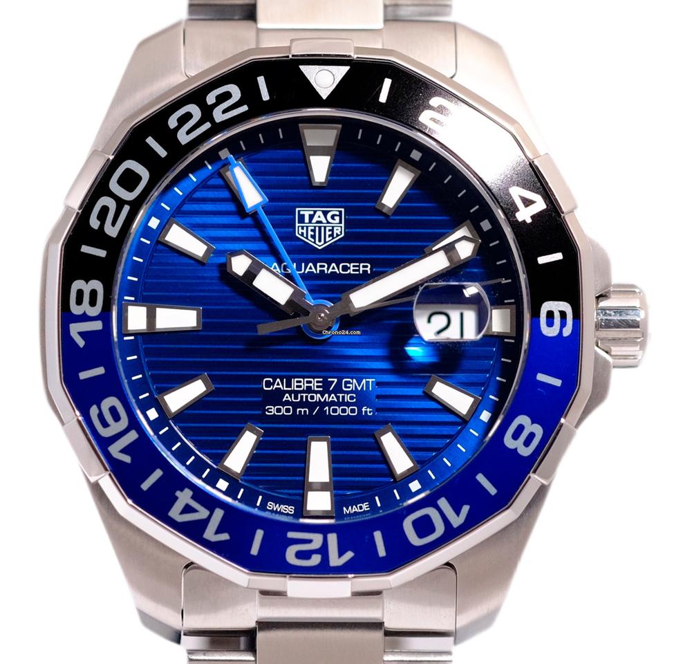
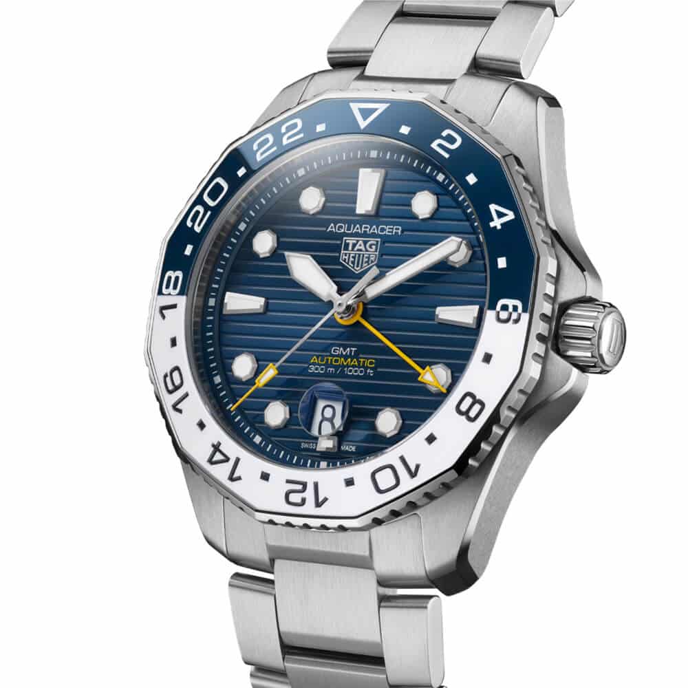
·odd the dial looks more cluttered on the new one. Yet the bezel looks more cluttered on the old one.
Jim Dollares
·
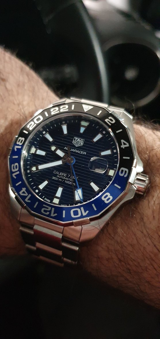
That is not a Batman though is it, you blind bicycle maniac
Jim Dollares
·odd the dial looks more cluttered on the new one. Yet the bezel looks more cluttered on the old one.
Jim Dollares
·I truly hate agreeing with Rob but I think the folded fabric dial is a step down for the Aquaracer.
THFan346
·That is not a Batman though is it, you blind bicycle maniac
THFan346
·I love uniformity and also symmetry, so I naturally lean more towards the old dial design, but I can’t help liking the new one too. Can’t say I prefer either, they are just different.
I have stared at the 3 o’clock area plenty but, whilst it is an obviously different area of the dial, it just doesn’t jar with me for some reason.
I have stared at the 3 o’clock area plenty but, whilst it is an obviously different area of the dial, it just doesn’t jar with me for some reason.
dtf
·Bezel, hands, markers from the old one. Dial from the new one.
Also don’t mind the gap in the waves on the dial, waves do that.
Also don’t mind the gap in the waves on the dial, waves do that.
Anthony.
·Aquagraph
·I love uniformity and also symmetry, so I naturally lean more towards the old dial design, but I can’t help liking the new one too. Can’t say I prefer either, they are just different.
I have stared at the 3 o’clock area plenty but, whilst it is an obviously different area of the dial, it just doesn’t jar with me for some reason.
Well, I guess being a true enthusiast I just have a finer eye. 😁 But I do find it odd that it's just me. I honestly did think my wife's Aquaracer was faulty when it arrived.
THFan346
·Well, I guess being a true enthusiast I just have a finer eye. 😁 But I do find it odd that it's just me. I honestly did think my wife's Aquaracer was faulty when it arrived.
I am open to opinions of others, to challenge my own, but I am ok with this one despite seeing how it must annoy a proper enthusiast.
Mspeedster
·Well, I guess being a true enthusiast I just have a finer eye. 😁 But I do find it odd that it's just me. I honestly did think my wife's Aquaracer was faulty when it arrived.
Aquagraph
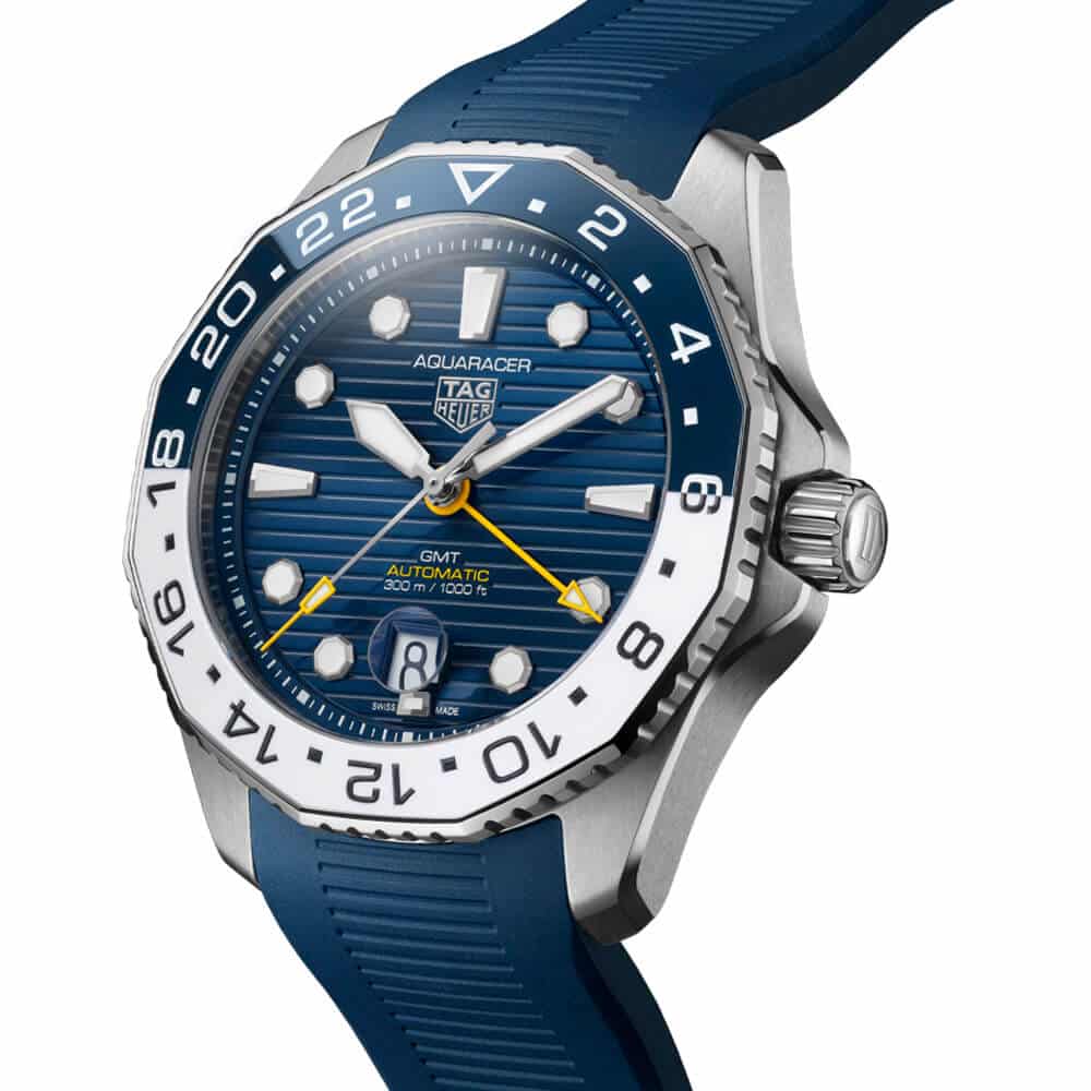
·It's not the wavy dial as such, I used to like it on the smaller ladies ARs and I don't mind it on the black one because it's less obvious. It's the execution and in particular that part near the date. The blue dial really catches the light and the waves are way too clear and obvious which is why that is my least favourite of the new ones, even though I think the blue colour is nicer than the green, which is kinda swampy looking to me. The GMT is definitely darker and that helps, there's other distractions too, like the bezel... but when you look at the the new Batman and the old one side by side it's a bit unfortunate that the only improvement I can see is the ceramic bezel.
Aquagraph
·What I mean is, I know I'm not the only one who has a problem with it, but most other people just don't like it. I just think some of it just looks a bit wrong.
Similar threads
- Posts
- 10
- Views
- 585
- Posts
- 0
- Views
- 529
- Posts
- 495
- Views
- 31K

