- Posts
- 378
- Likes
- 223
calibre11user
·In case any of you had not seen it yet, ABlogToWatch.com posted a video on April 28, 2015, of Tag Heuer's booth at Baselworld 2015:
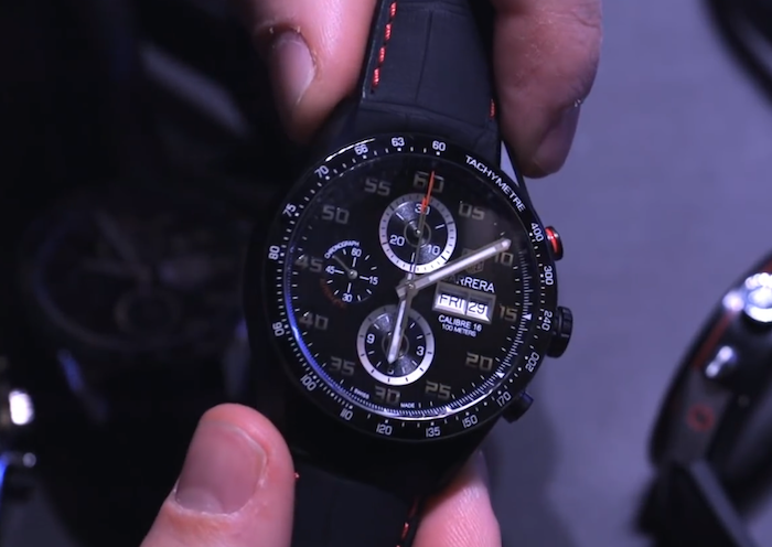
The host in the video (Ariel Adams) is handling several of Tag's watches and comes across some Carreras. At around 2:03 in the video, he picks up what appears to be a new 43mm Calibre 16 Carrera with racing strap. It looks a lot like the current Calibre 1887 Racing model CAR2A80.FC6237, but this one obviously has Calibre 16.
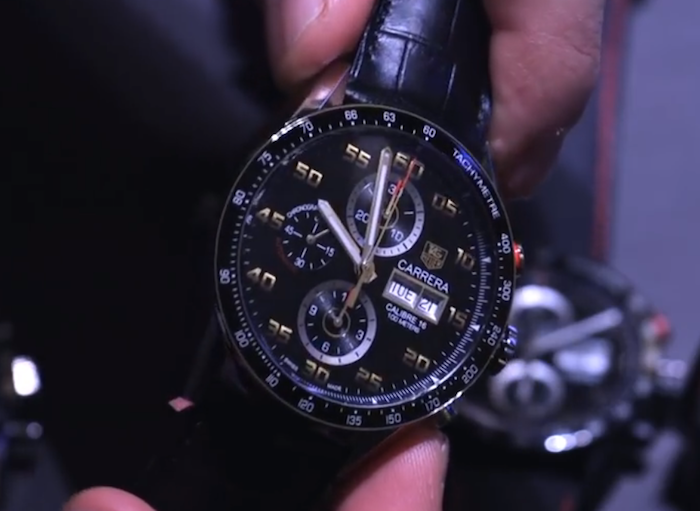
The next watch he picks up is another 43mm Calibre 16 model. The host says it's a new model, but it looks exactly like the current Calibre 16 day-date CV2A10.FC6235. He says that there are a lot of tweaks, like ceramic bezel and new hands.
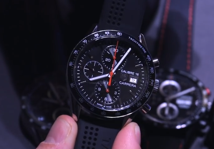
Finally, he picks up a 41mm Calibre 16. I think this is the model that was mentioned in another calibre11 forum posting, which itself discusses Tag Heuer's announcement on Facebook of a new 41mm Calibre 16. Tag previously had older models like CV2014, which was taken off its catalog website recently (I believe).


