AFAIK, the 'Aquaracer 2000' was never an official model name, although it is a good description for the generation of aquaracers prior to the recent redesign of the 300m. The Red/Green logo is usually seen on Quartz watches and the Black/transparent logo is usually seen on automatic watches, although all of the above look like quartz.
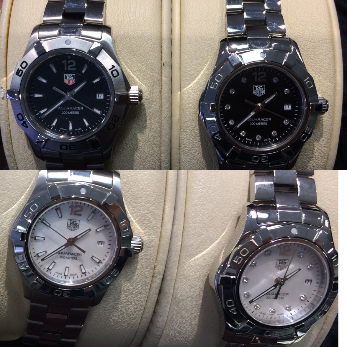
All of the above are of the
relatively recent collection of aquaracers, prior to the recent redesign where the Aquaracer 300 picked up the styling of the 500m (2010 - 2014?). Compare the history of the 2000/aquaracer, from '82, '91 and '95 respectively, to the above watches. The '95 watch is clearly closest to the ones above, but notice the different font, different hands and bezil lume, and the 'professional' on the dial, not 'aquaracer'. Be worth checking carefully that they are genuine too.

Check out the excellent guide to the 2000/Aquaracer here:
http://www.calibre11.com/tag-heuer-2000-series/
Its a very personal decision on which to buy. I have no issues wearing a 4yo design (one of
these) and a surprising number of people have commented on it looking like a fresh design now, but that said, I tried on one of the 2015 aquaracer watches and they do look very smart and a bunch more modern than the designs you have posted above. I would look at the cost of the above watches and the cost of the current model, and try them all on, and see which works best for you. The 2015 range is described here, they look a lot better in the metal than in the pictures:
http://www.calibre11.com/tag-heuer-aquaracer-300m-chronograph-calibre-16-calibre-45/
Of the watches above, I like the black, but that happens to be what I've worn most days for the last 6 years, so Im a little biased. When I bought it, the dealer said that the Black was the most popular, but I was very torn between the black and the blue. Lovely watch and very tough, only issue is that these days it looks a little small, but it fits nicely under a shirt cuff or under a wetsuit, so thats almost an advantage.