2022 TAG Heuer Aquaracer GMT WBP2010.BA0632

Posts
726
Likes
3,904
Really good.

The colors are great, the finishings too.

My 2 negative points are the same as the last Aquaracer:

- 43mm (not 40 or 41mm...)
- crappy Sellita movement
 
Posts
22,000
Likes
31,139
Just tried this on (and the Superdiver)... I like the Superdiver better to be honest.
 
Posts
10,191
Likes
13,130
Just tried this on (and the Superdiver)... I like the Superdiver better to be honest.
But the cyclops is better on the gmt tho, right??!
 
Posts
22,000
Likes
31,139
People in the shop were more interested in my watch... never seen a Golf before apparently.
 
Posts
119
Likes
242
Bit late to the party here, tried this on yesterday, absolutely stunning in the metal
 
Posts
82
Likes
28
I can’t see anything except a fake BLNR. Sorry.

the Tudor does homage a little subtler and better.

Are you for real mate?
Just a black & blue bezel and that's it, fake BLNR ? Didn't you noticed every detail is different ?
Hands, indexes, shape of the case, dial, how is that any close to what Rolex is doing ?
You can say whatever you want about this watch but it's pretty much doing its own thing, not copying nor homaging anything. I know it's an old thread, didn't planned to undig it until I've come across such horsesh*t.
 
Posts
82
Likes
28
Regarding the new GMT, I'm at a loss here. I really liked the old design, especially the pepsi way201F.BA0927.
I think it's one of the best Aquaracer releases in recent history.

montre-tag-heuer-aquaracer-calibre-7-twin-time-300m-cadran-noir-lunette-bleue-et-rouge-bracelet-acier-43-mm.jpg

But I'll never quite understood why choosing aluminum for the bezel instead of ceramic. At this price point, ceramic should be standard. Tudor can get away with it because they mainly do vintage-inspired watches, and ceramic would be out of place there. But Tag ? I believe Aquaracer is one of the most modern-looking divers on the market (which I love) so no excuse for not using ceramic, except to save a few bucks here and there. No the kind of cost-cutting decisions you'll expect to find on a 3K diver.
Even better, the renders of the watch on the official website depict a ceramic bezel, as you can tell by the engraved 8.

WAY201F.BA0927_0314.png

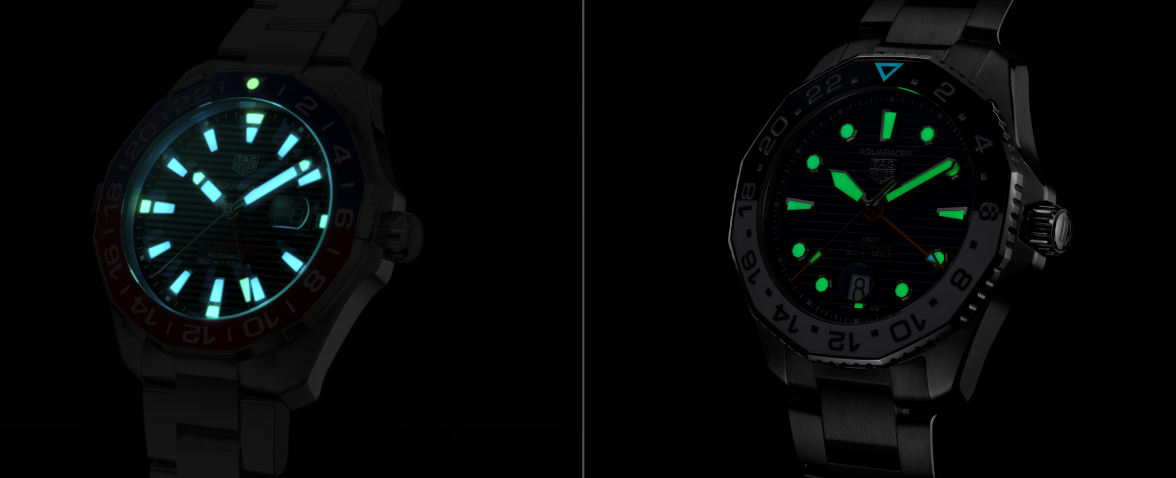
So a ceramic pepsi Aquaracer was indeed in the works, but was discarded last minute. Personally, I like the dial, hands & indexes of the "old" quite a lot more. Mainly because they look more agressive & distinctive, but also because I like lume. The new Aquaracer is a clear step down when it comes to lume, see for yourself :


So this new GMT finally brings the long overdue ceramic bezel, but loses the glorious dual-lume indexes & hands. Even without considering lume, the new set of handss & indexes appears a lot more generic and less distinctive, at least to my eye.
Anyway that was my take.
 
Posts
10,191
Likes
13,130
Regarding the new GMT, I'm at a loss here. I really liked the old design, especially the pepsi way201F.BA0927.
I think it's one of the best Aquaracer releases in recent history.

montre-tag-heuer-aquaracer-calibre-7-twin-time-300m-cadran-noir-lunette-bleue-et-rouge-bracelet-acier-43-mm.jpg

But I'll never quite understood why choosing aluminum for the bezel instead of ceramic. At this price point, ceramic should be standard. Tudor can get away with it because they mainly do vintage-inspired watches, and ceramic would be out of place there. But Tag ? I believe Aquaracer is one of the most modern-looking divers on the market (which I love) so no excuse for not using ceramic, except to save a few bucks here and there. No the kind of cost-cutting decisions you'll expect to find on a 3K diver.
Even better, the renders of the watch on the official website depict a ceramic bezel, as you can tell by the engraved 8.

WAY201F.BA0927_0314.png

So a ceramic pepsi Aquaracer was indeed in the works, but was discarded last minute. Personally, I like the dial, hands & indexes of the "old" quite a lot more. Mainly because they look more agressive & distinctive, but also because I like lume. The new Aquaracer is a clear step down when it comes to lume, see for yourself :


So this new GMT finally brings the long overdue ceramic bezel, but loses the glorious dual-lume indexes & hands. Even without considering lume, the new set of handss & indexes appears a lot more generic and less distinctive, at least to my eye.
Anyway that was my take.
Agree with a lot of what yo is sayin Chris. Lets hope they present the current gmt as a ceramic pepsi at some point. That would be very tempting for me to buy.
 
Posts
1,873
Likes
7,286
Lets hope they present the current gmt as a ceramic pepsi at some point. That would be very tempting for me to buy.

+1
 
Posts
2,859
Likes
11,827
Are you for real mate?
Just a black & blue bezel and that's it, fake BLNR ? Didn't you noticed every detail is different ?
Hands, indexes, shape of the case, dial, how is that any close to what Rolex is doing ?
You can say whatever you want about this watch but it's pretty much doing its own thing, not copying nor homaging anything. I know it's an old thread, didn't planned to undig it until I've come across such horsesh*t.
Yes it is an old thread, and yes that’s my opinion (or was) ‘so I am for real mate’.

sorry that doesn’t agree with yours. Move on.

I much prefer the blue and white version personally. Keep your horse shit comment to yourself - I could say far worse to you, but have a little more class.
Edited:
 
Posts
2,859
Likes
11,827
Agree with a lot of what yo is sayin Chris. Let’s hope they present the current gmt as a ceramic pepsi at some point. That would be very tempting for me to buy.
It’s no secret that Rolex have had issues in getting the Pepsi ceramic to look good (in many cases it looks more purple/ pink).

maybe tag would have a similar issue, and thus decide to stick to hues they can get right far easier?
 
Posts
10,191
Likes
13,130
It’s no secret that Rolex have had issues in getting the Pepsi ceramic to look good (in many cases it looks more purple/ pink).

maybe tag would have a similar issue, and thus decide to stick to hues they can get right far easier?
Naah Rolex just suck, the Chinese micro brands have been doing perfect shade red ceramic biiizels for many years.
 
Posts
82
Likes
28
Yes it is an old thread, and yes that’s my opinion (or was) ‘so I am for real mate’.

sorry that doesn’t agree with yours. Move on.

I much prefer the blue and white version personally. Keep your horse shit comment to yourself - I could say far worse to you, but have a little more class.

Well this isn't a matter of opinion but just simple facts. An homage GMT Batman, or fake BLNR as you call it, would be a Steinhart, a Pagani, something like that.

We're talking brands explicitly copying a successful design to the point of being saved from lawsuits only by their logo on the dial.

THAT is Homage.
The Aquaracer Batman only have a bezel with the same colors as the Rolex. Besides that, the said bezel differs in shape, font & materials. The rest of the watch? Not a single trait took from the GMT-Master.

So yes, I'm sorry but calling this watch homage is an absolute boatload of complete horsesh*t. Fact, not opinion or something up for debate.
ESPECIALLY since in your original post, you've compared it with a Tudor, which is the homage watch by definition. Ridiculous.
 
Posts
82
Likes
28
It’s no secret that Rolex have had issues in getting the Pepsi ceramic to look good (in many cases it looks more purple/ pink).

maybe tag would have a similar issue, and thus decide to stick to hues they can get right far easier?

Even Mido can pull this off. So yeah I believe Tag has all the know-how / tooling to do so, they just wanted to save a few bucks, knowing their core customer base doesn't even know "ceramic" could be found on high-end bezels.

It's not the first time they do some questionable cost cutting decisions. That would be acceptable for a microbrand that needs to do compromises here and there go keep prices low. But Tag ain't no microbrand, and they definitely don't keep prices low.

So that aluminum bezel ? Despicable.
I've handled the Pepsi in person, and everything looks the part. Dial, bracelet, it all checks out but man the bezel looks like it's from your cheap $300 diver from Amazon. Glossy aluminum.

Tudor can get away with aluminum because they mainly do watches with a vintage vibe. Ceramic would look out of place there. But the Aquaracer?? Modern all the way, aluminum would look out of place there, and indeed it does.
Edited:
 
Posts
2,859
Likes
11,827
Well this isn't a matter of opinion but just simple facts. An homage GMT Batman, or fake BLNR as you call it, would be a Steinhart, a Pagani, something like that.

We're talking brands explicitly copying a successful design to the point of being saved from lawsuits only by their logo on the dial.

THAT is Homage.
The Aquaracer Batman only have a bezel with the same colors as the Rolex. Besides that, the said bezel differs in shape, font & materials. The rest of the watch? Not a single trait took from the GMT-Master.

So yes, I'm sorry but calling this watch homage is an absolute boatload of complete horsesh*t. Fact, not opinion or something up for debate.
ESPECIALLY since in your original post, you've compared it with a Tudor, which is the homage watch by definition. Ridiculous.
Not a single trait from the gmt master - aside from the bezel, being the most visibale/ recognisable piece.

we can go on for hours and you can continue to claim people talking horseshit.

leave it and move on, tks
 
Posts
4,257
Likes
7,184
Let’s act civilized gents. Everyone stated and ‘colourfully’ defended their opinion and position. No enlightenment expected here. Let’s leave it at that.