Aquagraph
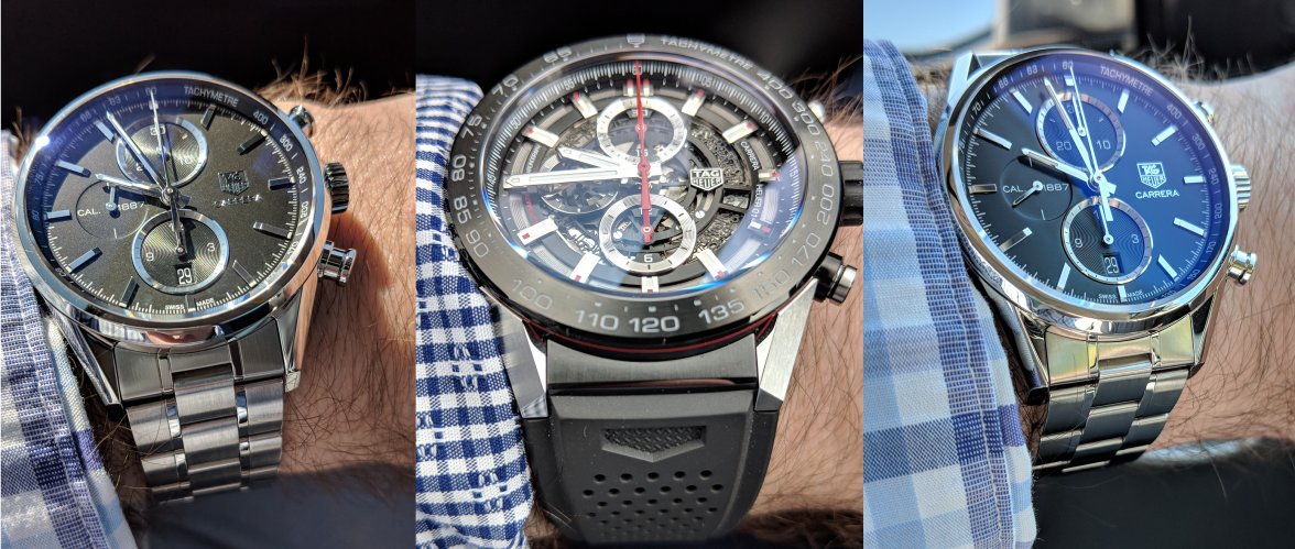
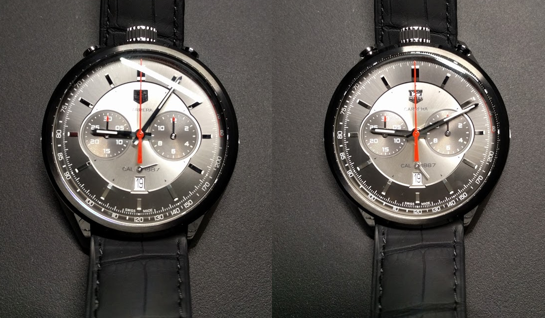
·Now that the dust has settled, how do you guys feel about the new logo?
I must admit it's grown on me, at first it looked way too stretched but now I've got used to it I don't mind it all. If anything it now makes the 'classic' logo look a bit clumsy (as much as I love it and as iconic as it is). I find it quite refreshing that a company has the balls to change something as fundamental as their logo design, and more than that to change something with a forward looking view - rather than 'reverting' to an old design.... eg- Breitling!
The nitpicker in me wants to complain that the outside edges of the T and G don't line up with the edges of the H and R, but that would require it to be even more stretched or the Heuer part squashed in, and I'm sure that wasn't up for discussion!


