- Posts
- 3
- Likes
- 0
watchfortime
·Hello everyone,
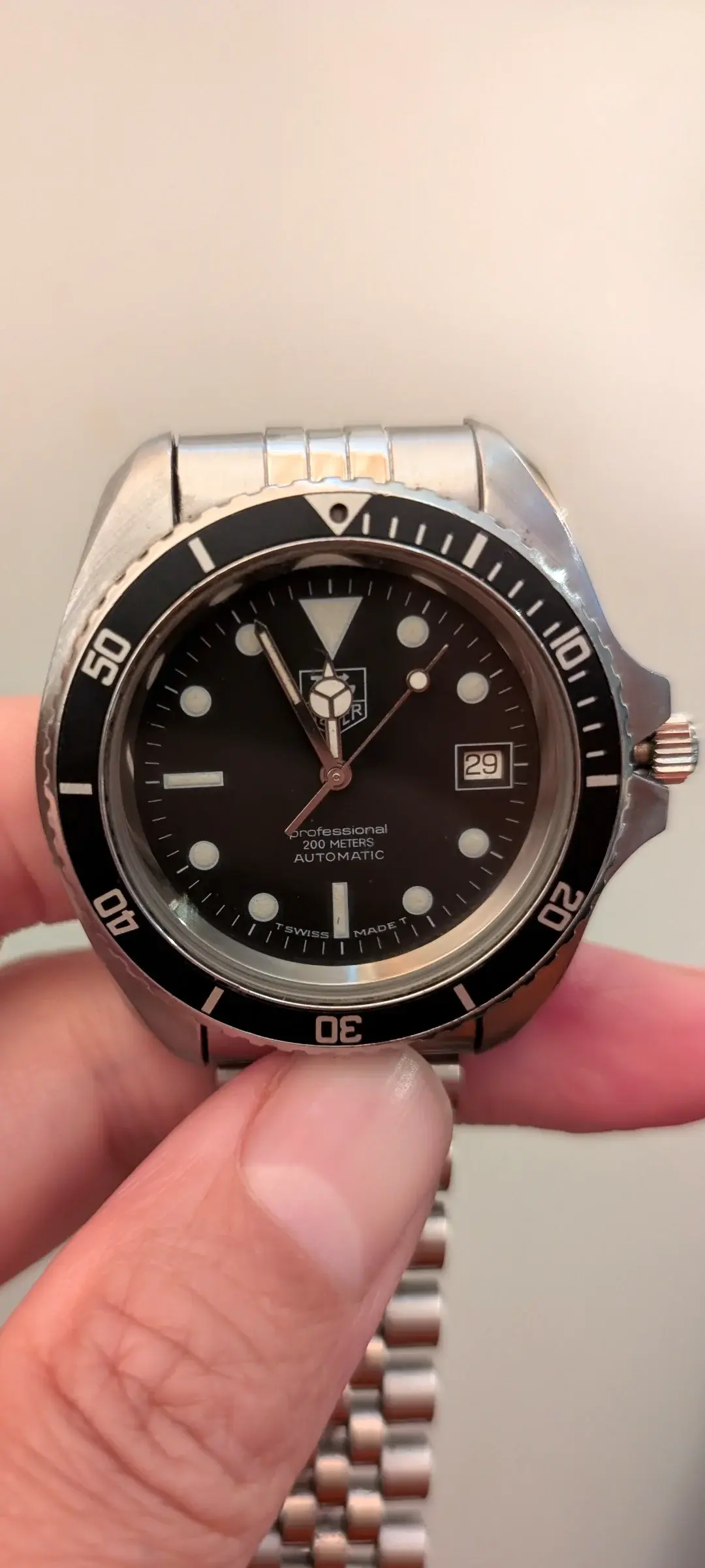
I recently purchased a TAG Heuer 844/5 automatic online, a watch that’s been my holy grail for quite some time. Perhaps I was a little blinded by excitement, but also reassured by the seller’s strong claims of originality and that the movement had been recently serviced, which turned out to be untrue.
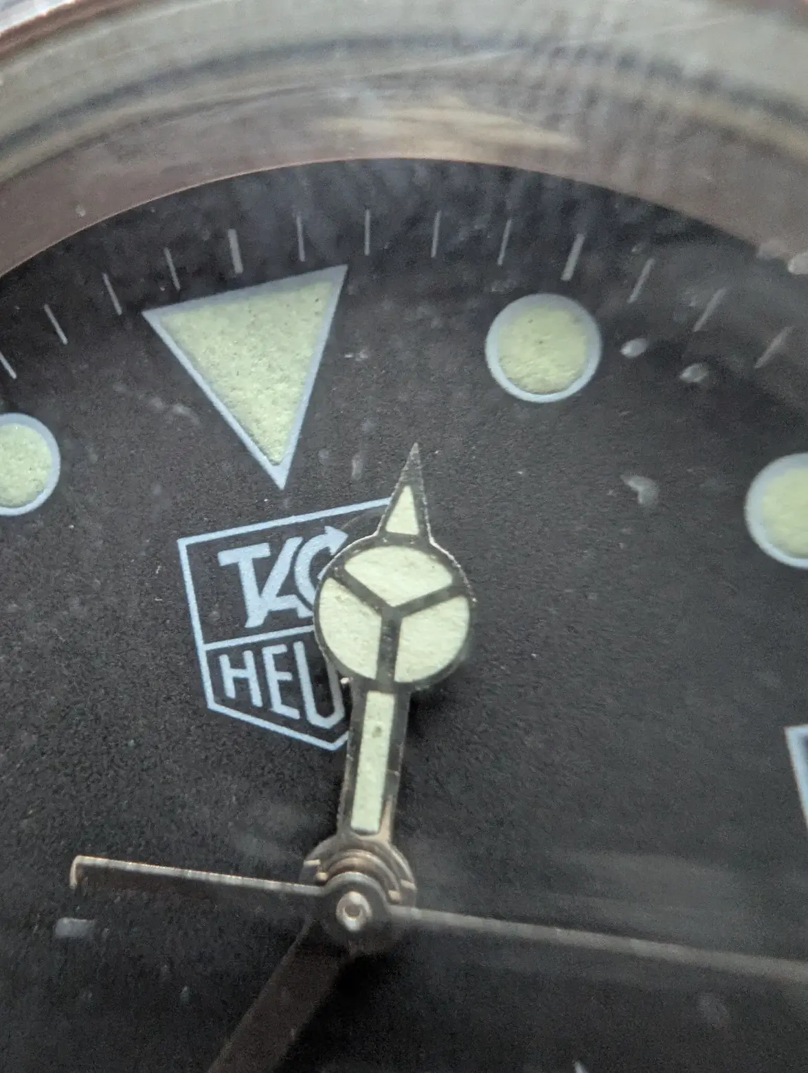
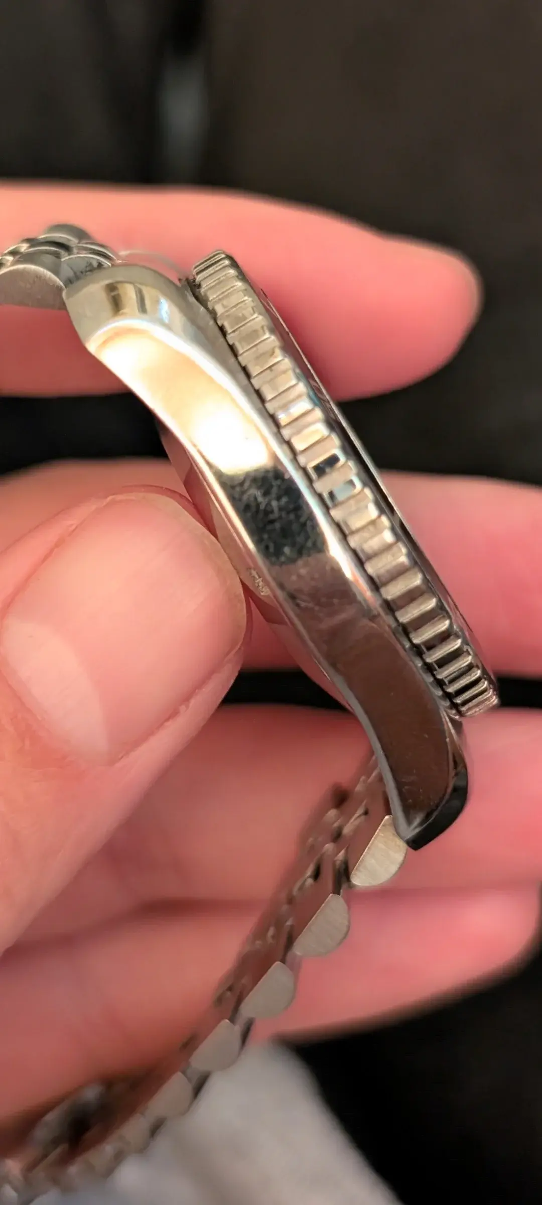
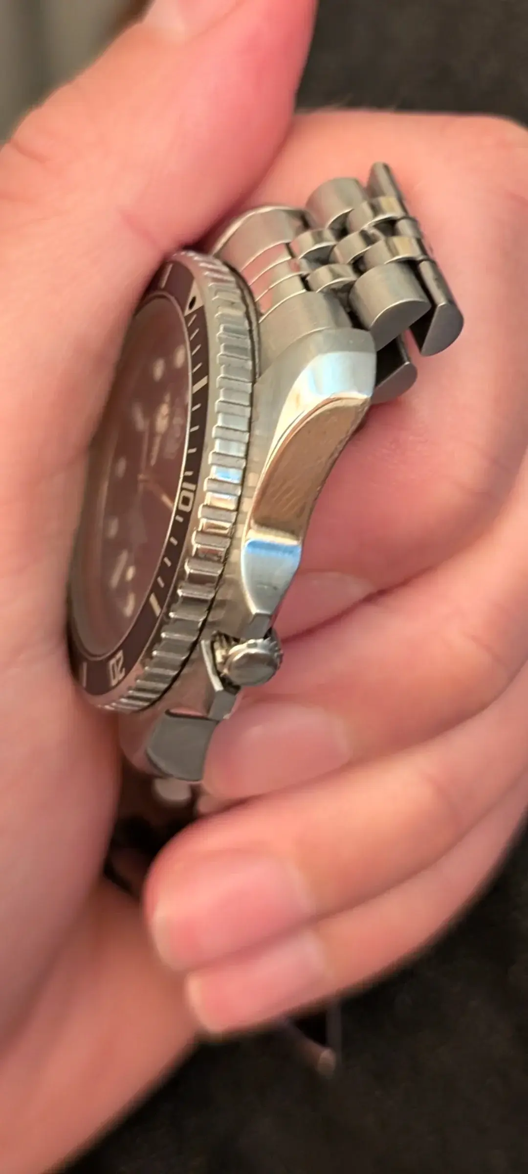
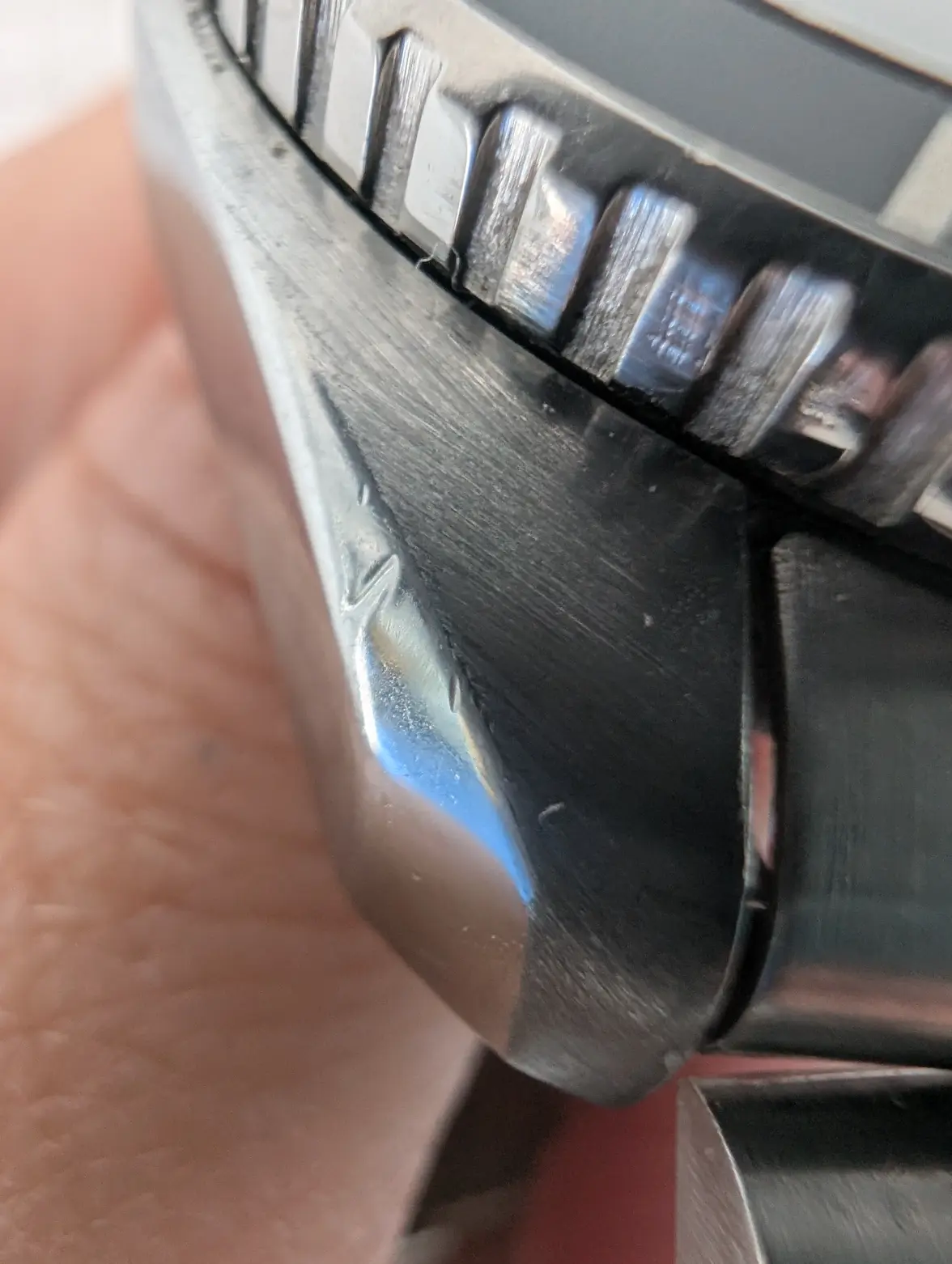
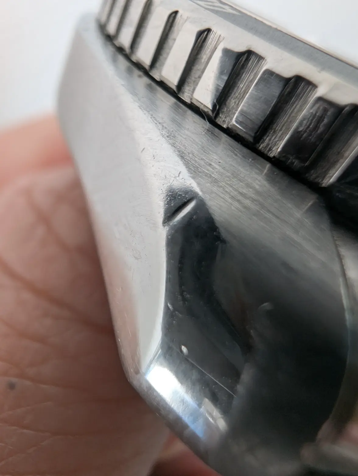
For now, I'll focus on the visual inconstencies. First, the case appears to have been polished. Then there’s the lume: the hour and second hands clearly differ from the minute hand and the dial plots. I initiated a dispute yesterday, and as I highly likely need to escalate the dispute on Thursday, I’ve taken a closer look today and found more concerns.
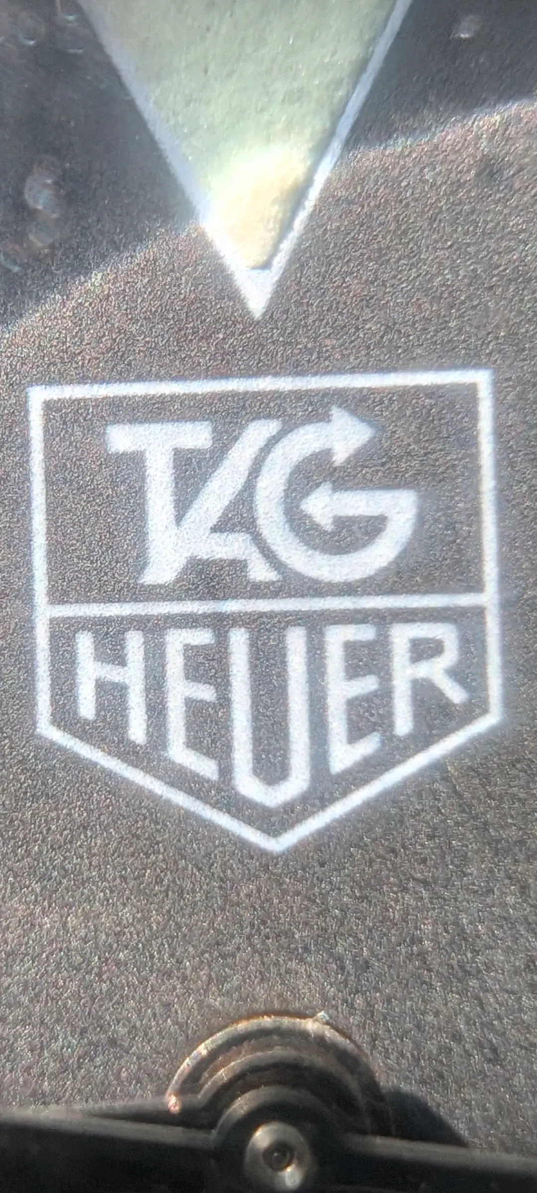
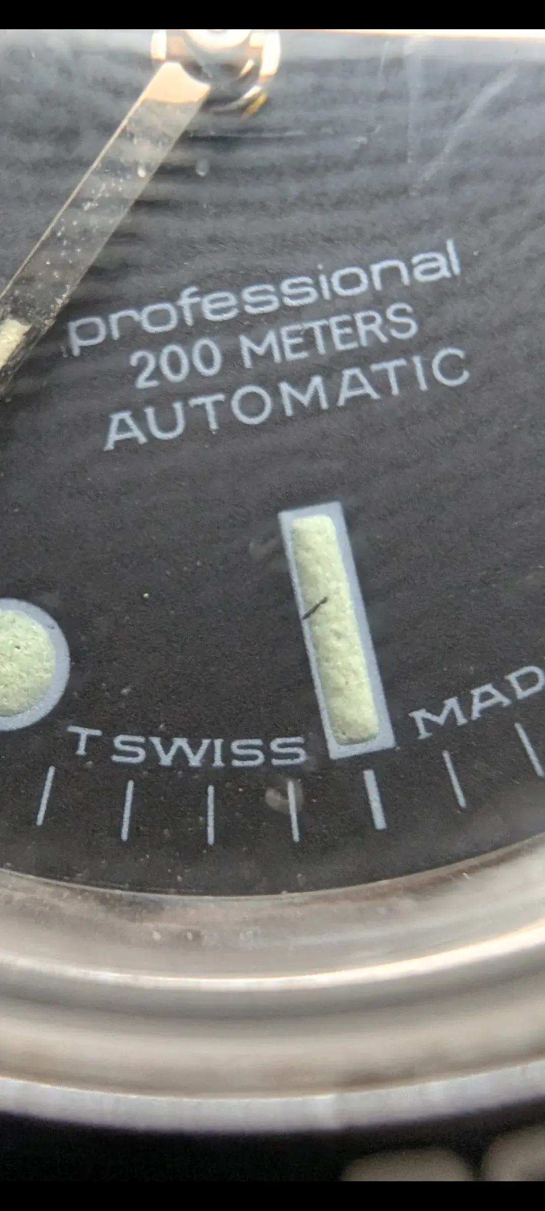
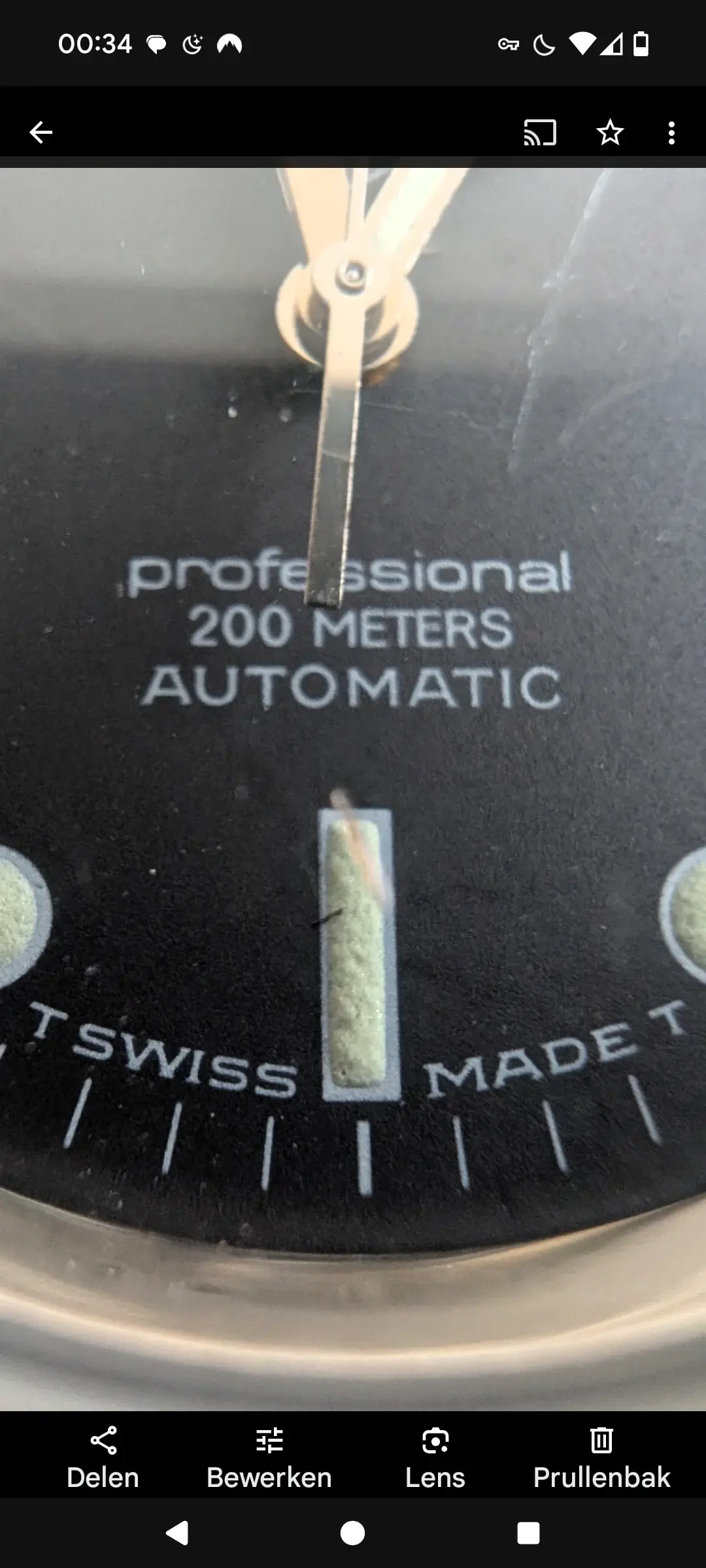
The hour hand looks odd, possibly aftermarket or very poorly relumed. The dial surface is irregular grainy, is that normal for this model? Under magnification, the logo seems questionable: the print shows uneven thickness, slight misalignment, and some of the letter shapes look off compared to known originals. Also the rest of the printing seems odd to me, but because I noticed that more recently, so I don't have proper macro shots from it yet. It's late here and there's no good light anymore to make some.
Any feedback from experienced members would be hugely appreciated. And if anyone with a confirmed original 844/5 could share some macro shots of their dial and logo, that would be extremely helpful for comparison.
Thanks in advance!
