Connected Custom Watchfaces / Which Watch Face are Wearing Today?
Albert-AMG
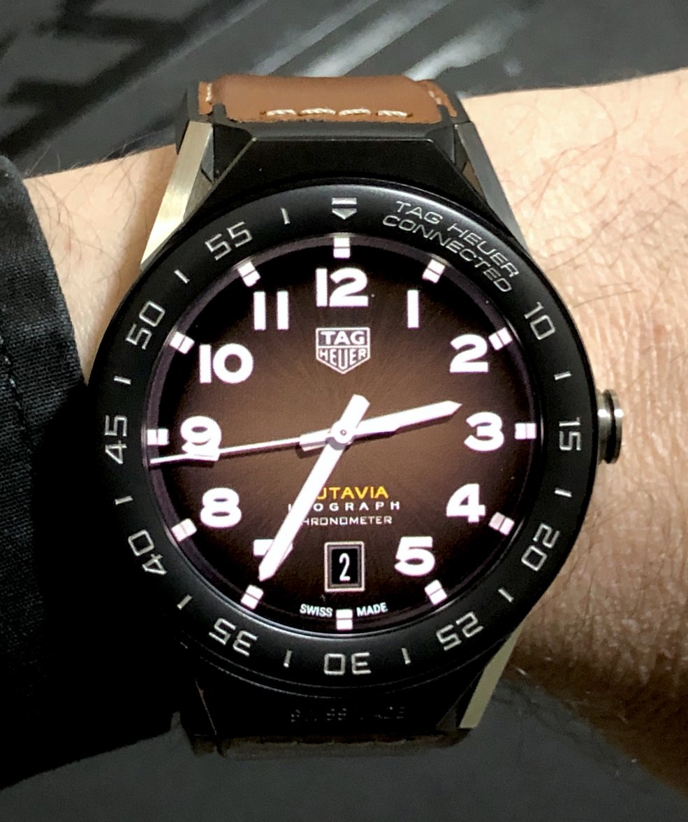
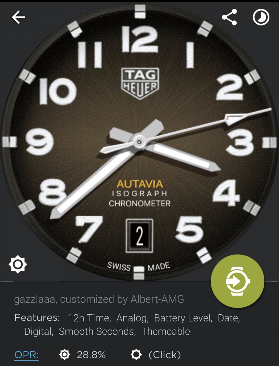
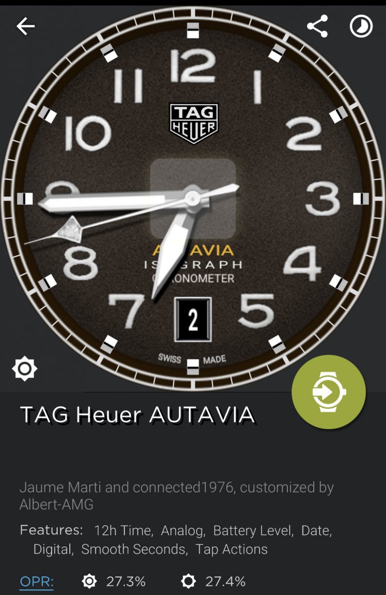
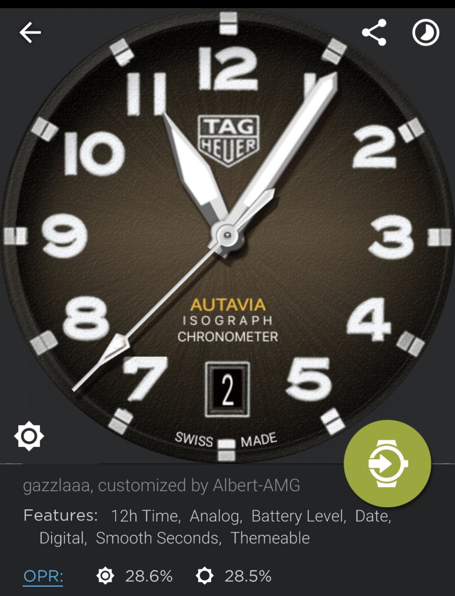
··TAG Heuer Forums ModeratorToday this TAG Heuer Autavia Isograph (2019) face, by gazzlaaa, slightly customized. It’s a “ucolor” face, so you can choose the colour of the background
Picture in ambient/dimmed mode, with seconds hamd showing battery level when dimmed
This is the link for the WatchMaker app:
http://dk2dv4ezy246u.cloudfront.net/share/rJl7mBJWtN.watch
Picture in ambient/dimmed mode, with seconds hamd showing battery level when dimmed
This is the link for the WatchMaker app:
http://dk2dv4ezy246u.cloudfront.net/share/rJl7mBJWtN.watch
Remo
·Today this TAG Heuer Autavia Isograph (2019) face, by gazzlaaa, slightly customized. It’s a “ucolor” face, so you can choose the colour of the background
Picture in ambient/dimmed mode, with seconds hamd showing battery level when dimmed
This is the link for the WatchMaker app:
http://dk2dv4ezy246u.cloudfront.net/share/rJl7mBJWtN.watch
Pretty good version, apart from the hands. I like the original shapes, cause they reflect the Autavia idea (minute-hand=motorsports, hour-hand=aviation).
Albert-AMG
··TAG Heuer Forums ModeratorPretty good version, apart from the hands. I like the original shapes, cause they reflect the Autavia idea (minute-hand=motorsports, hour-hand=aviation).
Yes, this other version (by @connected1976 ) has better hands! 👍 Both versions look nice on the TH Connected 😀
Link:
http://dk2dv4ezy246u.cloudfront.net/share/B1mEGfWtE.watch
Remo
·Yes, this other version (by @connected1976 ) has better hands! 👍 Both versions look nice on the TH Connected 😀
Link:
http://dk2dv4ezy246u.cloudfront.net/share/B1mEGfWtE.watch
Edited:
Albert-AMG
··TAG Heuer Forums ModeratorYes, but here the numerals are too thin. So the combination of both would be optimal. Or the real thing even better 😉
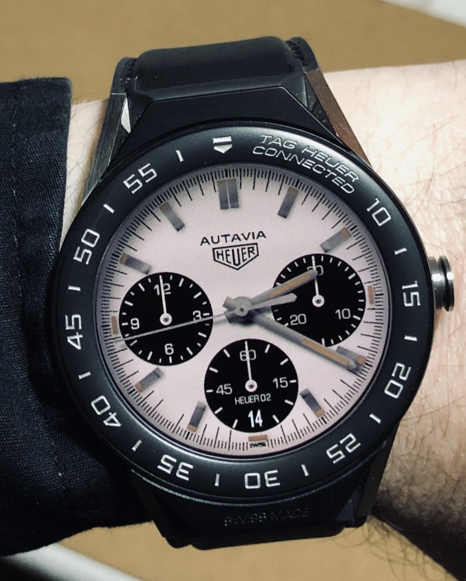
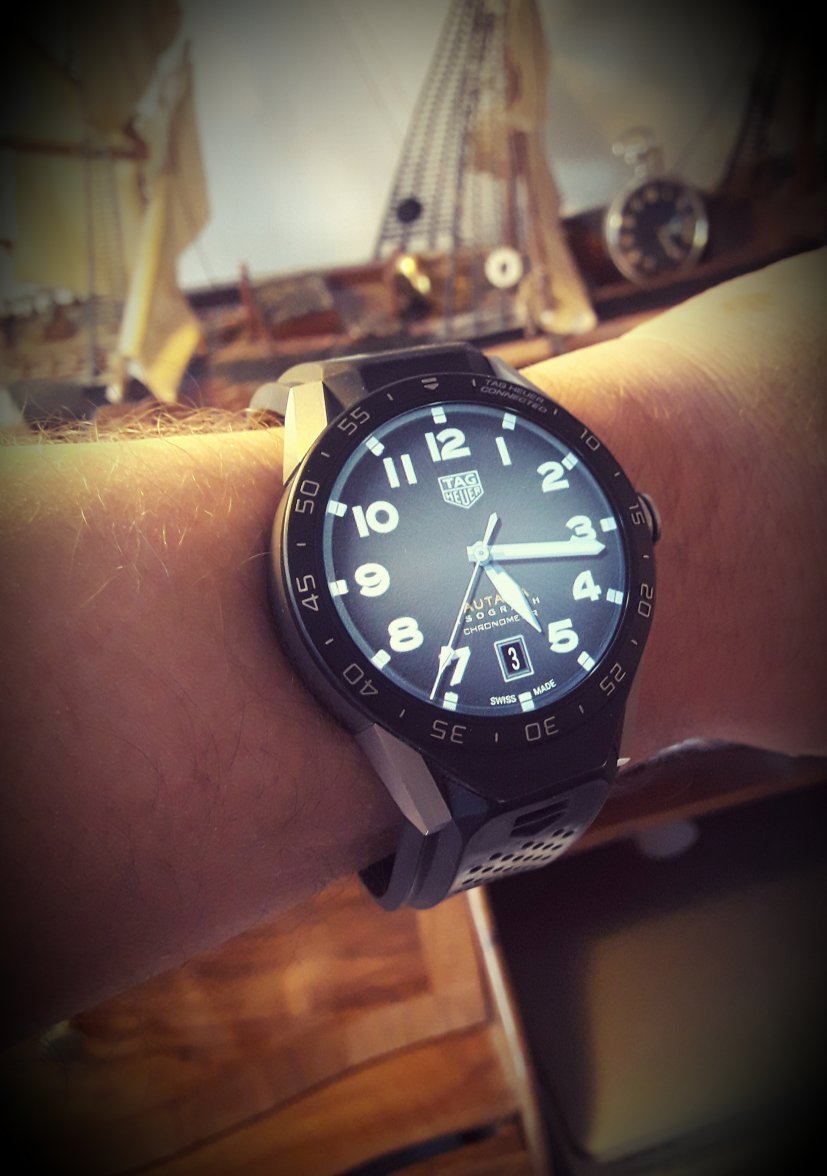
I don’t have the real thing, but here it is... the combination of both versions! 😉
Link for the WatchMaker app:
http://dk2dv4ezy246u.cloudfront.net/share/rJThCSZFV.watch
Hubert
··TAG Heuer Forums ModeratorTeam work is always nice! 👍
dndyols
·Today this Heuer Autavia “Harrods Limited Edition” face, by Gavril Tardi (GabiT), which I customized to become the Harrods version. Picture in dimmed mode, with SW second hand showing battery level
This is the link for the WatchMaker app:
http://dk2dv4ezy246u.cloudfront.net/share/SJj5kHZlE.watch
Please, Can you help me understand, since I might be really confused but I can't reset the left chronograph, is that due to battery indicator?
Thanks for letting me know.
dndyols
·Please, Can you help me understand, since I might be really confused but I can't reset the left chronograph, is that due to battery indicator?
Thanks for letting me know.
Remo
·I don’t have the real thing, but here it is... the combination of both versions! 😉
Albert-AMG
··TAG Heuer Forums ModeratorPlease, Can you help me understand, since I might be really confused but I can't reset the left chronograph, is that due to battery indicator?
Thanks for letting me know.
SW seconds hand shows battery level in dimmed mode, and it’s normal SW seconds hand in bright mode.
whitecap
·I don’t have the real thing, but here it is... the combination of both versions! 😉
Link for the WatchMaker app:
http://dk2dv4ezy246u.cloudfront.net/share/rJThCSZFV.watch
Albert-AMG
··TAG Heuer Forums ModeratorBTW i do love this watch face, how can I customize it myself, since I've notice that the date lacks right "white color" as of the other number and I´m not 100% confident that the font is right.
The link is unlocked, so you can customize the face with the WatchMaker app:
http://dk2dv4ezy246u.cloudfront.net/share/SkVhP8GKN.watch
Anyway, the date is already set in white color (ffffff), but white text is usually showed slightly blue on the watch screen, something that doesn’t happen with white images, just with white text and numbers. If you find the way to improve that “white” date, please inform us here 😉
Albert-AMG
··TAG Heuer Forums ModeratorGreat! 😀 As @Hubert said, this Autavia Isograph face was team work: I found and customized a good base by gazzlaaa (in MeWe), @Remo found the hands mistake, and @connected1976 found the proper hands for his version, also thanks to @Hubert suggestions! 👍
Edited:
dndyols
·The link is unlocked, so you can customize the face with the WatchMaker app:
http://dk2dv4ezy246u.cloudfront.net/share/SkVhP8GKN.watch
Anyway, the date is already set in white color (ffffff), but white text is usually showed slightly blue on the watch screen, something that doesn’t happen with white images, just with white text and numbers. If you find the way to improve that “white” date, please inform us here 😉
For some reson .This face has a much better date .
I keep it as it is .Thanks for this update!
Albert-AMG
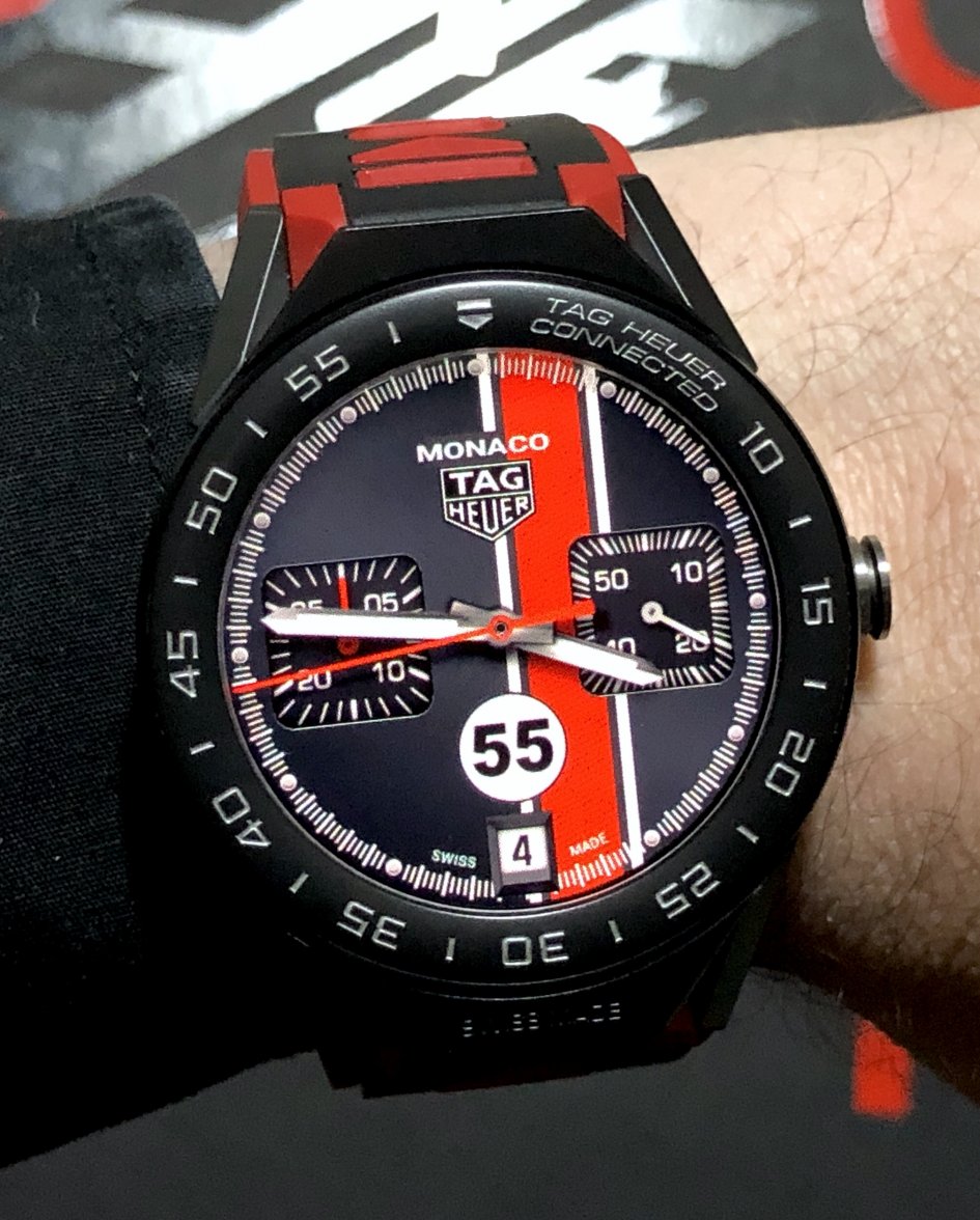
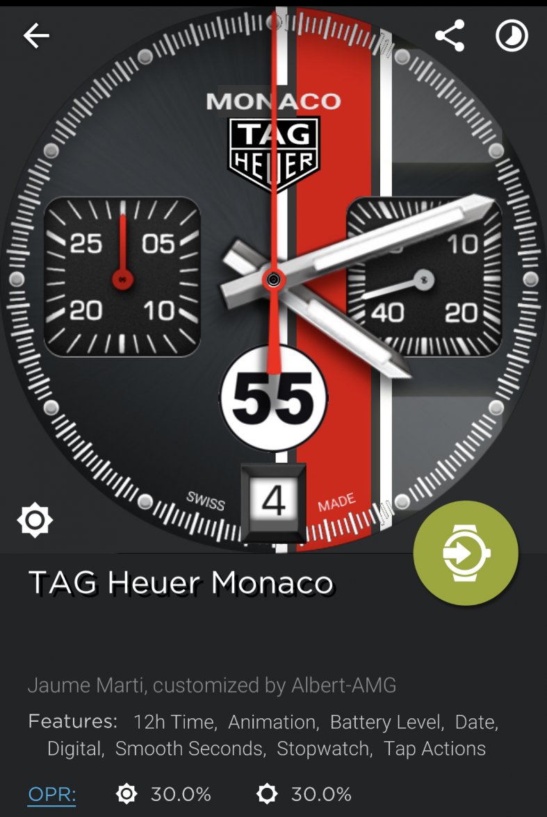
··TAG Heuer Forums ModeratorToday this updated TAG Heuer Monaco Calibre 12 n55 face by Jaume Martí, customized (zoomed and removed bezel) #Monaco50
Picture in dimmed mode, with SW seconds hand showing battery level when dimmed
Updated link for the WatchMaker app:
http://dk2dv4ezy246u.cloudfront.net/share/r1Qhl9mYN.watch
Picture in dimmed mode, with SW seconds hand showing battery level when dimmed
Updated link for the WatchMaker app:
http://dk2dv4ezy246u.cloudfront.net/share/r1Qhl9mYN.watch
Rkick07
·Albert-AMG
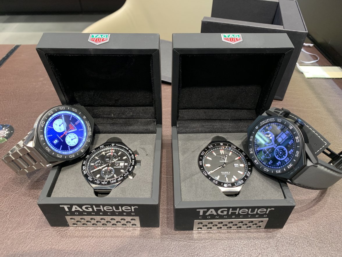
··TAG Heuer Forums ModeratorI did a bad thing.. 🤨
I also did similar “bad things”, but I have only one connected module! 😁
Rkick07
·Nice modular collection!! 😎 👍
I also did similar “bad things”, but I have only one connected module! 😁
this is an expensive addiction
