Baselworld 2015 - Preview

Posts
10,120
Likes
11,179
http://www.tagheuer.com/int-en/live/baselworld

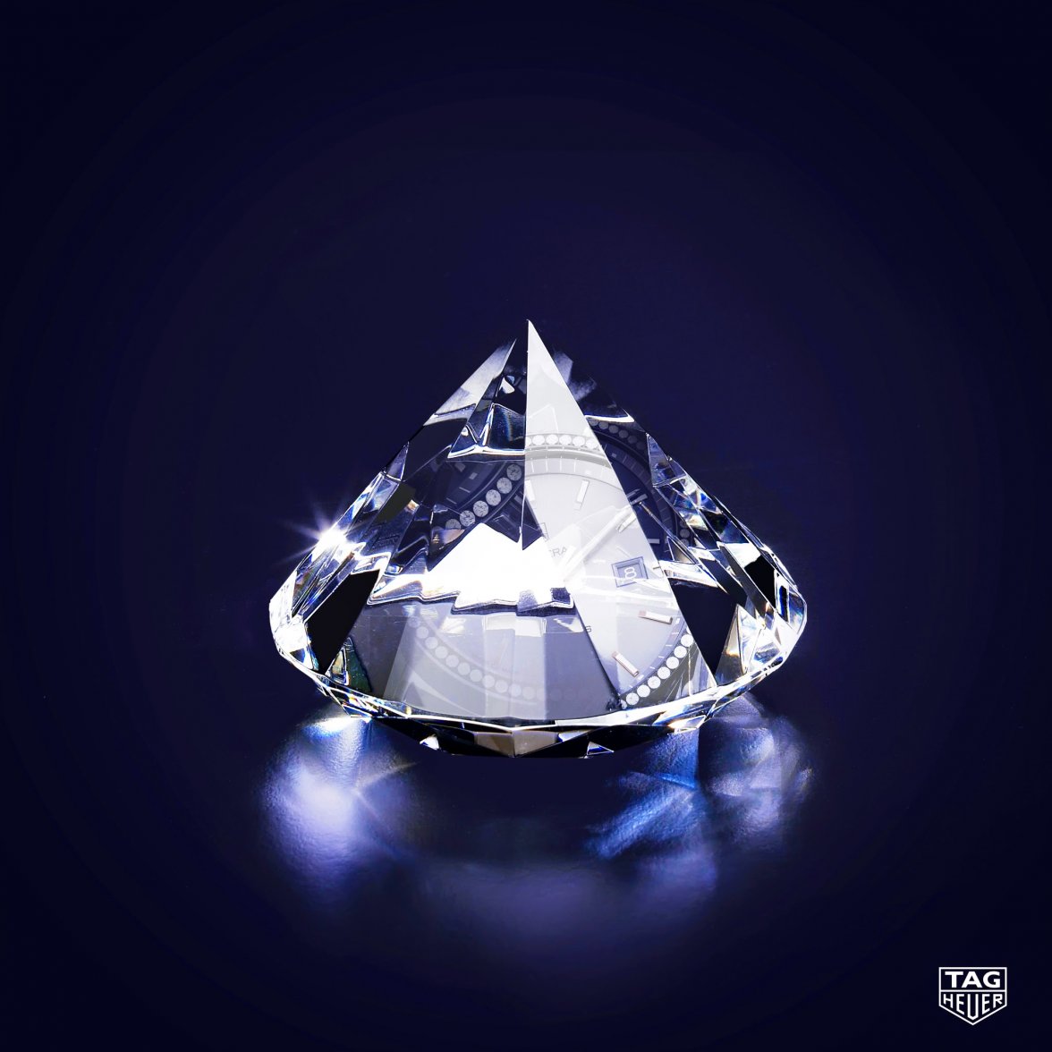
This year at Baselworld, TAG heuer will reveal one of its greatest jewels, perfect combination of raw material and finest watchmaking expertise. #BaselWorld2015
150302_tagheuer_baselworld_v4phantom.png
 
Posts
10,120
Likes
11,179
Probably, or something similar. Cannot be a calibre 36, because its missing the chrono pushers. Judging by the "mold" image, I suspect some light weight alloy, or a carbon composite material.
 
Posts
7,123
Likes
15,096
Good spot- certainly looks like a V4.

While most of TAG Heuer's haute horlogerie range has been wound down, the V4 will continue
 
Posts
23
Likes
4
Calibre11 D.C
That's last year's Monaco V4 😉

I got to try it on at TimeCrafters last spring in NYC. Amazing.

yty2y7ys.jpg
 
Posts
10,120
Likes
11,179
Very nice; let's see how this new one compares.
 
Posts
10,120
Likes
11,179
It’s coming. A perfect balance of innovative design and classic styling. tag.hr/baselworld #BaselWorld2015
150316_tagheuer_baselworld_heuer01.jpg

BTW, what's up with the new logo? Heuer now features more prominently than TAG, but it looks deformed? Thoughts?
 
Posts
10,120
Likes
11,179
Breathtaking, strong, chic, sparkling… she’s a diamond, and we’ve crafted a watch from her unique personality - tag.hr/baselworld. #BaselWorld2015
 
Posts
375
Likes
221
BTW, what's up with the new logo? Heuer now features more prominently than TAG, but it looks deformed? Thoughts?

I noticed it too today on Facebook, here it is:

It is already 30 years old so a revamp might have been needed, but I have to say that it will take a while to get used to it, as I really liked the old "T" and "G"...
 
Posts
7,123
Likes
15,096
Yes, the logo has been revised- for the first time since 1986! The main change is to the "TAG" font, which no longer overlaps and the letters spaced out a little more. It's certainly cleaner, but the sloped "A" and arrows on the "G" have always been part of Techniques d'Avant Garde's logo. It's certainly more modern and cleaner.

 
Posts
7,123
Likes
15,096
Some updated thoughts at calibre11.com on what to expect this week...and you can watch the press conference where:

"Jean-Claude Biver will announce a unique collaboration with global partners that will marry the latest creative technological innovation with TAG Heuer's watchmaking credibility and Swiss watchmaking tradition." I wonder what that could be???

http://www.calibre11.com/2015-baselworld-preview-tag-heuer
 
Posts
160
Likes
33
That movement puzzles me: I don't recognise that toothed foot-shaped lever on a 2824 or 2892.

What looks like a 1 behind the watermark logo is also confusing because it looks like the hands are at 10:10.

Mainly, that lever is bugging me.
Is it just part of the setting mechanism that I'm not recognising? Is it a (hefty) retrograde? Power reserve indicator? Any watchmakers/tinkerers have a better answer?
 
Posts
160
Likes
33
Oh wait, skeletonised dial: that 1 could be part of the exposed date ring.

Still leaves that lever.
Looks like it is running from the setting wheels are but there looks like there are a few extra wheels in that area so it might actually not be that.
What else uses a lever (rack) like that?
The only other thing I can think of is a striking lever. If only I could see the whole thing then I could count the teeth and make a better guess...
 
Posts
10,120
Likes
11,179
While the old logo certainly could have used some updates, in order to match the currently "flat" design language used by many in the high-tech industry, I think the proportions should have been somewhere in between, like the 3rd image I edited below:
Edited: