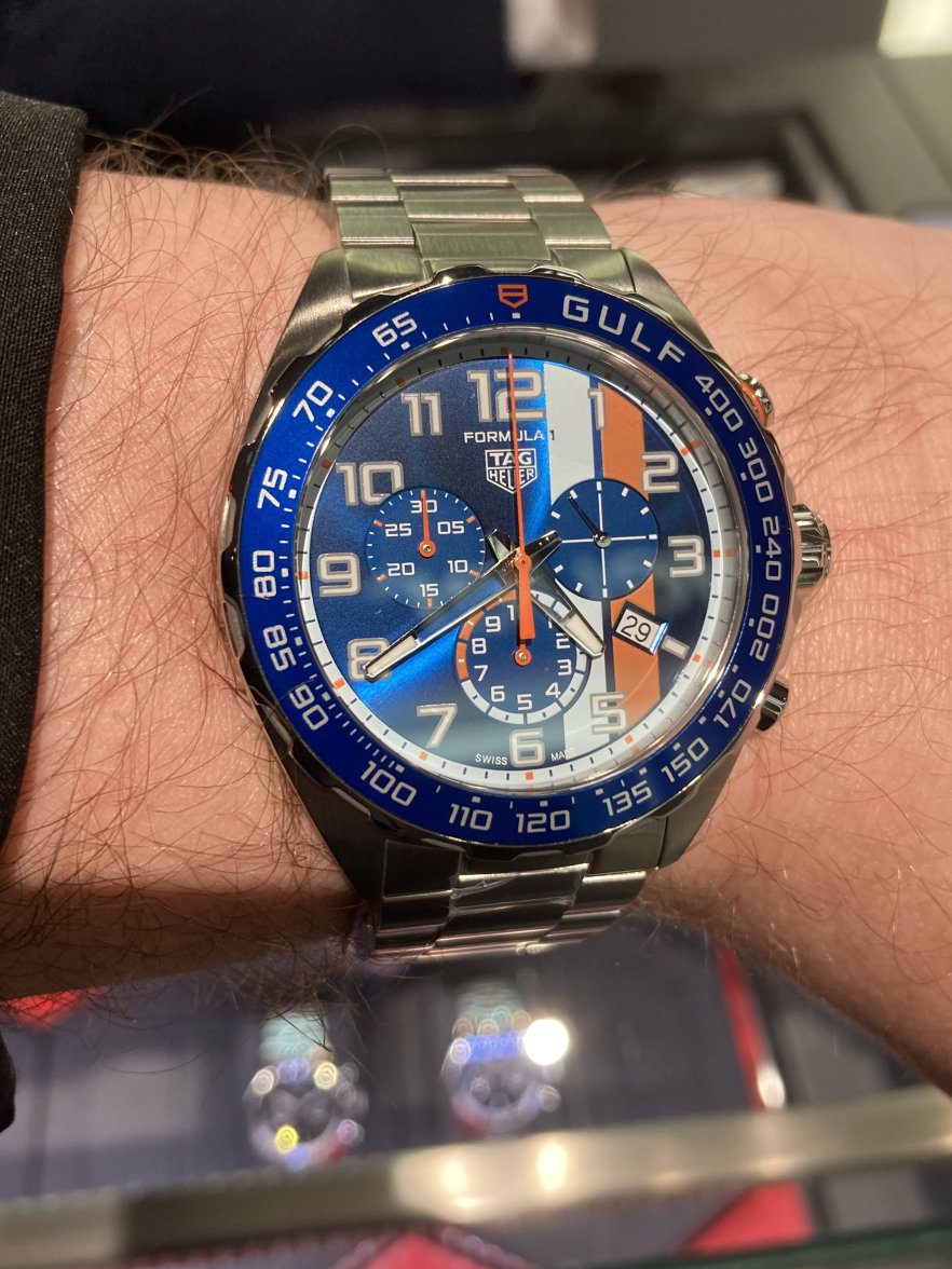
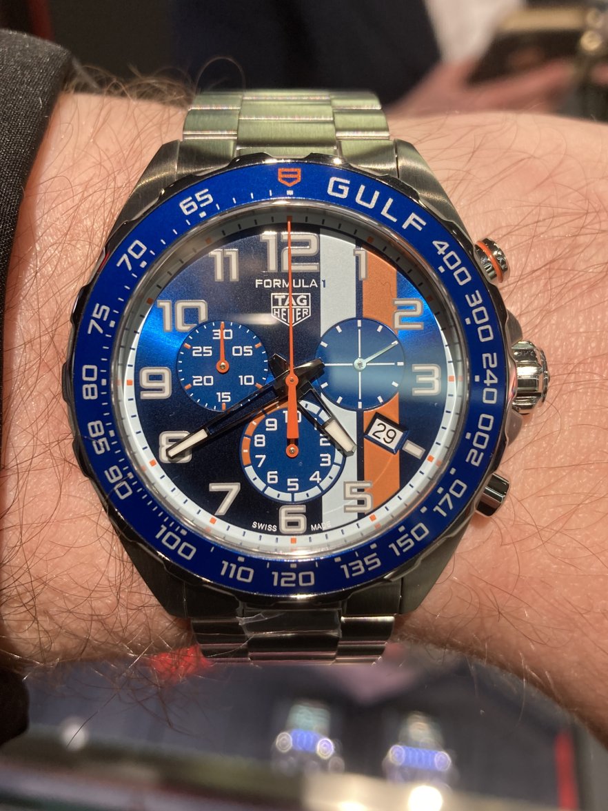
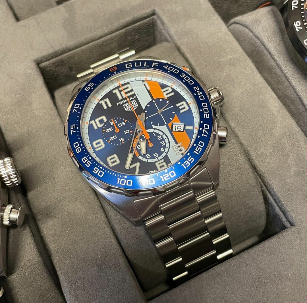
2023 TAG Heuer Formula 1 Gulf Edition
Jim Dollares
·Love the deep blue sunburst, this reminds me of the mighty 211T aka gulf king
Mspeedster
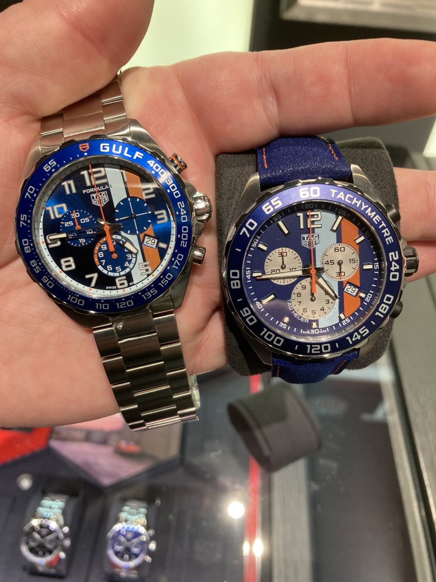
·Looks similar at first glance but viewed side by side with the previous one it’s actually quite a bit nicer.
There are pros and cons. The new one is a lot busier looking, similar to the latest Red Bull's busy design. Also, I do prefer the contrasting off-white sub-dials of the old model (making it a blue reverse panda), as well as having hour markers as opposed to the numbers on the new one. Some people may have not liked the old one's black pushers and crown. But for me, it matched the black hands within the sub-dials. So silver vs. black crown/pushers is a wash. The old one could be had with a unique asphalt leather strap or bracelet, the new one only seems to come on the same bracelet.
Then there's the price. The old one's retail, when initially released, was $1600 USD. The new one is $2350, which makes it a non-starter. I simply can't justify paying over $2000 for quartz.
Edited:
Hubert
·Updated title.
Aquagraph
·This is a great improvement
abrod520
·The vibrant sunburst blue dial is main thing this new version has going for it. Overall, I like it quite a bit, but I'd say it's only marginally nicer for me.
I'd say looking at them side by side, the biggest improvement was the white outer dial ring - it gave it a much greater sense of depth. The more vibrant blue bezel helps a lot too, and I think the steel pushers and crown give it a more premium feel. I'm still never going to buy a quartz watch but this was the first quartz F1 I appreciated on the wrist, for whatever that's worth
Aquagraph
·Yeah, steel pushers get a big thumbs up!
Mspeedster
·I'd say looking at them side by side, the biggest improvement was the white outer dial ring - it gave it a much greater sense of depth. The more vibrant blue bezel helps a lot too, and I think the steel pushers and crown give it a more premium feel. I'm still never going to buy a quartz watch but this was the first quartz F1 I appreciated on the wrist, for whatever that's worth
But I still stand by what I said previously, there are pros and cons for me. I just have a thing for pandas/reverse pandas, hence the new one isn't an instant slam dunk. I do feel the new one is better, but not enough that I'd buy one even if the price was the same as when I got mine.
Mspeedster
·Let me put it another way. If the new one had the same matte blue dial as the old one, I think I'd like the old one better. It's that gorgeous blue on the new one that grabs me most.
bpsmith
·Love the old one. Love the new one. Both excellent to me.
HoltzPlatz
·The bezel with smaller numbers and concise markers for speed are a welcomed upgrade. An improvement to the somewhat oversized and cartoonish one on the "old" version I have. Can I update my bezel to this "new" one?
Edited:
Mspeedster
·The bezel with smaller numbers and concise markers for speed are a welcomed upgrade. An improvement to the somewhat oversized and cartoonish one on the "old" version I have. Can I update my bezel to this "new" one?
But the color is a brighter blue, so I don't think it will match the blue dial on the old one, even if you could find the bezel insert separately. I guess you'll just have to buy the new one @HoltzPlatz. 😁
HoltzPlatz
·👎
Anthony.
·Seems to look out of place in the light blue.
Obviously it's part of the Formula 1 but looks lonely out there on its own.
Albert-AMG
·Looks similar at first glance but viewed side by side with the previous one it’s actually quite a bit nicer.
bpsmith
·I really like this one. Kind of rescue’s the lack of Watches and Wonders releases that appeal to me personally this year.
Jim Dollares
·I really like this one. Kind of rescue’s the lack of Watches and Wonders releases that appeal to me personally this year.
bpsmith
·I agree with the mighty Ben, the new one is about 120 times better than the previous version. Busy dial aint no issue for me, my thoughts are always super busy and confused, perhaps this is why I like a good busy dial.
Aquagraph
·Definitely better than the previous one.
Similar threads
- Posts
- 130
- Views
- 9K
- Posts
- 7
- Views
- 1K
- Posts
- 143
- Views
- 9K
- Posts
- 33
- Views
- 3K


