KojakWeb
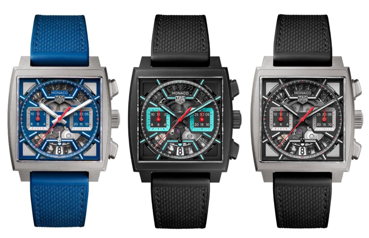
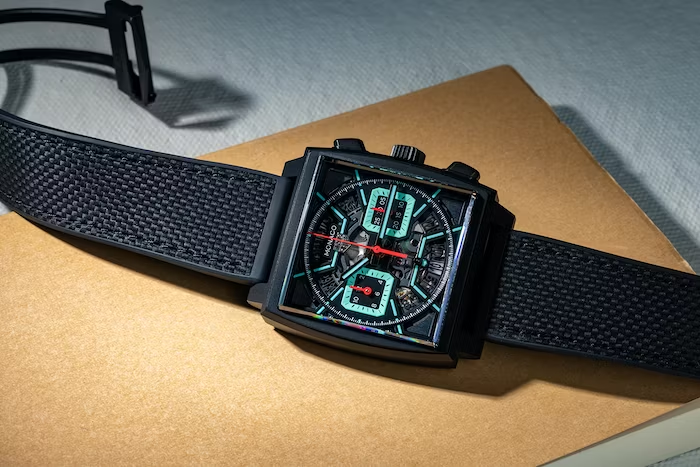
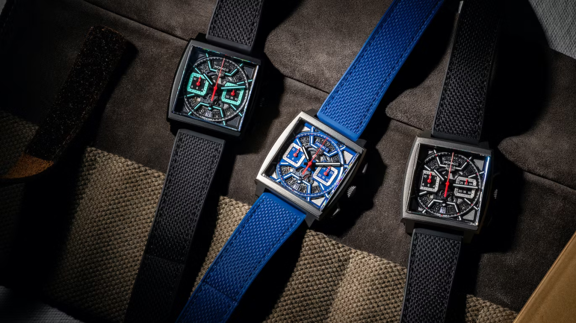
·In May'23 TAG Heuer released not one but three skeletonised Monacos to celebrate the 80th Monaco Grand Prix. Two of them use traditional colours in a bead blasted titanium case, but the one I ended up getting was the luminous turquoise edition in a black DLC coated titanium case, which some have nicknamed "Tron". Compared to the 2015 re-issued Steve McQueen and the 2022 re-imagined Dark Lord that I already have, this watch certainly has a bold design and justifies the website's description as being "Fierce and Unruly". I don't know whether they realised that this could be abbreviated to "FU", but "The FU Monaco" might be an alternative nickname for this watch, as it sticks the proverbial middle finger up to its forebears.
Photo 1: Class of '23
We've been here before with the likes of the Sixty-Nine, Twenty-Four, LS, Mikrograph, all attempts by TAG Heuer to break with tradition. You can point to the V4 as the first skeletonised Monaco. But more recent releases have paved the way to what we have today. TAG Heuer produced a one off Monaco for the 2021 Only Watch auction, a skeletonised version of the legendary 1974 Dark Lord housed in a forged carbon case. Then in March'22 they launched the Monaco Riviera, re-using the dial design and drenching it in the fashionable Tiffany blue (sorry, turquoise). Limited to 30 timepieces and limited in appeal to those that thought the design bore little resemblance to Monaco's past (despite the familiar steel case). All of these examples of skeletonised Monacos have been extremely expensive, so this year marks the first time we see something more affordable, relatively speaking (more on that later).
Photo 2: Meet the Parents?
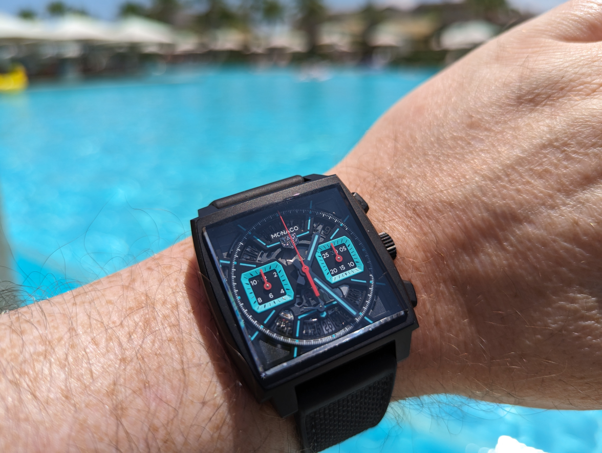
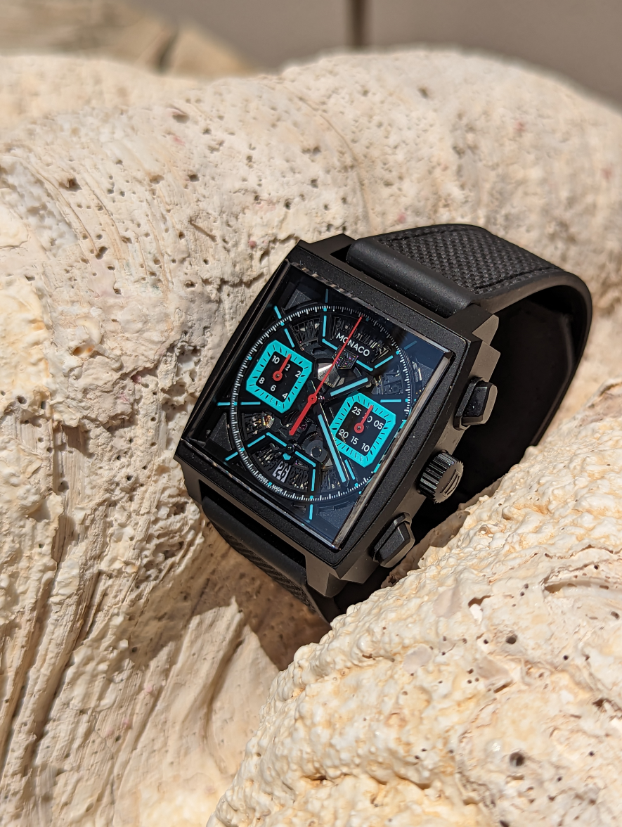
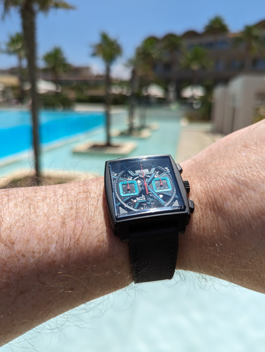
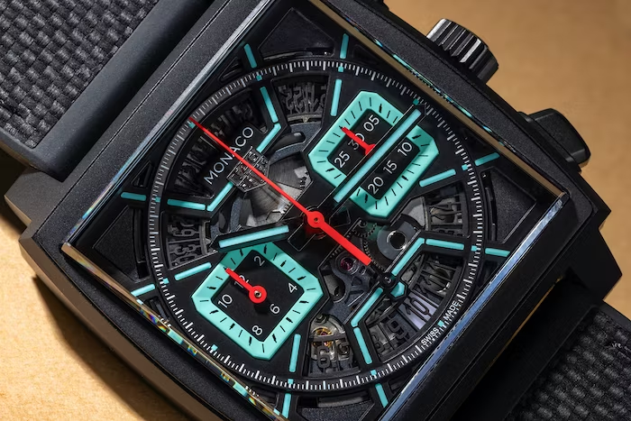
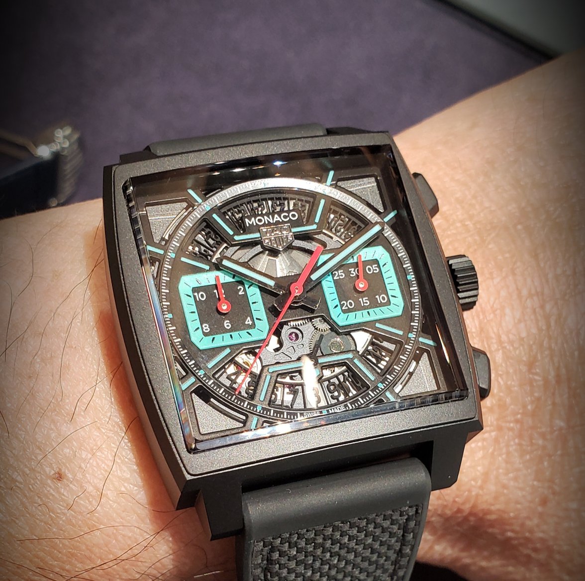
The dial on the FU Monaco (and it's siblings) has undergone a redesign, with the skeletonisation integrated into the hour indices themselves. Although the cardinal indices are removed, presumably to reduce clutter, the others start from the edge of the dial and converge until they meet up with either of the two chronograph subdials or the horizontal bridge that supports the Tag Heuer applied logo or the other horizontal bridge with the small seconds hand. The small seconds sub-dial present on the Only Watch/Riviera has been removed thus restoring the bi-compax aesthetic of this Monaco, but admitadely legibility is impacted. Unlike the Riviera's over-abundance of tiffany blue (again sorry, turquoise) which made it look washed out, it's paired right back on the FU Monaco, but with a black outline the accent colour really stands out proving that less is definitely more! This black outline gives the minute track the appearance of floating on top of the elongated skeletonised indices. Other than that it's the same as other Heuer02 based Monacos except for turquoise column wheel/rotor inscription. We also see the introduction of a flexible and very comfortable hybrid rubber/leather strap.
Photo 3: What time does the pool bar open?
Since picking this up on launch day my opinion of this watch has changed. At one point I even felt uneasy with my purchase, part of that was down to the price (again more on that later) but part of it is that the design is so different from what has come before. I do wonder whether that feeling of unease is how people felt when the Monaco originally launched in 1969, it's bold design challenged preconceived notions about what a watch should look like and earned it a reputation of being a maverick. Not many were brave enough to buy the watch, as supposedly less than 5,000 timepieces were sold before production was ceased in the 70s (despite the Autavia and Carrera continuing to sell well). It has taken time for the Monaco to build up a following, it's design now considered iconic but perhaps it's no longer the maverick it once was. Maybe that's what the FU Monaco has recaptured, forcing prospective buyers to judge it on it's own merits without relying on nostalgia (save for the familiar case shape).
Photo 4: Feeling a bit clammy?
Being a maverick doesn't come cheap as it's priced at £3k more than the other Monaco watches in the core lineup (or £2k more than the special edition Dark Lord). Whether you go for this or the other more traditional coloured version of the watch, does the skeletonised dial justify the extra cost? I do get it, creating an openwork version of a watch "should" cost more, but to this extent? Personally I would have liked them to have included something to really differentiate it from the other watches in the lineup, maybe include the Heuer02 flyback complication in the price?
Photo 5: Staring at the sun!
Skeletonised watches aren't for everyone, especially where the skeletonisation can reduce legibility (e.g. Zenith Defy). But TAG Heuer's decision to use the skeletonisation to accentuate the indices mitigates this to a great degree. For me this watch wears more casual than the other Monacos in my collection. It's been my go to watch for my summer holiday and feels at home in the blazing Mediterranean sun where it really comes to life. But I understand that many would consider this to be the black sheep of the Monaco family. Family members might be shocked, jealous or even a little proud that this watch doesn't feel obliged to adhere to convention and is able to get away with being fierce and unruly.

Photo 6: Can you guess the other watches?
Photo 1: Class of '23
We've been here before with the likes of the Sixty-Nine, Twenty-Four, LS, Mikrograph, all attempts by TAG Heuer to break with tradition. You can point to the V4 as the first skeletonised Monaco. But more recent releases have paved the way to what we have today. TAG Heuer produced a one off Monaco for the 2021 Only Watch auction, a skeletonised version of the legendary 1974 Dark Lord housed in a forged carbon case. Then in March'22 they launched the Monaco Riviera, re-using the dial design and drenching it in the fashionable Tiffany blue (sorry, turquoise). Limited to 30 timepieces and limited in appeal to those that thought the design bore little resemblance to Monaco's past (despite the familiar steel case). All of these examples of skeletonised Monacos have been extremely expensive, so this year marks the first time we see something more affordable, relatively speaking (more on that later).
Photo 2: Meet the Parents?
The dial on the FU Monaco (and it's siblings) has undergone a redesign, with the skeletonisation integrated into the hour indices themselves. Although the cardinal indices are removed, presumably to reduce clutter, the others start from the edge of the dial and converge until they meet up with either of the two chronograph subdials or the horizontal bridge that supports the Tag Heuer applied logo or the other horizontal bridge with the small seconds hand. The small seconds sub-dial present on the Only Watch/Riviera has been removed thus restoring the bi-compax aesthetic of this Monaco, but admitadely legibility is impacted. Unlike the Riviera's over-abundance of tiffany blue (again sorry, turquoise) which made it look washed out, it's paired right back on the FU Monaco, but with a black outline the accent colour really stands out proving that less is definitely more! This black outline gives the minute track the appearance of floating on top of the elongated skeletonised indices. Other than that it's the same as other Heuer02 based Monacos except for turquoise column wheel/rotor inscription. We also see the introduction of a flexible and very comfortable hybrid rubber/leather strap.
Photo 3: What time does the pool bar open?
Since picking this up on launch day my opinion of this watch has changed. At one point I even felt uneasy with my purchase, part of that was down to the price (again more on that later) but part of it is that the design is so different from what has come before. I do wonder whether that feeling of unease is how people felt when the Monaco originally launched in 1969, it's bold design challenged preconceived notions about what a watch should look like and earned it a reputation of being a maverick. Not many were brave enough to buy the watch, as supposedly less than 5,000 timepieces were sold before production was ceased in the 70s (despite the Autavia and Carrera continuing to sell well). It has taken time for the Monaco to build up a following, it's design now considered iconic but perhaps it's no longer the maverick it once was. Maybe that's what the FU Monaco has recaptured, forcing prospective buyers to judge it on it's own merits without relying on nostalgia (save for the familiar case shape).
Photo 4: Feeling a bit clammy?
Being a maverick doesn't come cheap as it's priced at £3k more than the other Monaco watches in the core lineup (or £2k more than the special edition Dark Lord). Whether you go for this or the other more traditional coloured version of the watch, does the skeletonised dial justify the extra cost? I do get it, creating an openwork version of a watch "should" cost more, but to this extent? Personally I would have liked them to have included something to really differentiate it from the other watches in the lineup, maybe include the Heuer02 flyback complication in the price?
Photo 5: Staring at the sun!
Skeletonised watches aren't for everyone, especially where the skeletonisation can reduce legibility (e.g. Zenith Defy). But TAG Heuer's decision to use the skeletonisation to accentuate the indices mitigates this to a great degree. For me this watch wears more casual than the other Monacos in my collection. It's been my go to watch for my summer holiday and feels at home in the blazing Mediterranean sun where it really comes to life. But I understand that many would consider this to be the black sheep of the Monaco family. Family members might be shocked, jealous or even a little proud that this watch doesn't feel obliged to adhere to convention and is able to get away with being fierce and unruly.
Photo 6: Can you guess the other watches?
Edited:
