Chrisred71
·When Tag Heuer redesigned the Aquaracer back in april 2021, scraping almost instantly all WAYXXXX references in the process, I was disappointed.
The new watch, with references starting with WBP, is a lot more generic than its predecessor. You could say what you want about the WAY Aquaracer, but even when fitted with a Pepsi bezel and a cyclop, it was still doing its own thing. It was a very unique, distinctive & original design.
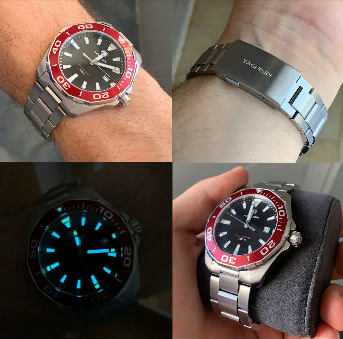
This 101B is interesting because it part ways with the cyclop and the ridged lines on the dial. Two elements (borrowed from other brands) this design never needed to shine. The touch of color on the bezel is also not borrowed elsewhere (no, it's not the same red as Tudor's). A few pictures of mine below :
The bracelet was also unique in its own way, with hexa-shaped links and "Tag Heuer" simply engraved on the clasp.
Overall, I think this design might have been too idiosyncratic for some, maybe too agressive, which led to the brand massively softening the looks of the Aquaracer for the next generation watches. I personnally loved the Aquaracer for being unique and agressive.
Here's what traits the WBP redesign lost, in favor of more generic/lesser elements :
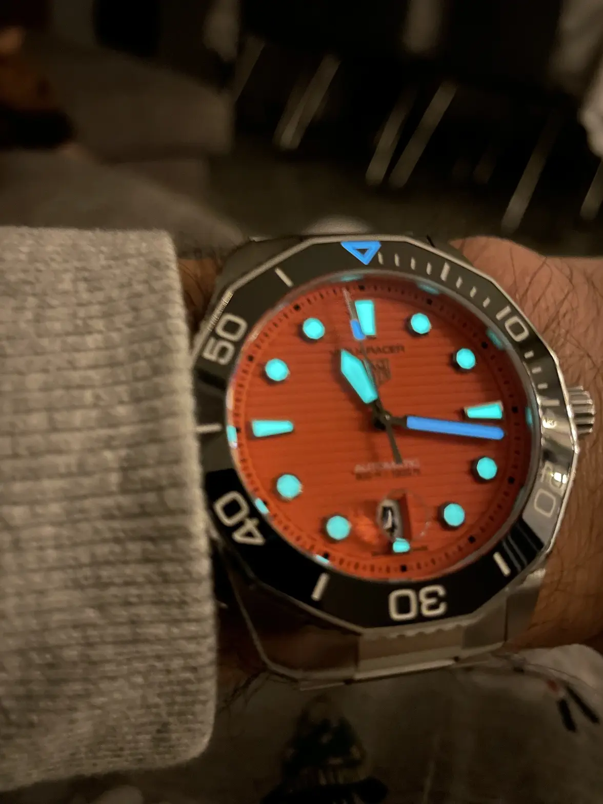
- Triangle indexes with dual lume at 6-9-12
(now octagonal indexes, appears round from a distance, no dual lume)
- Blue Super Luminova BGW9 (now green, I assume C7/C5, and doesn't last as long)
- "LOGO" hour and minute hands, with dual lume (now generic sword hands, no dual lume)
- Lume pip at 12 (now lumed triangle at 12 and nothing on steel bezels watches)
- Bracelet with hexa-shaped links, Tag Heuer engraved letters (Now generic flat link bracelet, Tag Heuer logo no text version engraved on clasp which is rather reminiscent of the Tudor shield).
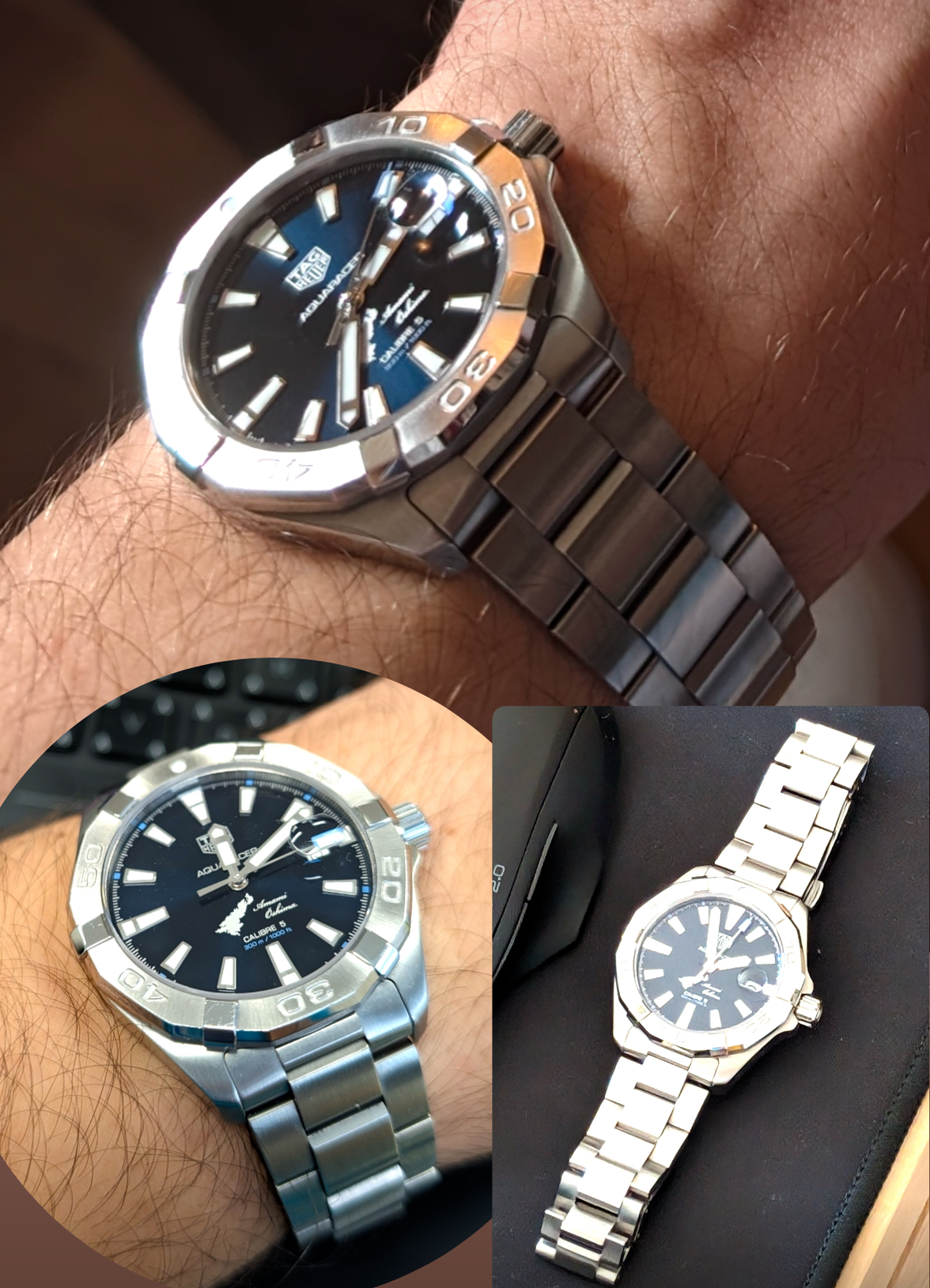
- 300M of W.R for all watches across the line-up (steel bezel refs. have been downgraded to 200)
Overall, I understand the decision of the brand to redirect the Aquaracer line towards a larger audience by softening the design.
After all, a product liked by many will sell more than one loved by a few.
I'm just sad to see one of my favorite watch designs of all time being up(down?)graded to something often mocked as "poor men's Seamaster" , because the previous gen was nothing like that.
Let me know what you think below, alongside your favorite references of ARs no matter which gen !
Good day.


