- Posts
- 1
- Likes
- 1
Watchface
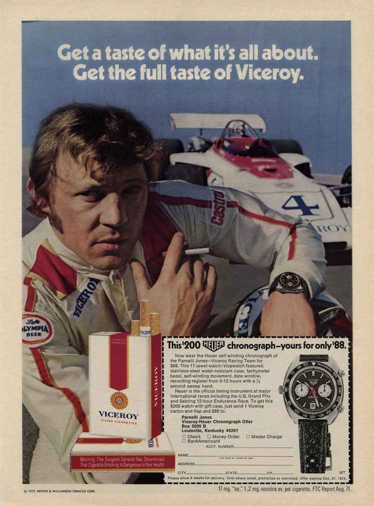
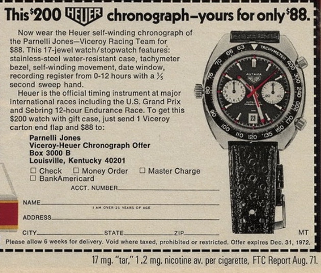
·So, everyone knows the story of the Viceroy cigarette/Heuer chronograph promotion from the early 70’s. Here below is the well-known advert.
Recently I was doing a little background research on the Heuer 1163V that led me to look a little closer at this advert – and I found 3 very weird things.
Does this give you the pip?
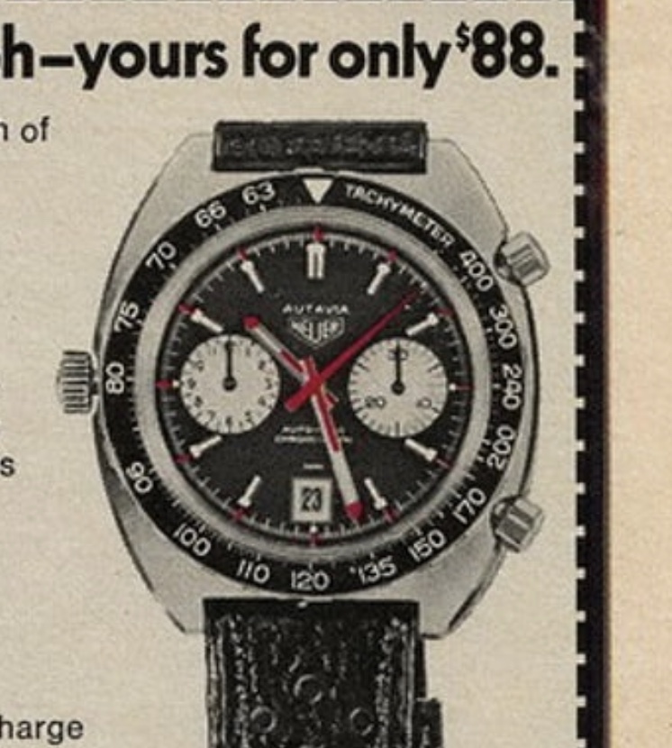
Now look closely at the watch in the ad. Notice the lume pips at 3 ,6 and 9. The plots or pips are located just at the outer edge of the red 5-minute markers. The 3 and 9 sit just off the subdials and the one at 6 sits just below the date window. What is curious is that every other Heuer Viceroy has those lume dots located back on the minute track. A quick google image search can attest to this. Weird huh?
Spooky numbers!
Now this one is uncanny. Viceroy sponsored the Pernelli Jones Racing team, so the team was the logical choice as the tie in when they decided to run the Heuer chronograph promotion. Parnelli Jones the owner of the team - was an accomplished driver and competed in many national races, but he only won the Indianapolis 500 once. The year he won was 1963, he started in pole position and he finished first.
#1 pole position, # 1 podium finish, year 63. (do you see where I’m going with this) Now V stands for Viceroy but allow a little creative license because it’s also the Roman numeral for 5 as in Indy 500 bring those numbers together and you get 1163V. (Cue twilight zone music)
Did Heuer make a Franken watch for this ad?
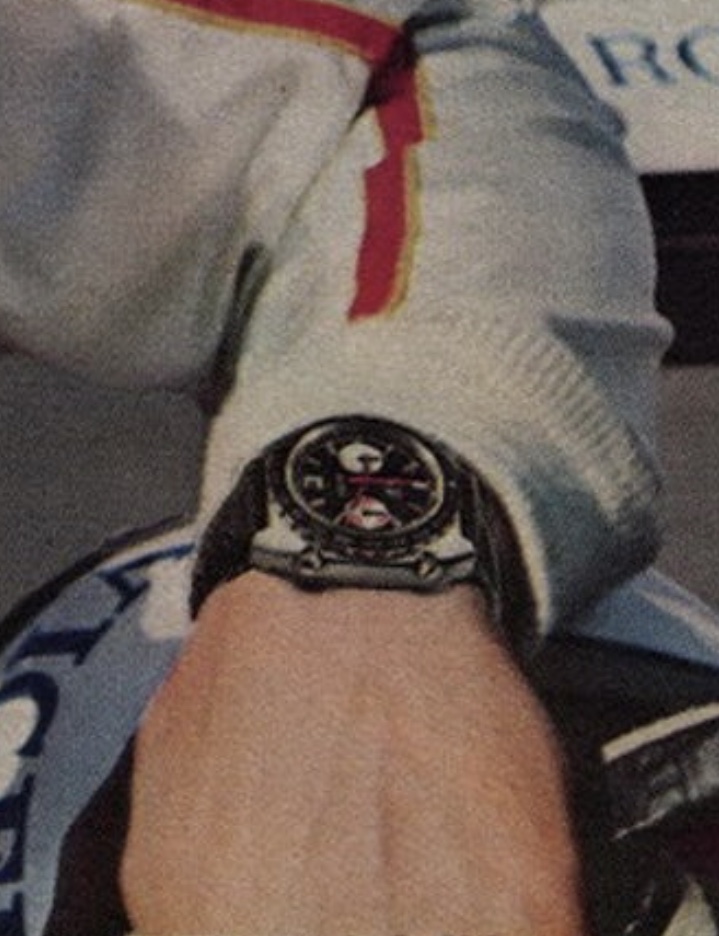
Now look closely at the watch in the ad. No. Not that one. I’m talking about the one on the wrist of the actor coolly smoking his viceroy. Clearly, he’s wearing a Heuer chronograph. But, Ahem, what model? The pushers are exposed from the front, so we can see the case is made by Schmitz. The watch also clearly shows a red chrono hand as used by the Viceroy, but it also has coloured markings around the right subdial just like the orange boy. As far as I can tell Heuer never made a watch with that colorway. What the?


