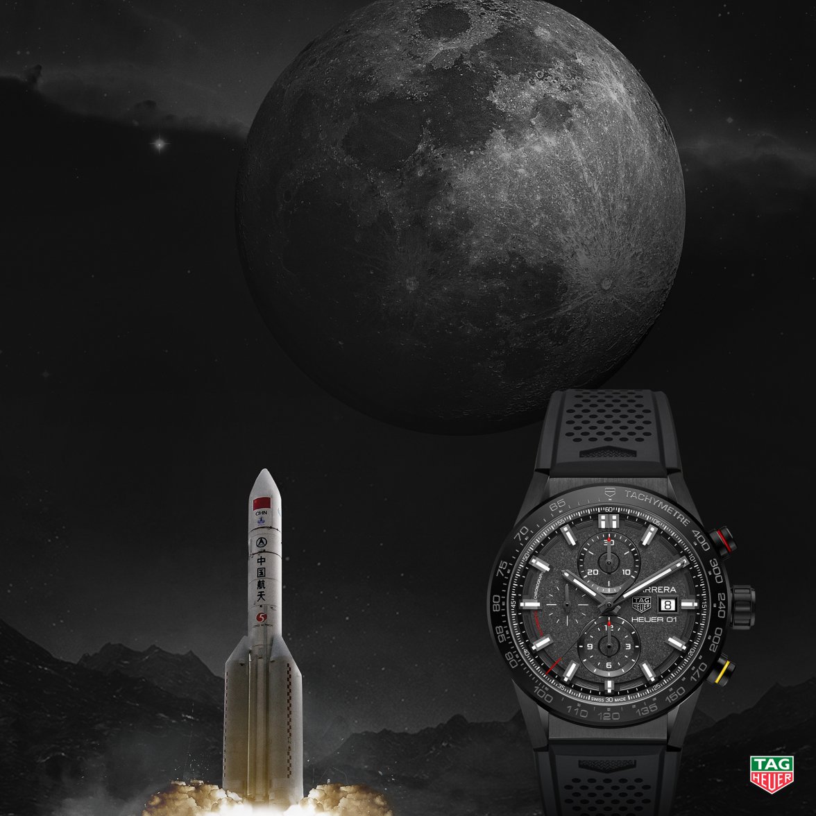
2018 TAG Heuer HEUER 01 China Space Exploration "Hidden Face of the Moon" (CAR201J)

Posts
21,243
Likes
29,675
My mistake, you're right. The blue moonphase released before is steel, with a blue dial and bezel. This one is in a blue ceramic case. For some odd reason, along with the CK2998 pulsations LE it hasn't been highlighted by any other media outlet.

The Basel releases this year are pretty boring, and Omega is no exception - though I have tried on the Planet Ocean Big Blue (which is made of the same blue ceramic) and it's actually kinda cool

Ah right, so I wasn't going mad then! :)
 
Posts
11,518
Likes
36,894
Ah right, so I wasn't going mad then! :)

We should be seeing more in the next few days, looks like many of the pieces from Omega and others we've seen on social media haven't been "officially" debuted yet.
 
Posts
23
Likes
17
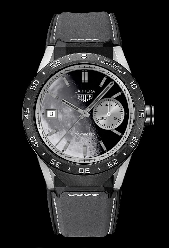
Really love the textured dial on this one. I think the Aquaracer version would be much improved with some texture on the dial, whether on the whole thing (with the Moon part smooth) or having the main dial smooth, with the Moon part visibly textured and having some depth to it... give some actual depth to the craters/seas.

Seems bizarre to me that neither of these two CLEP watches have any Chinese writing on them. They use "CLEP", the English abbreviation? Would seem far more "authentic" (and desireable) to me if the majority of the writing were in Chinese.
 
Posts
10,048
Likes
11,103
Really love the textured dial on this one. I think the Aquaracer version would be much improved with some texture on the dial, whether on the whole thing (with the Moon part smooth) or having the main dial smooth, with the Moon part visibly textured and having some depth to it... give some actual depth to the craters/seas.

Seems bizarre to me that neither of these two CLEP watches have any Chinese writing on them. They use "CLEP", the English abbreviation? Would seem far more "authentic" (and desireable) to me if the majority of the writing were in Chinese.
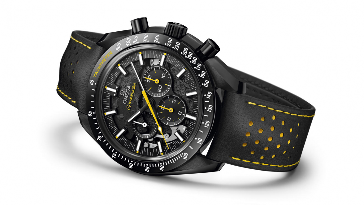
Omega applied a similar idea to their latest offering.
https://www.omegawatches.com/en-us/watches/baselworld-2018/speedmaster-moonwatch-apollo-8/
upload_2018-3-26_12-13-29.png
 
Posts
512
Likes
416
Really love the textured dial on this one. I think the Aquaracer version would be much improved with some texture on the dial, whether on the whole thing (with the Moon part smooth) or having the main dial smooth, with the Moon part visibly textured and having some depth to it... give some actual depth to the craters/seas.

Seems bizarre to me that neither of these two CLEP watches have any Chinese writing on them. They use "CLEP", the English abbreviation? Would seem far more "authentic" (and desireable) to me if the majority of the writing were in Chinese.
A majority of the writing in Chinese would be more desirable for you, but I'm not that sure about the Chinese market. As far as I know, this wil only be sold in Chinese boutiques and I think that it might actually be more popular if the writing is in English, at least for the Chinese owners and buyers.

I've spent quite some time in Asia, but unfortunately, I have nothing concrete to go after here, just my gut feeling!
 
Posts
21,243
Likes
29,675
Really love the textured dial on this one. I think the Aquaracer version would be much improved with some texture on the dial, whether on the whole thing (with the Moon part smooth) or having the main dial smooth, with the Moon part visibly textured and having some depth to it... give some actual depth to the craters/seas.

Seems bizarre to me that neither of these two CLEP watches have any Chinese writing on them. They use "CLEP", the English abbreviation? Would seem far more "authentic" (and desireable) to me if the majority of the writing were in Chinese.

I like the idea of making the moon cratery - good idea!
 
Posts
23
Likes
17

Ok, I like the way they've textured the Moon, but the skeletonization and the separation of the sub-dials makes it less appealing to me than the TAG version. The TAG sub-dials continue the texture, which I think looks better. Don't know why Omega did this on the seconds sub-dial, but not the other two. And the partial skeletonization just seems like they couldn't make up their minds. A design-by-committee is what it looks like to me.

A majority of the writing in Chinese would be more desirable for you, but I'm not that sure about the Chinese market. As far as I know, this wil only be sold in Chinese boutiques and I think that it might actually be more popular if the writing is in English, at least for the Chinese owners and buyers.

I've spent quite some time in Asia, but unfortunately, I have nothing concrete to go after here, just my gut feeling!

Ok, maybe I shouldn't have said "a majority" but I would expect at least a little bit, given that this is a Chinese government space program and AFAIK English isn't an official language of China. I mean c'mon, it's the official watch of a Chinese space program and it doesn't have a single character in Chinese! I would at least expect it to have a logo like this one from the end of the video that Hubert linked:

CLEP.png

Perhaps not on the front but at least on the back! I would prefer this simple logotype to the amateur-looking line drawing of the lunar rover. That design could have been a good basis for an engraved caseback, but the way it's executed on the sapphire caseback, it just looks very cheap/dated IMO. Like something out of the 90's.